Overview
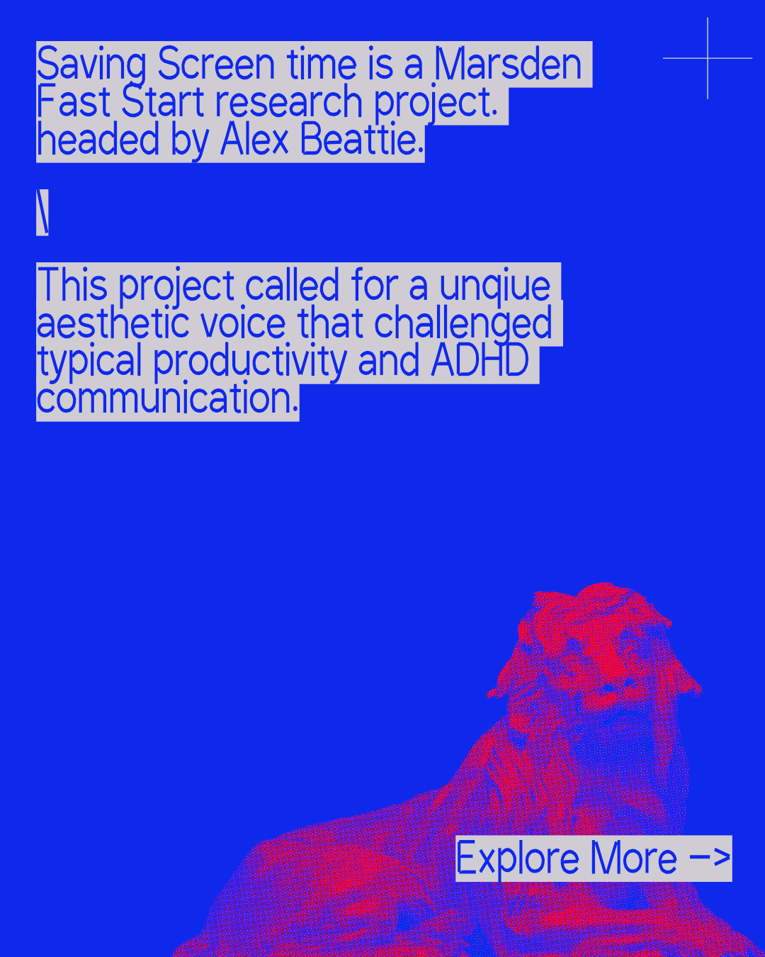
Digital wellbeing has a house style. Soft gradients, rounded corners, a muted sage green, and a line chart that is supposed to go down. It is the visual language of a scold — calm, corrective, and quietly certain that less is better. Saving Screen Time is a Marsden Fast Start research project that argues the opposite, and my job was to make it look like it meant it.
The research is led by Alex Beattie at Te Herenga Waka — Victoria University of Wellington, with a team of seven across information management, health psychology and Māori technology ethics. It starts from a plain observation: not everyone experiences the internet the same way. For people with ADHD, formally or self-diagnosed, being online — and taking breaks from it — carries benefits and costs that do not match the neurotypical template. The project reads that difference through crip time, a disability-studies idea about bending the clock to suit disabled bodies and minds rather than forcing those bodies and minds to meet the clock.
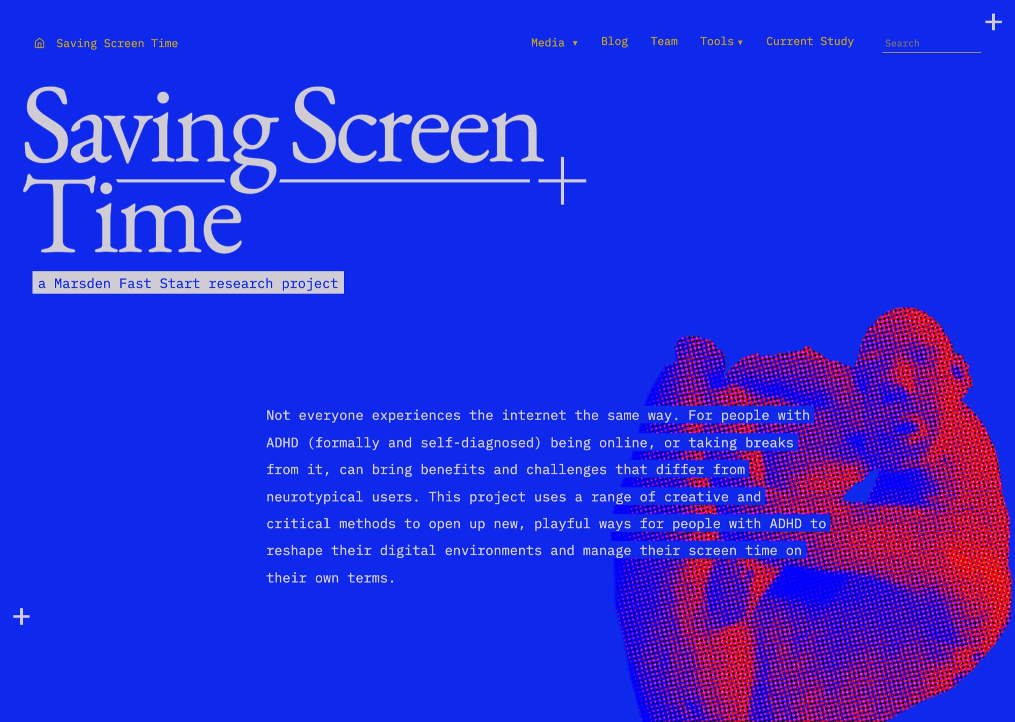
That left a design problem with a sharp edge on it. A project arguing that the demand to disconnect carries an assumption about whose mind counts as normal cannot turn up dressed as a productivity app. If the identity looked like the thing being criticised, the criticism would be over before the first paragraph. So the brief was never to illustrate the research. It was to build a voice — identity, platform, study portal, tools — that treats restlessness as a way of knowing rather than a symptom to be managed.
A voice that argues
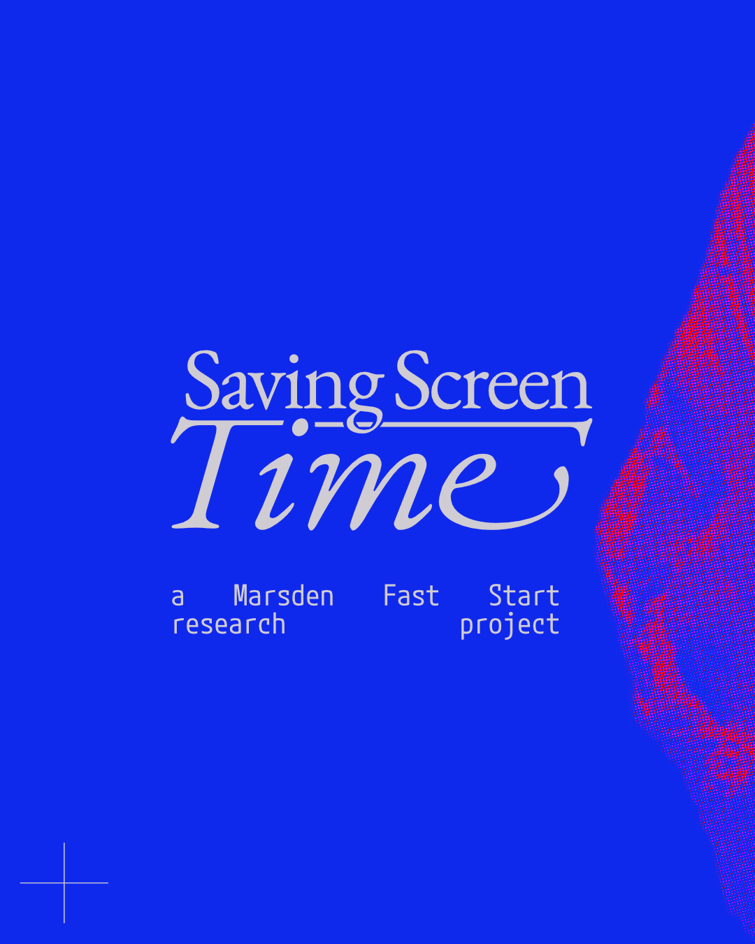
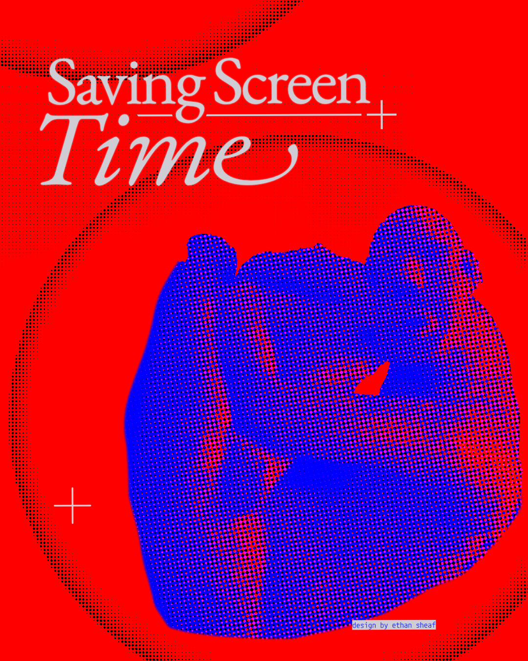
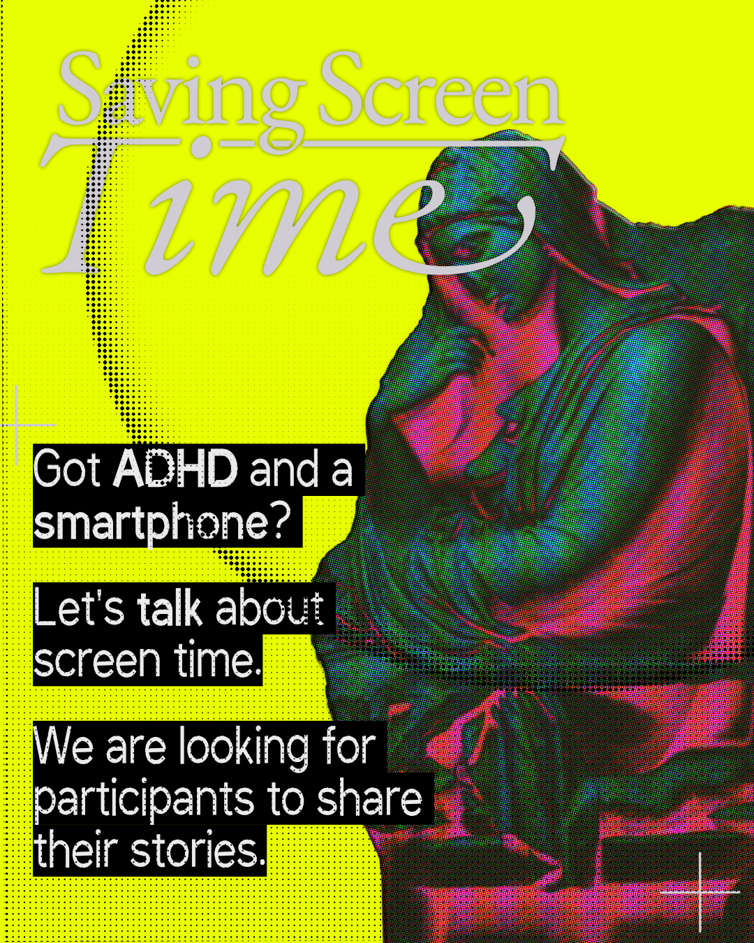
The imagery is classical statuary — a rearing horse and rider, a seated figure, a winged Victory — put through a coarse halftone until the surface starts to come apart. Statues are the most confident objects we make: monuments to the ideal body, cast to outlast the people looking at them. Run at this dot size they stay recognisable and stop being smooth. The point is not to wreck the ideal figure but to make its resolution visible, the way the project makes the norms inside “healthy” screen use visible.
Three typefaces, three jobs. EB Garamond carries the argument, because the argument is scholarship and should read like it. IBM Plex Mono carries the apparatus — straplines, labels, section numbers, the things that behave like a specimen sheet. DM Sans carries the shout, set in slabs at a size that makes a paragraph behave like a placard. The palette does the rest of the refusing: an electric blue, a Defacer red, and an acid yellow-green that no wellness product would ever sign off. Registration marks sit in the corners of every page, so the whole thing reads as a proof still on press rather than a finished, frictionless product.


The monogram is allowed to fail. Cropped hard into the halftone it stops being letters and becomes texture, and the poster still holds, because the colour and the dot screen are doing the identifying. A system that only works when every element is legible is a system that cannot be pushed, and this one gets pushed constantly — across a poster set, a website, a recruitment campaign and two tools that look nothing like each other.
The argument down the page
The homepage is sequenced as an argument rather than as a set of marketing sections. It opens on the premise — that being online, and taking breaks from it, works differently for different minds — and then turns the volume up in stages. ADHD CRIP lands as black display type on acid yellow, at a scale where a piece of disability theory is the loudest thing on the page. Under it sits the project’s wager: that people with ADHD are early indicators of how many minds now operate in a stimulus-rich world.
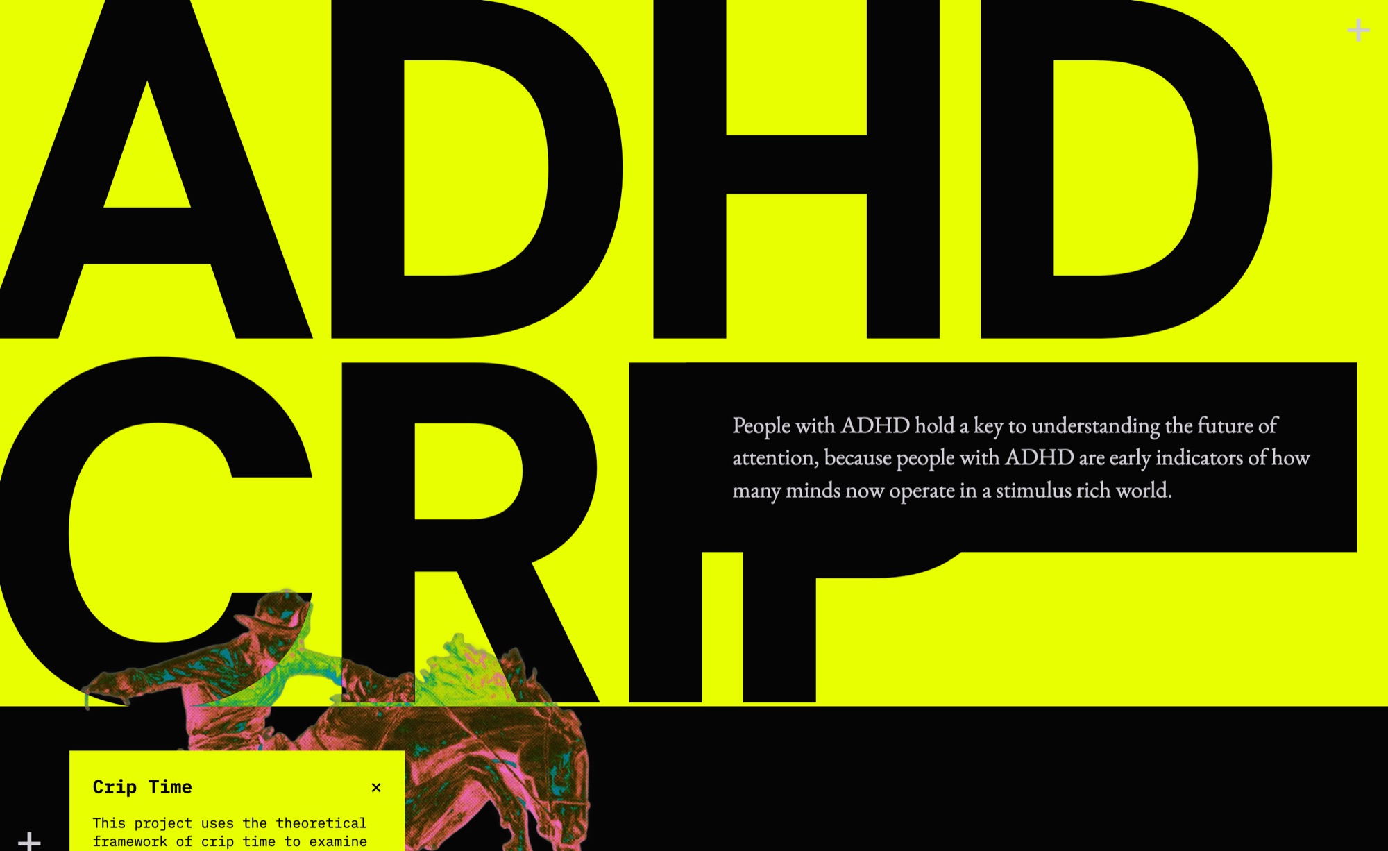
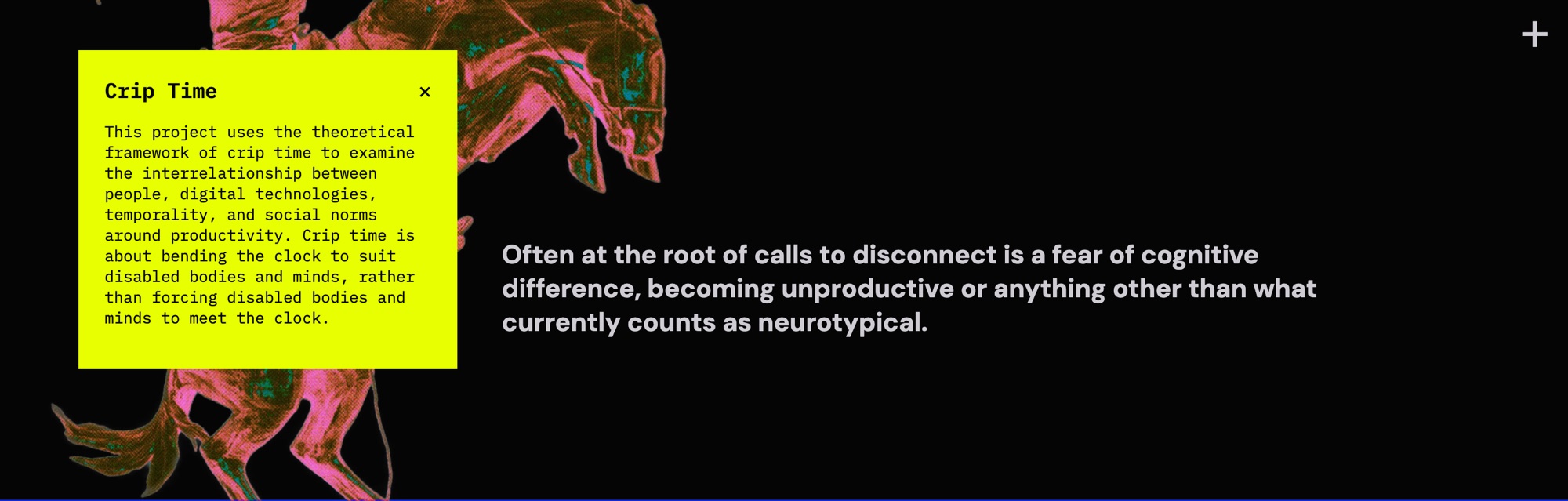
Crip time then arrives as an annotation next to the argument rather than as an entry in a glossary somewhere else, so a reader meets the idea at the moment they need it. The card can also be dismissed. A definition you have already read should be able to get out of your way, and a project about accommodating different minds should not force the same scaffolding on everyone. From there the page turns over into the counter-claim: that at the root of calls to disconnect is often a fear of cognitive difference. Each move is marked by a full-bleed change of colour, so the shape of the argument is legible before a word of it is read.

Do it now, do it later
The recruitment campaign and the study portal are the same sentence at two scales. The poster asks: got ADHD and a smartphone? Let’s talk about screen time. The portal opens on the same words and then has to do the harder thing — turn a person with an attention condition into a person who has finished a research instrument.
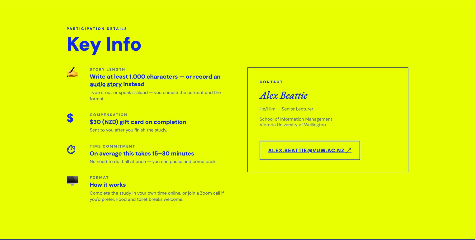
Most of the decisions on that page are crip-time affordances rather than descriptions of one. The study uses story completion, so participants write short fiction about an imagined person rather than confessing about themselves, which holds a sensitive topic at arm’s length. A thousand characters minimum — or record an audio story instead, if writing is the barrier. Fifteen to thirty minutes, with an explicit note that there is no need to do it all at once. Take part alone, or join a Story Completion Party on Zoom and write alongside other people; food and toilet breaks welcome. And at the top, where a recruitment page would normally put one urgent call to action, there are two: Do It Now and Do It Later. Deferral is offered as a legitimate choice rather than counted as attrition.
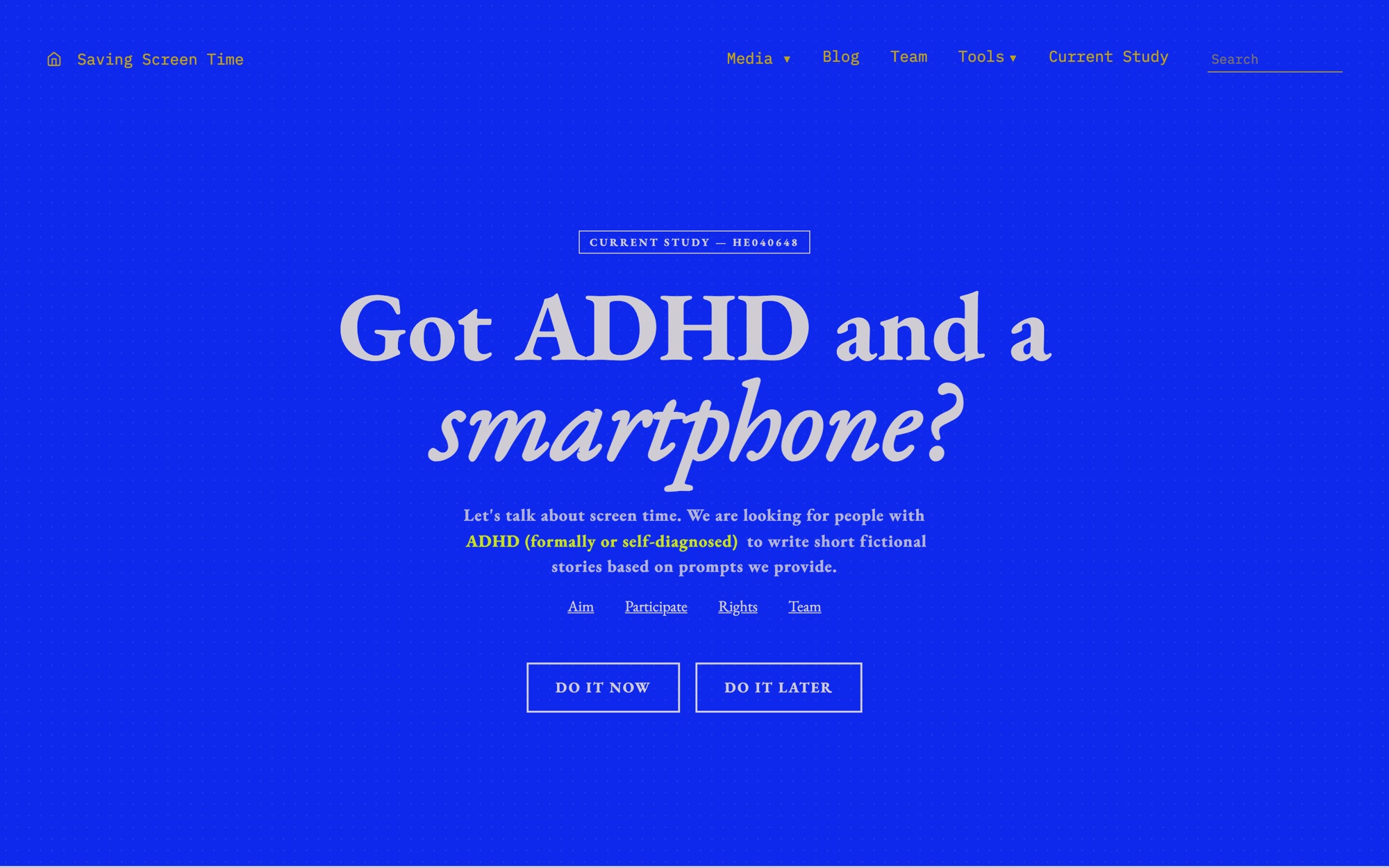
That last one is the argument working rather than being stated. A page that bends around the person it is recruiting is a small, testable version of what the research says out loud: that the clock should move, not the mind.
Scribbling back
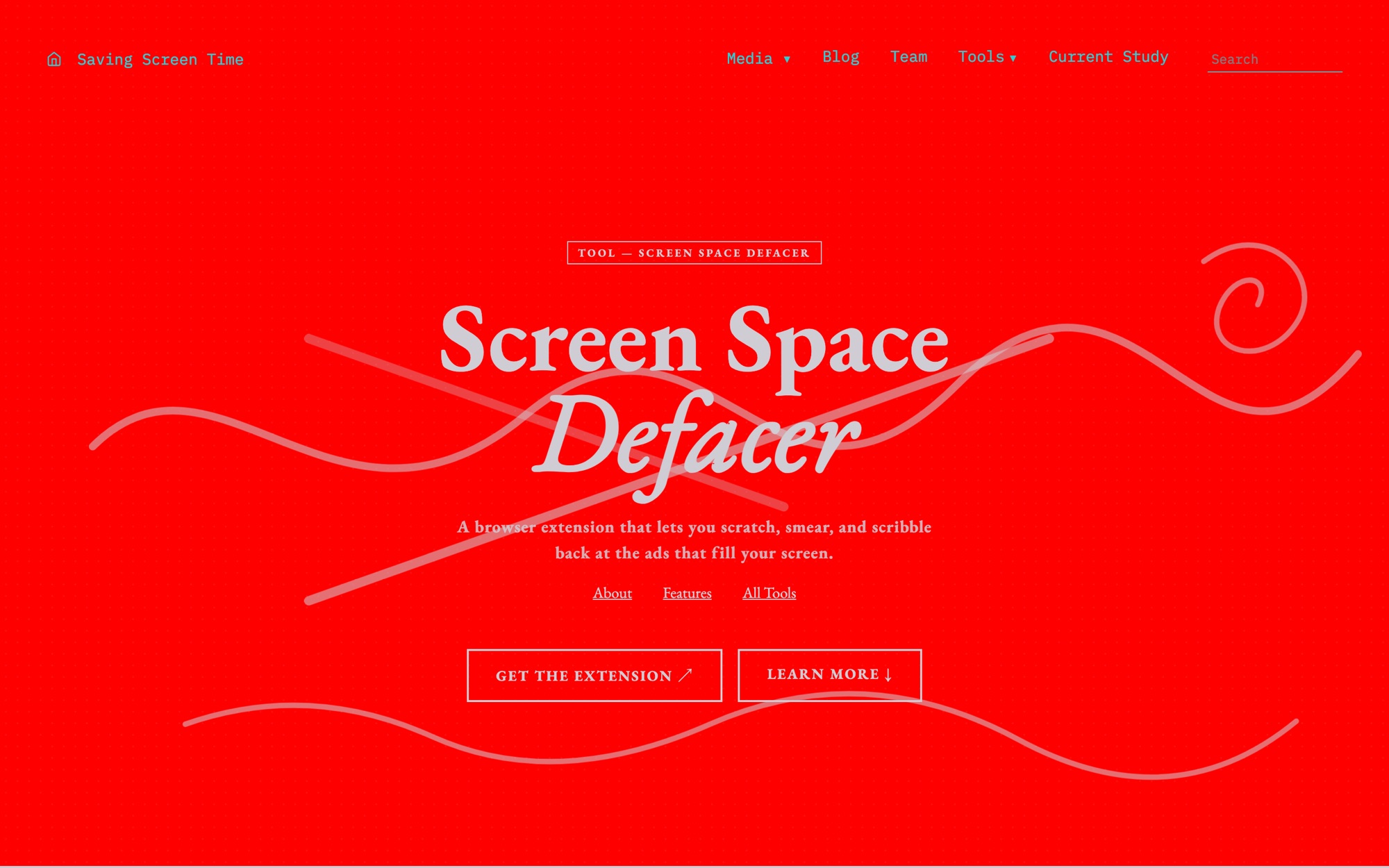
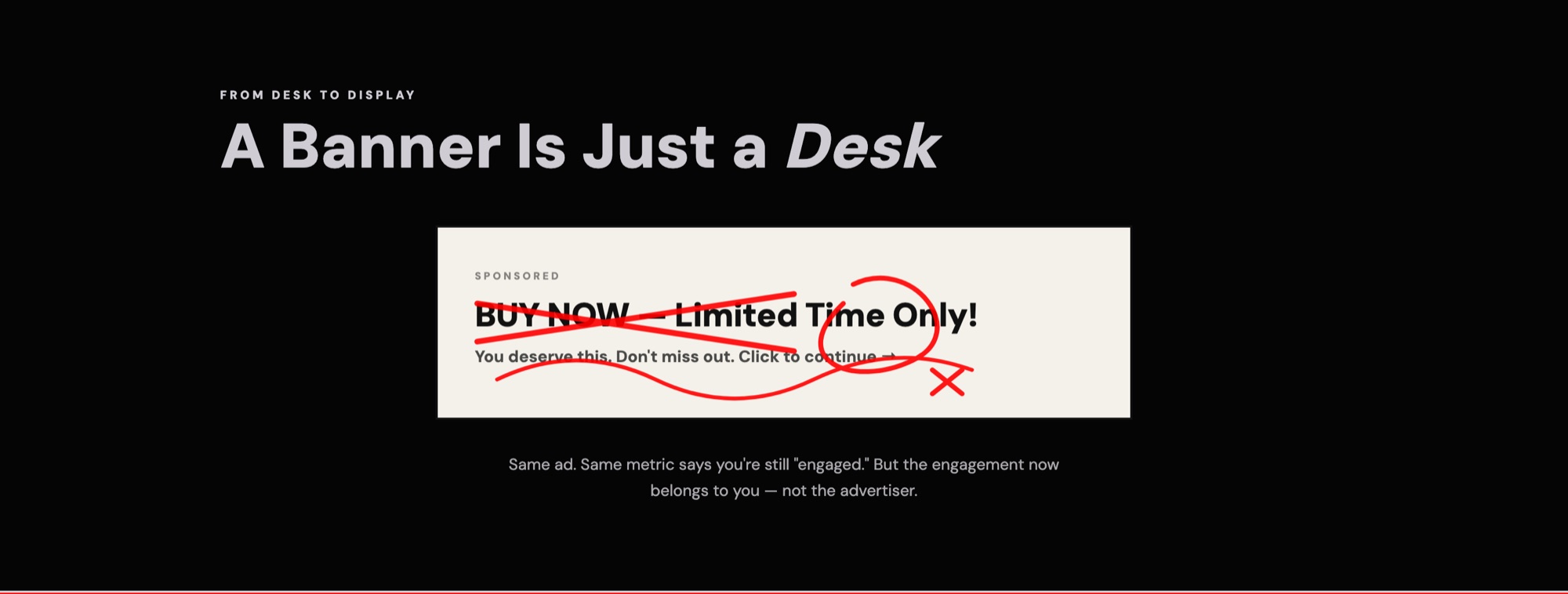
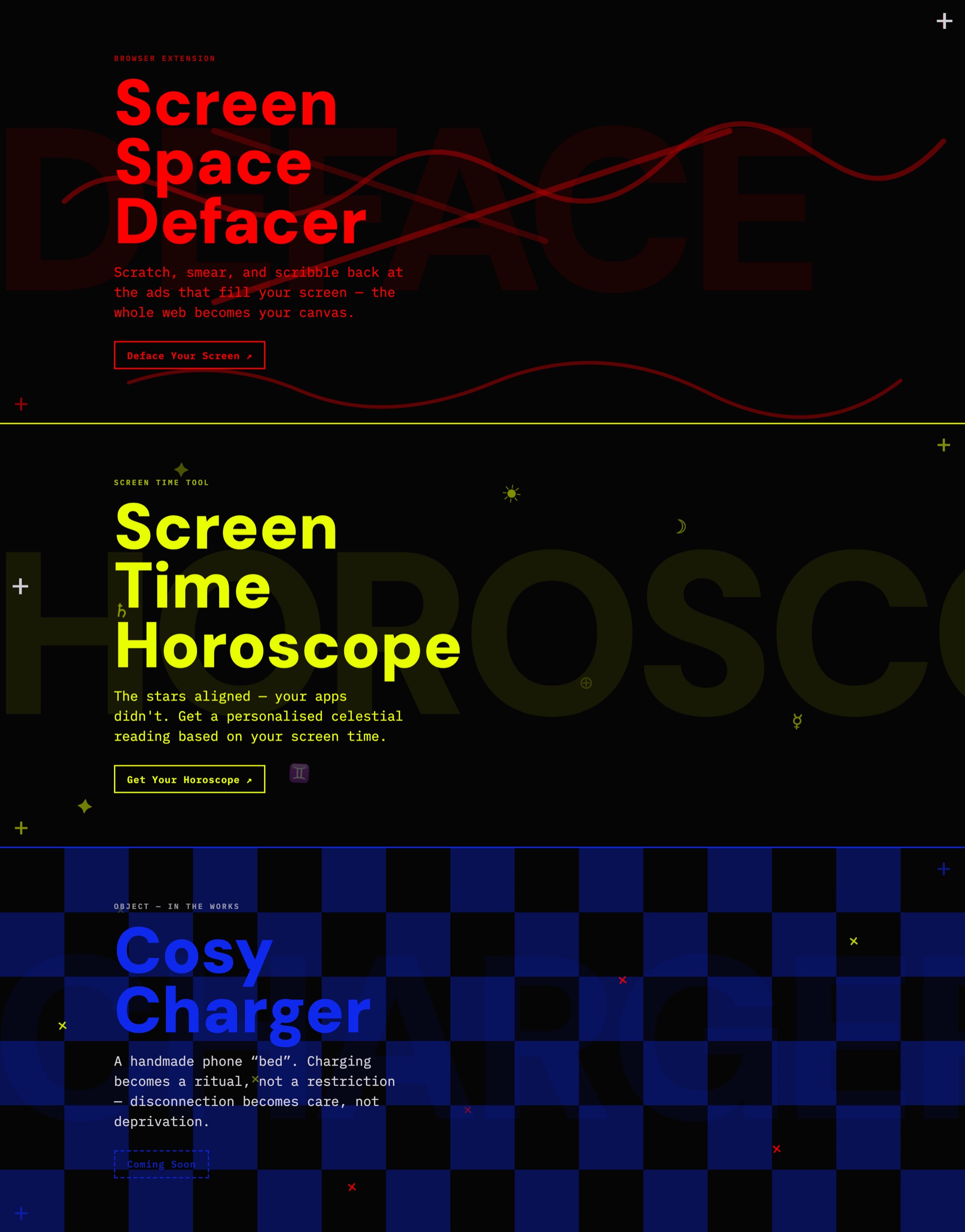
The first tool is a browser extension. Screen Space Defacer lets you scratch, smear and scribble over the ads on any page — not block them, not hide them, deface them. The distinction is the whole argument. An ad blocker makes the commercial layer invisible; the Defacer makes it tangible. A banner stops being a one-way demand for your attention and becomes a surface you can touch, mark, and slowly wear down.
It starts with a question about school desks. If you were the kid who drew on the desk — shading the margins, carving patterns into the wood, unable to sit still — what might it mean to start drawing on your screen? The tool takes that literally. Fidgeting is how a lot of restless minds stay in a space at all, not a failure to be corrected. Feeds are sold to us as frictionless, but smooth is not neutral and it is not smooth for everyone; sometimes the accessible move is not removing every bump but adding the right ones.
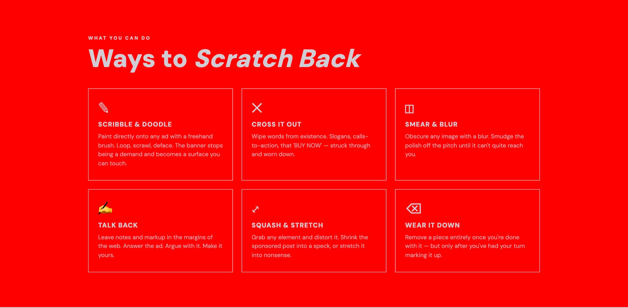
There are six ways to mark a page: scribble and doodle, cross it out, smear and blur, talk back, squash and stretch, wear it down. Deletion is deliberately last, and deliberately conditional — you can only remove an element once you have had your turn marking it up. That single rule is what keeps the tool closer to graffiti than to ad blocking. Removal ends the encounter; defacement extends it.
None of this topples the attention economy, and the page says so in as many words. It is a small, repeatable ritual of refusal.
Rather than describe that, the page hands over a sandbox: a parody broadsheet called the Infinite Feed Gazette — Vol. ∞, No. 404, Monday Forever, weather a vague feeling — with a Destruction Kit floating over it. Squish, shatter, scissors, fudger, stamp, shop, a damage count, and a reset that brings the ads back. The ads are load-bearing. Try removing one.
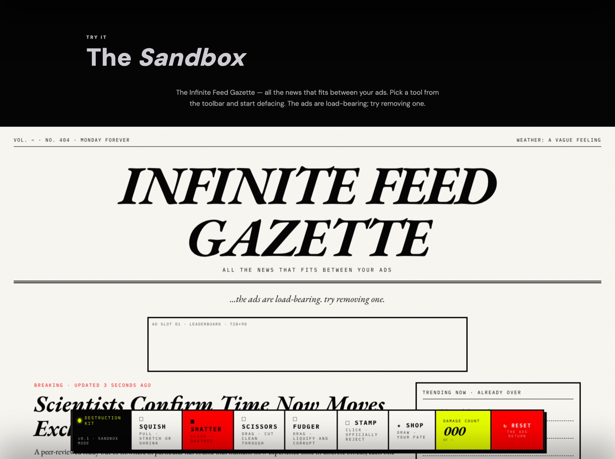
The extension itself is on the Chrome Web Store as Screen Space Defacer. No account, no sign-up.
A counter-reading
The second tool starts from a notification. Every Monday morning: your daily average is up fifteen per cent from last week. One number, standing in for an entire week of working, worrying, commuting and scrolling. The line goes up, therefore you have been bad. You are always bad.
The Screen Time Horoscope offers a different reading of the same data. You hand over a screenshot of your weekly report — or type the totals — along with your star sign, and app categories are mapped onto astrological archetypes before a language model composes the reading. The model is instructed to sound less like a diagnosis and more like something a slightly space-cadet friend might text you at midnight. The honesty lives in the framing rather than in a privacy policy: nothing is extracted or mined, and the page calls the whole exercise vibe-tracking — surveillance at the level of reading your palm.
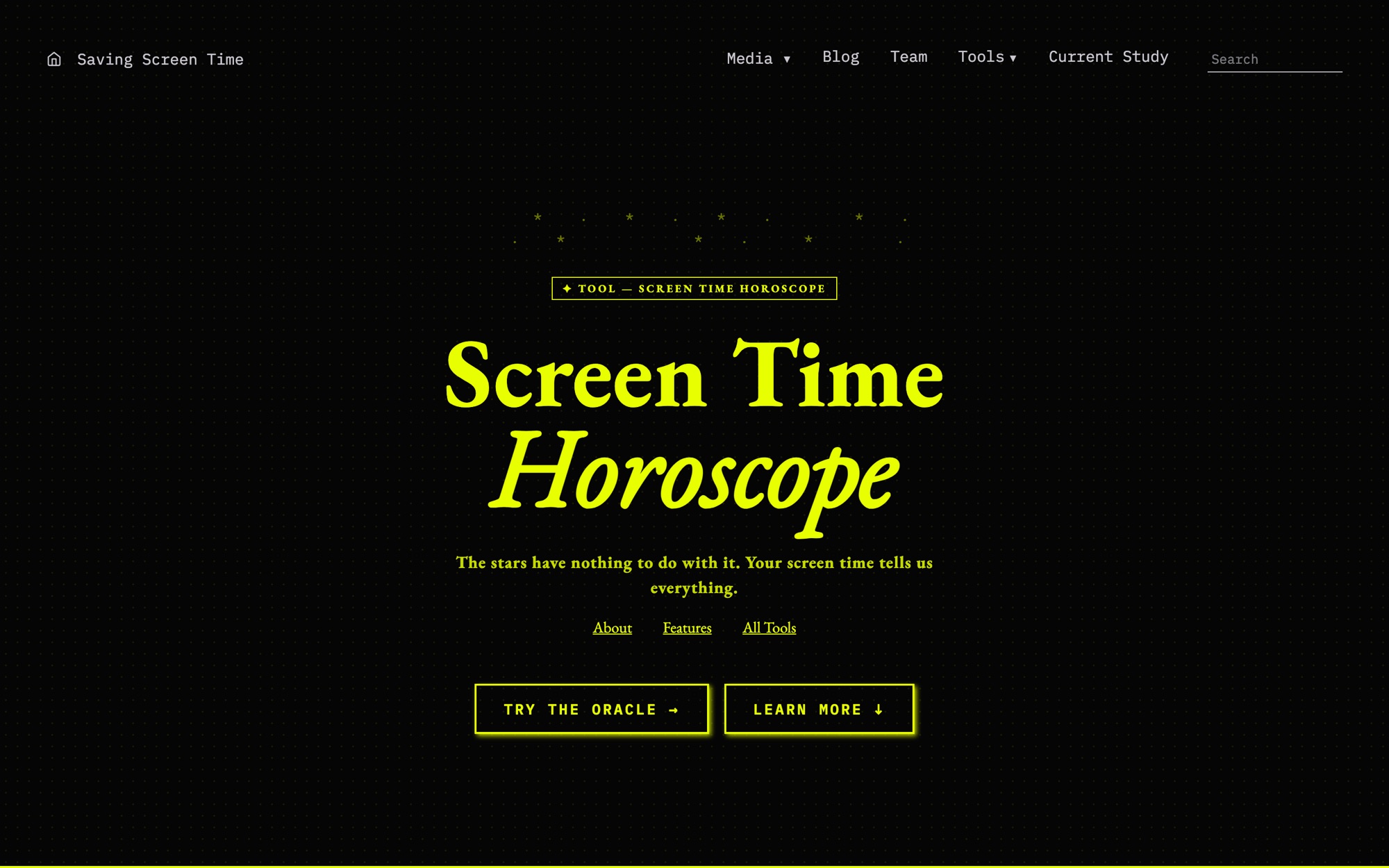
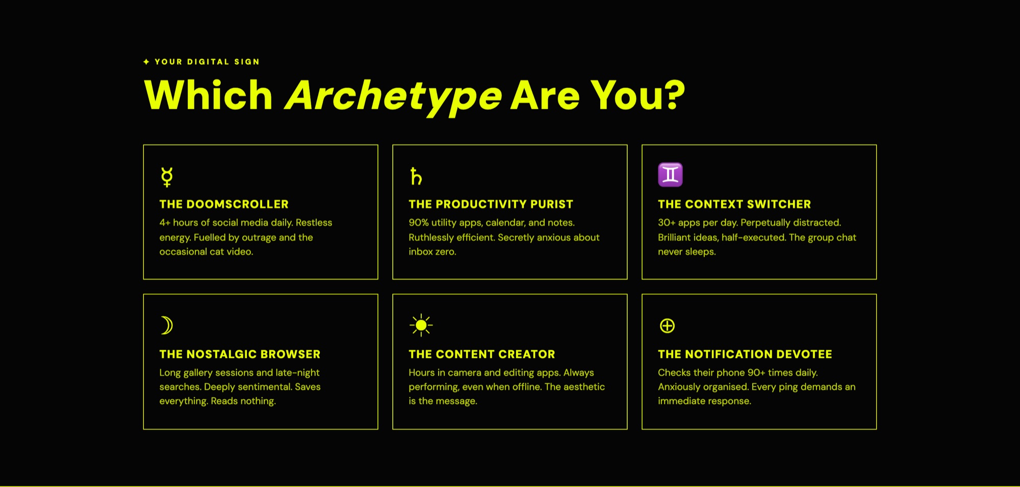
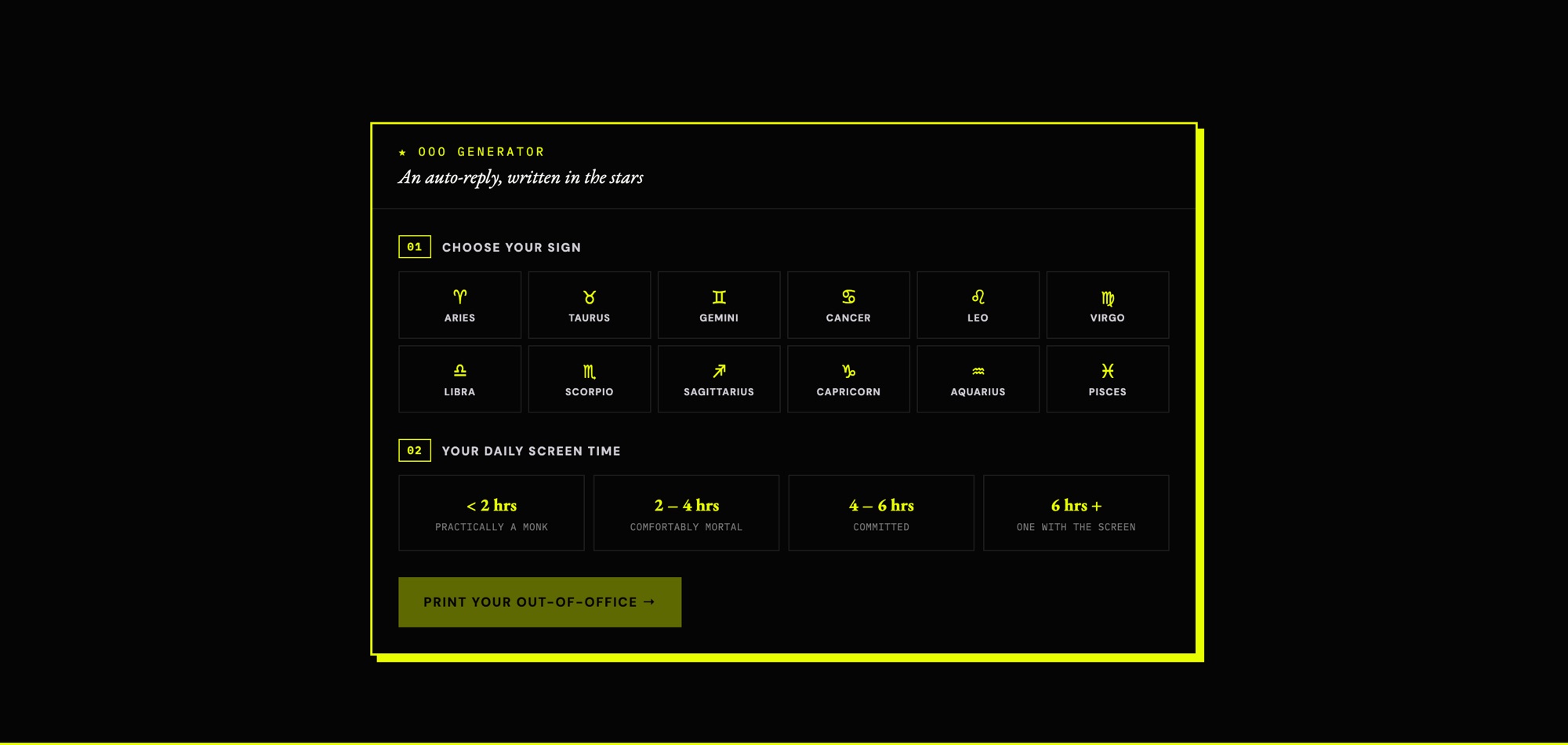
Astrology is the point rather than the joke. It is a language of disposition — of tendency, temperament, things you are inclined towards — and a disposition is not a failure state. The Doomscroller, the Productivity Purist, the Context Switcher, the Nostalgic Browser, the Content Creator, the Notification Devotee: six archetypes that are unflattering without being corrective, which is a register the wellbeing dashboard has no way of reaching. The out-of-office generator then lets the reading leave the page entirely, turning a horoscope into an auto-reply that tells your colleagues where you have gone.
Building it
The platform is a Next.js App Router build on Vercel. The pages that move on research time rather than deploy time — publications, press, the current study — read from Sanity, so a new paper or a change to the participant information goes up without me. That split matters more than it sounds on a project running across a seven-person team for several years: the parts that need to stay stable are in code, and the parts that need to stay current are in the hands of the people doing the research.
The section reveals are one class toggled by an IntersectionObserver, and on this site that is an argument rather than a flourish. Sections arrive as you reach them, one idea at a time, instead of the whole page landing at once and asking to be triaged. It is a small piece of pacing, which is the thing the research is actually about.
Tools
-
Next.js (App Router)
-
Sanity, for the publications, press and study pages
-
Vercel
-
Screen Space Defacer — a Chrome extension, published on the Chrome Web Store
-
EB Garamond, DM Sans, IBM Plex Mono
-
Halftone and collage work for the poster set
Links
Gallery