Overview
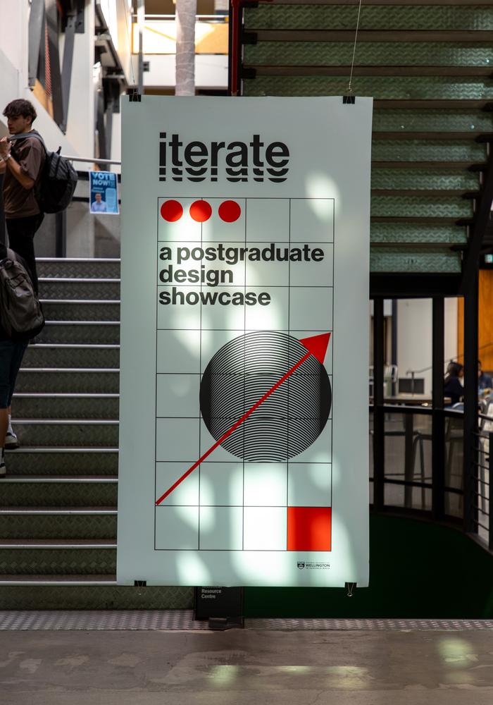
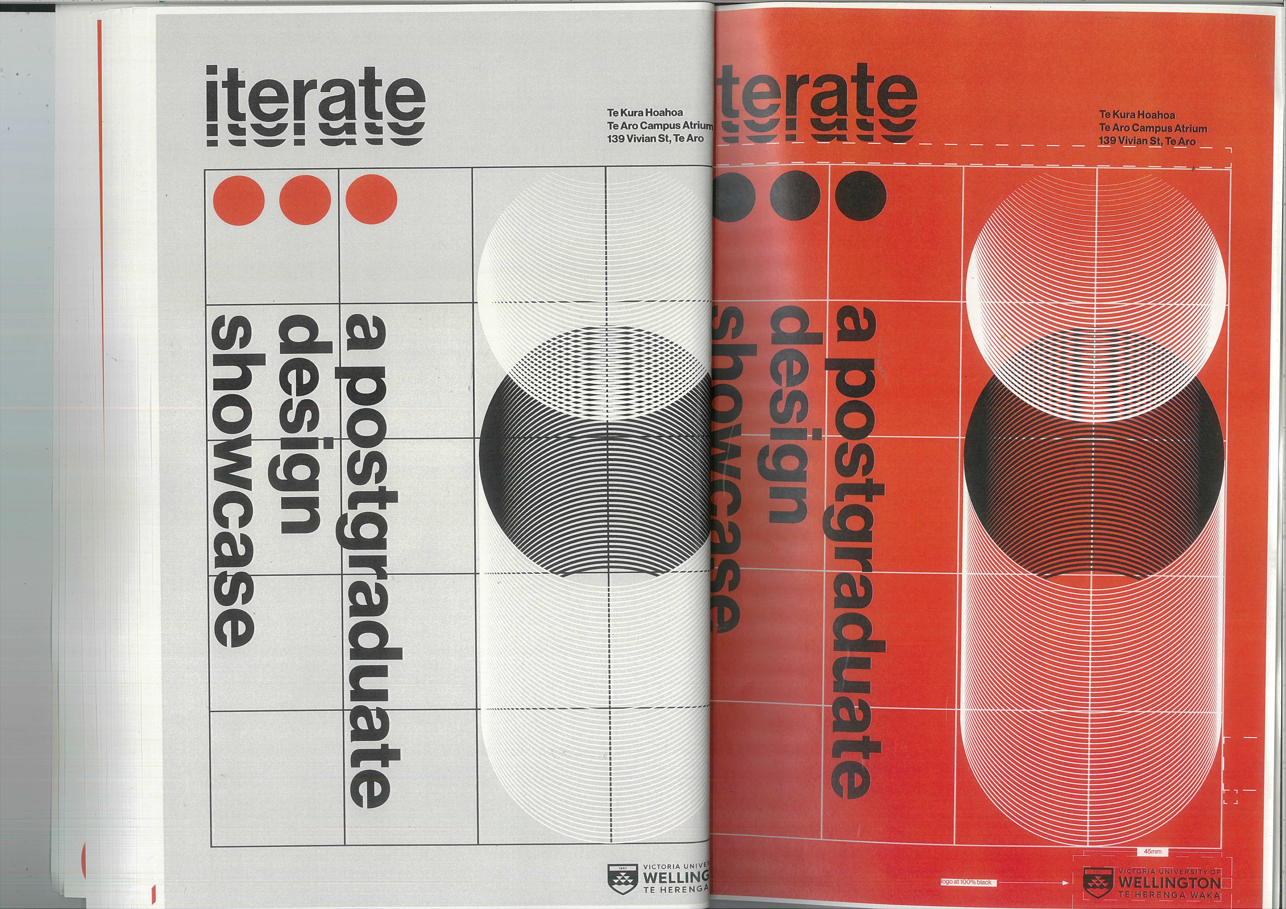
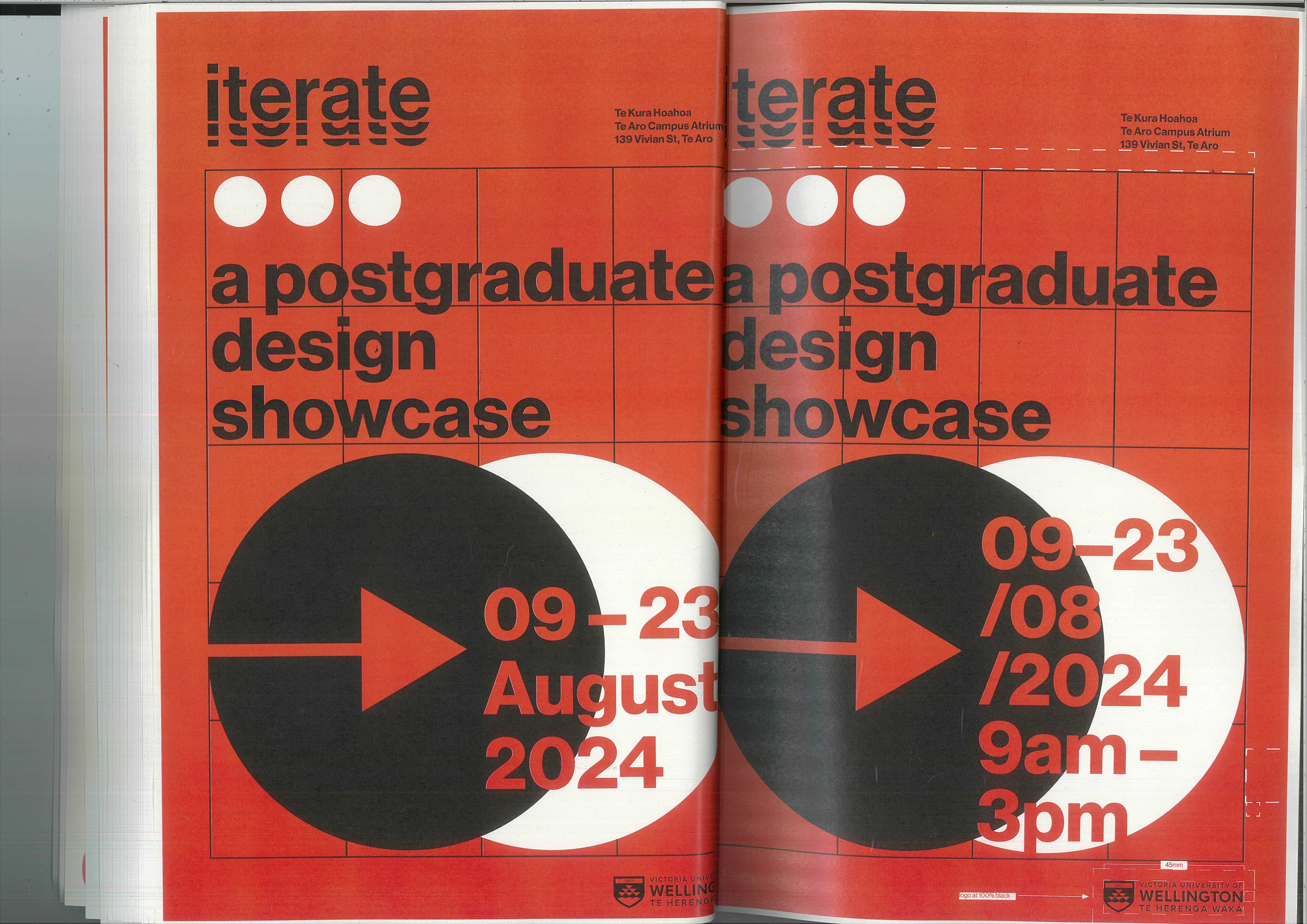
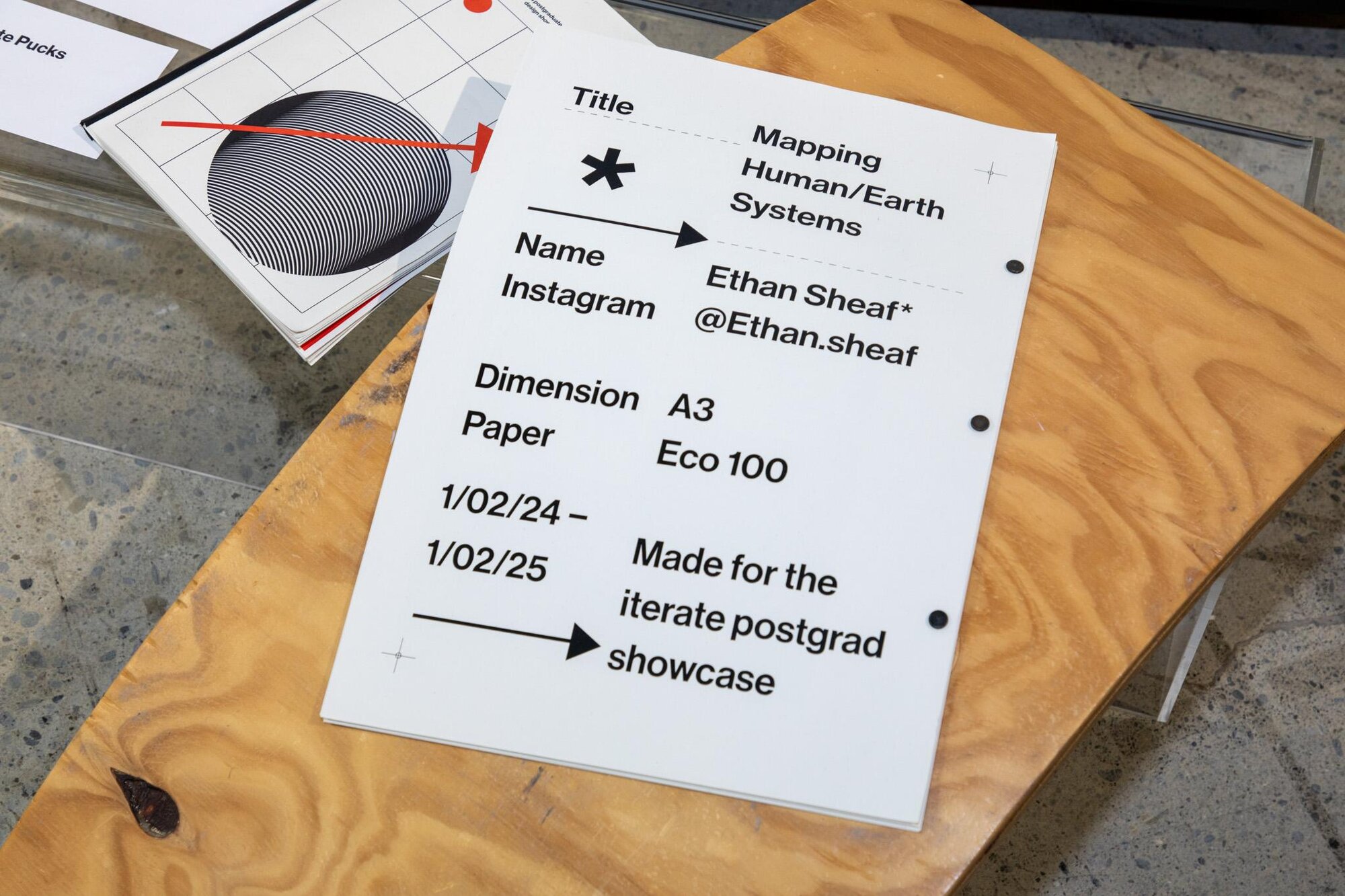
Iterate was the 2024 postgraduate design showcase for Te Kura Hoahoa, the School of Design Innovation at Te Herenga Waka — Victoria University of Wellington. My role was to develop the exhibition’s complete visual identity: a logo and mark, a typographic system, a grid-driven imagery language, and the print, motion, and spatial applications that carried it across the exhibition and its promotion.
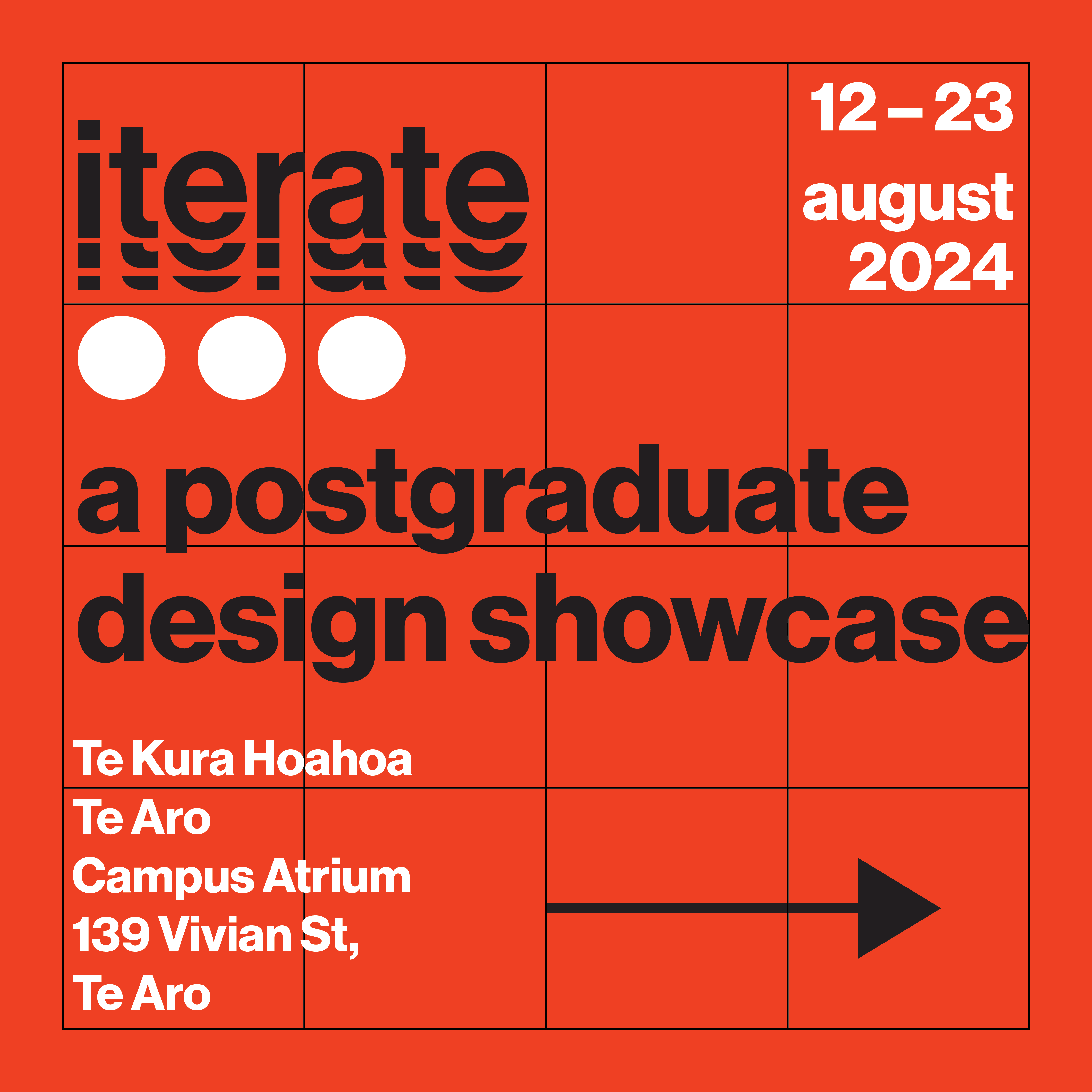
The brief was to create a system flexible enough to hold together a cohort of wildly different research practices, yet distinctive enough to read as one show. The answer was iteration itself — a modular grid and a small set of repeatable elements that could be recombined endlessly, so every application felt like another pass at the same idea.
Brand Identity
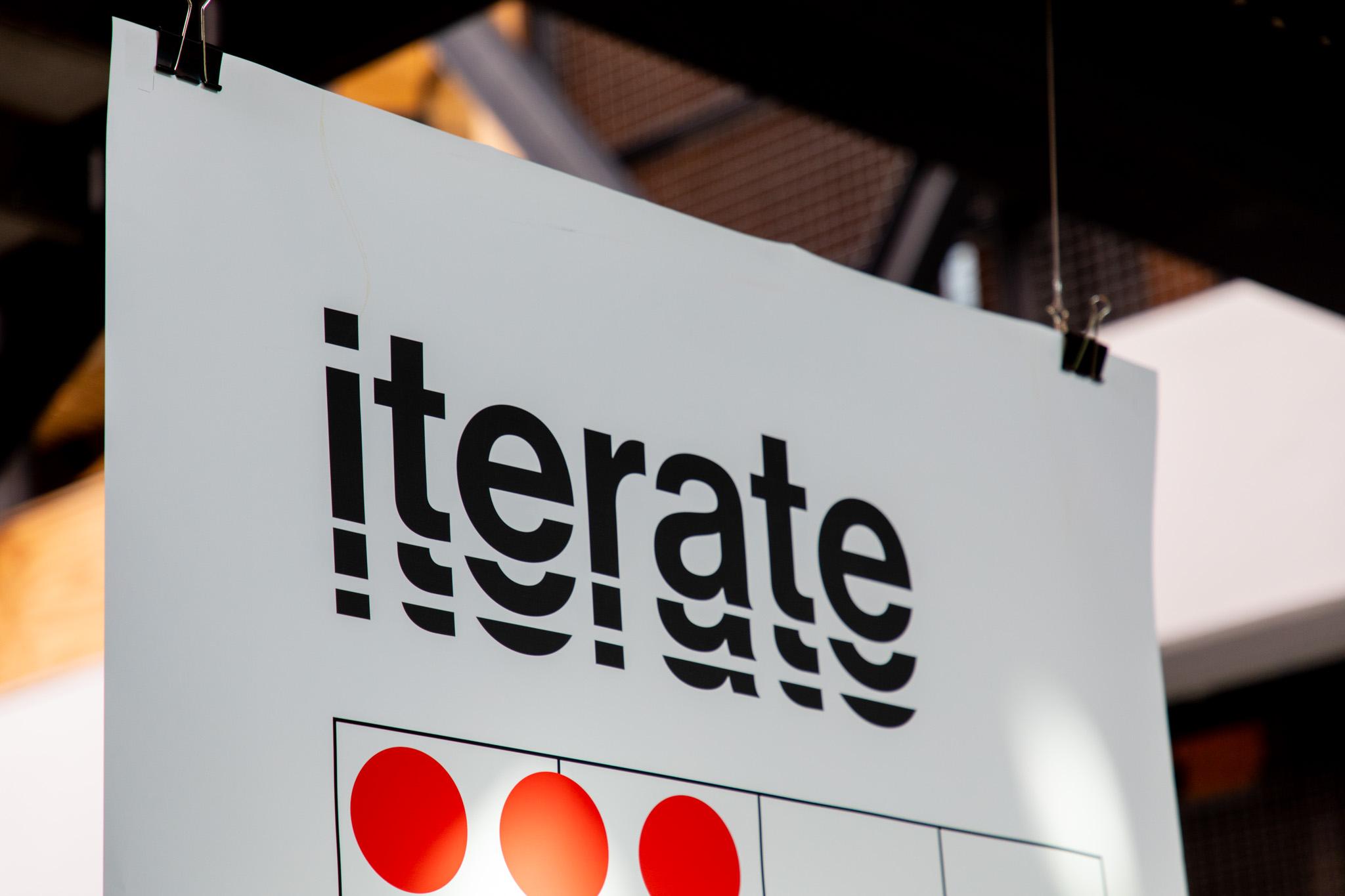
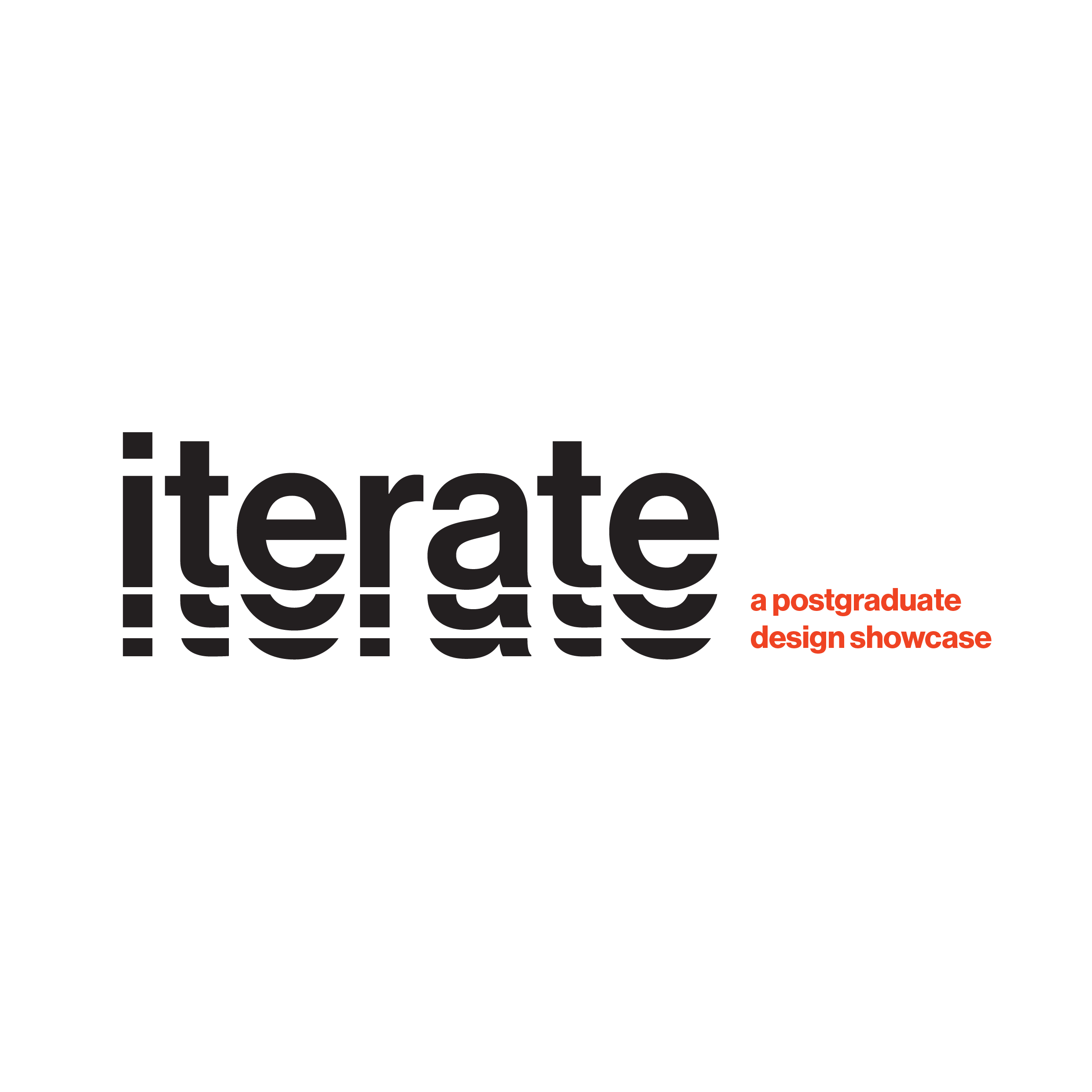
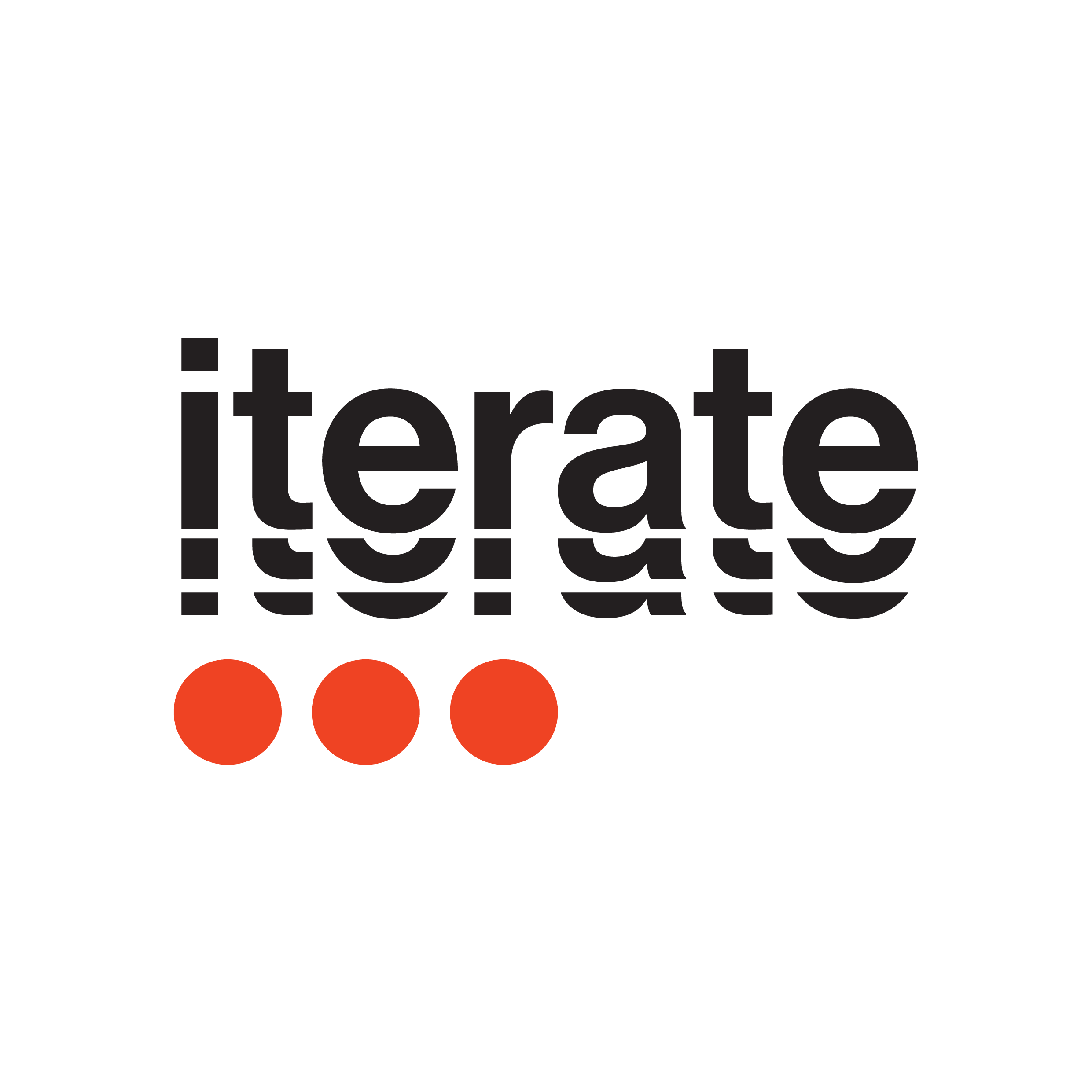
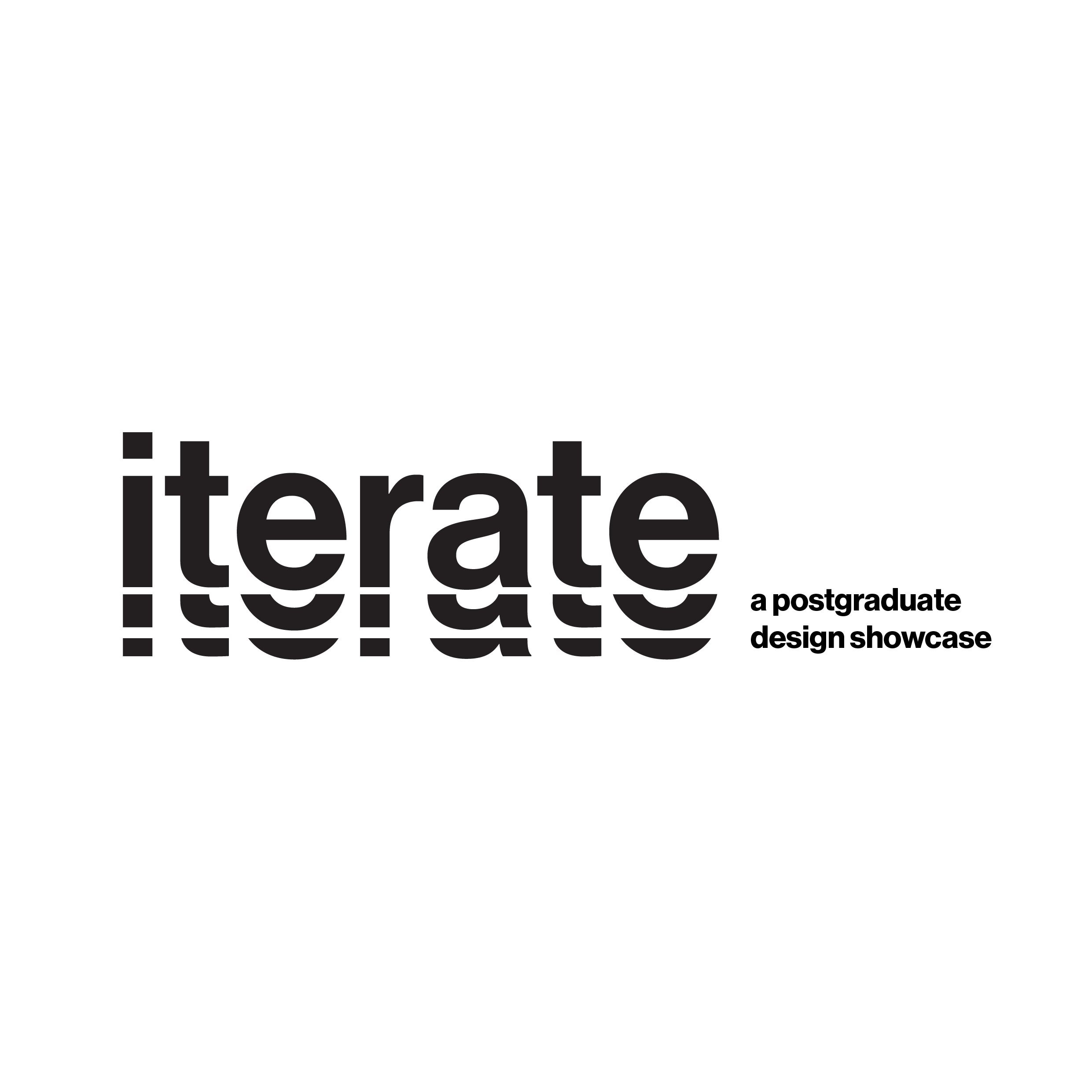
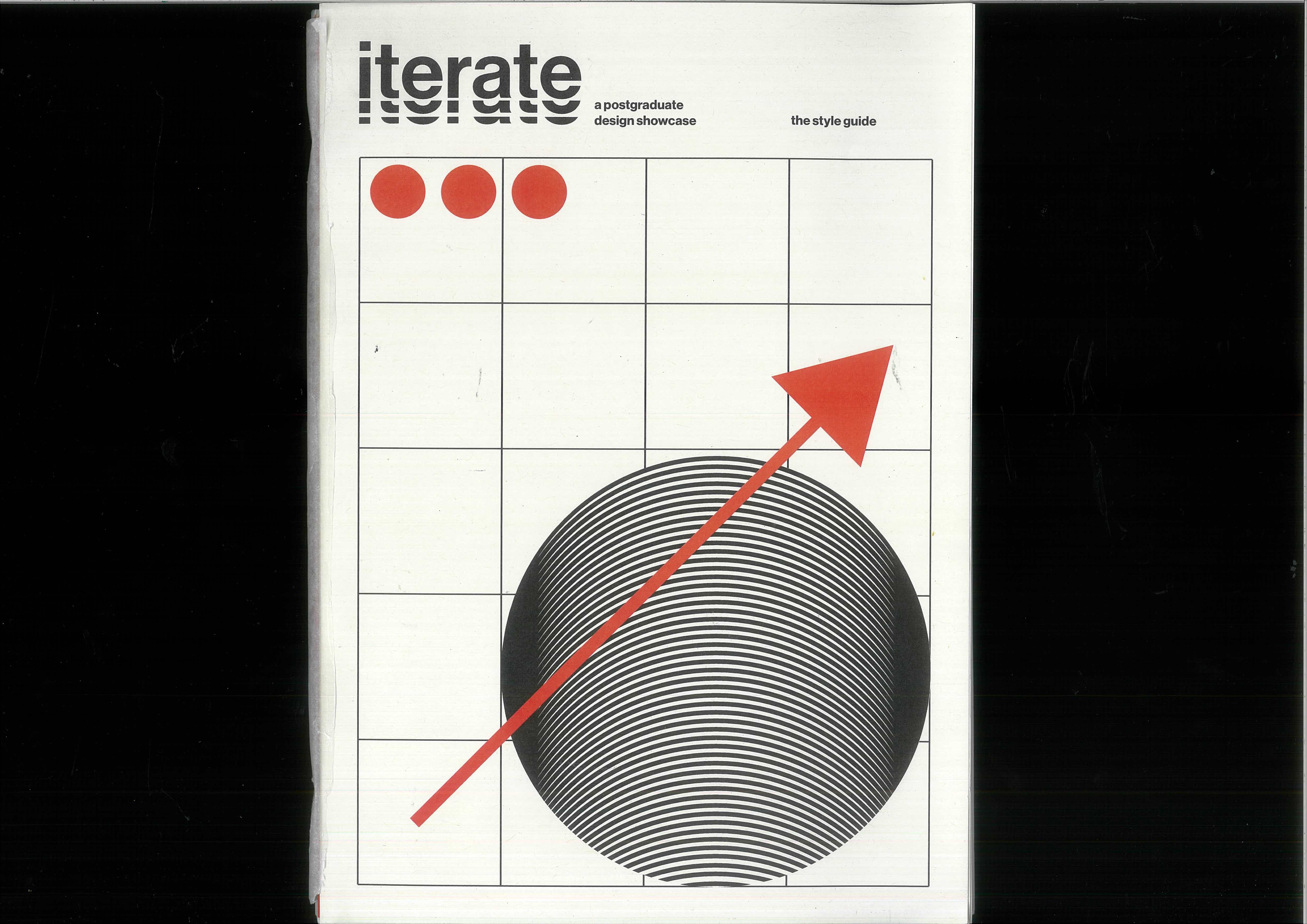
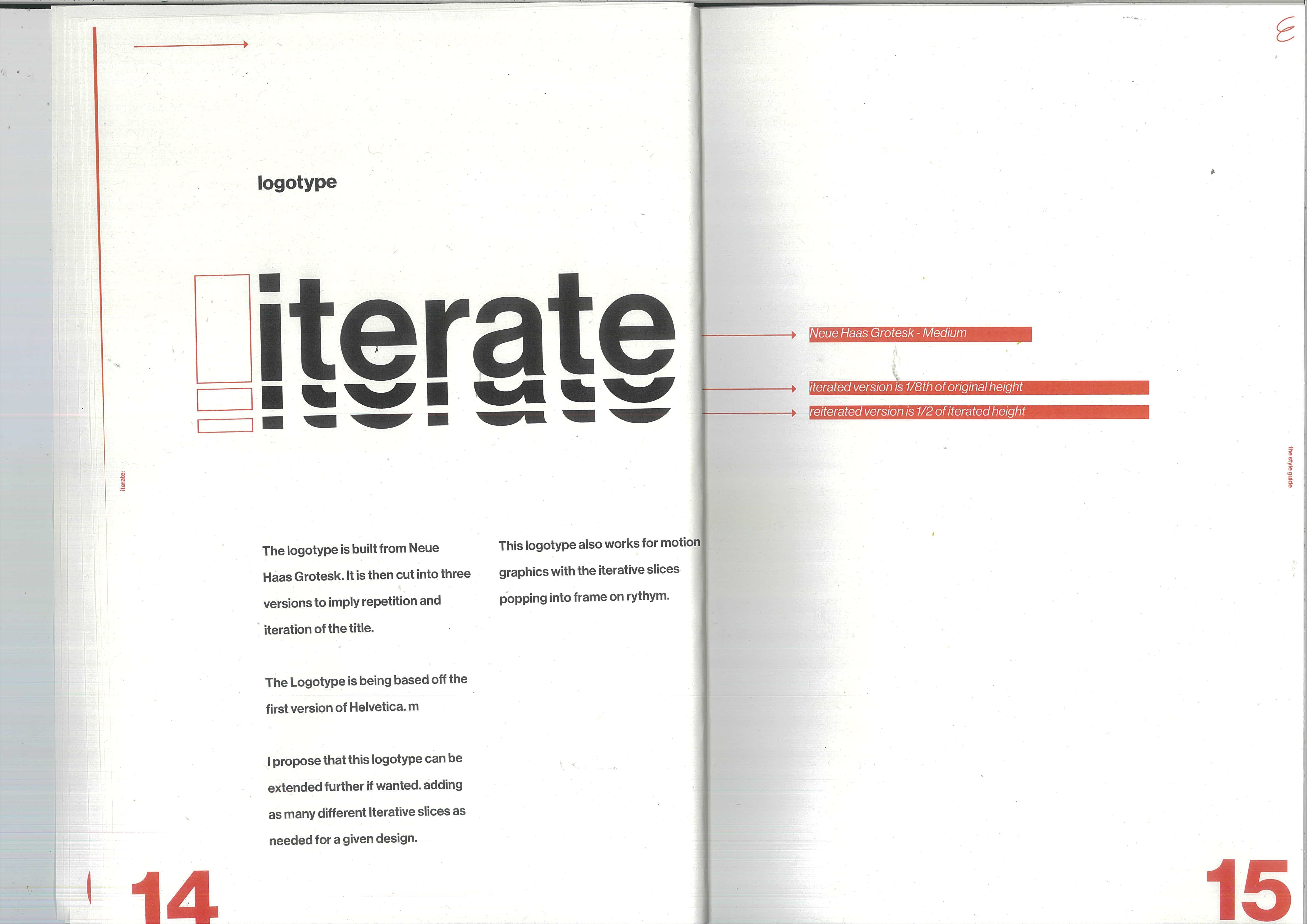
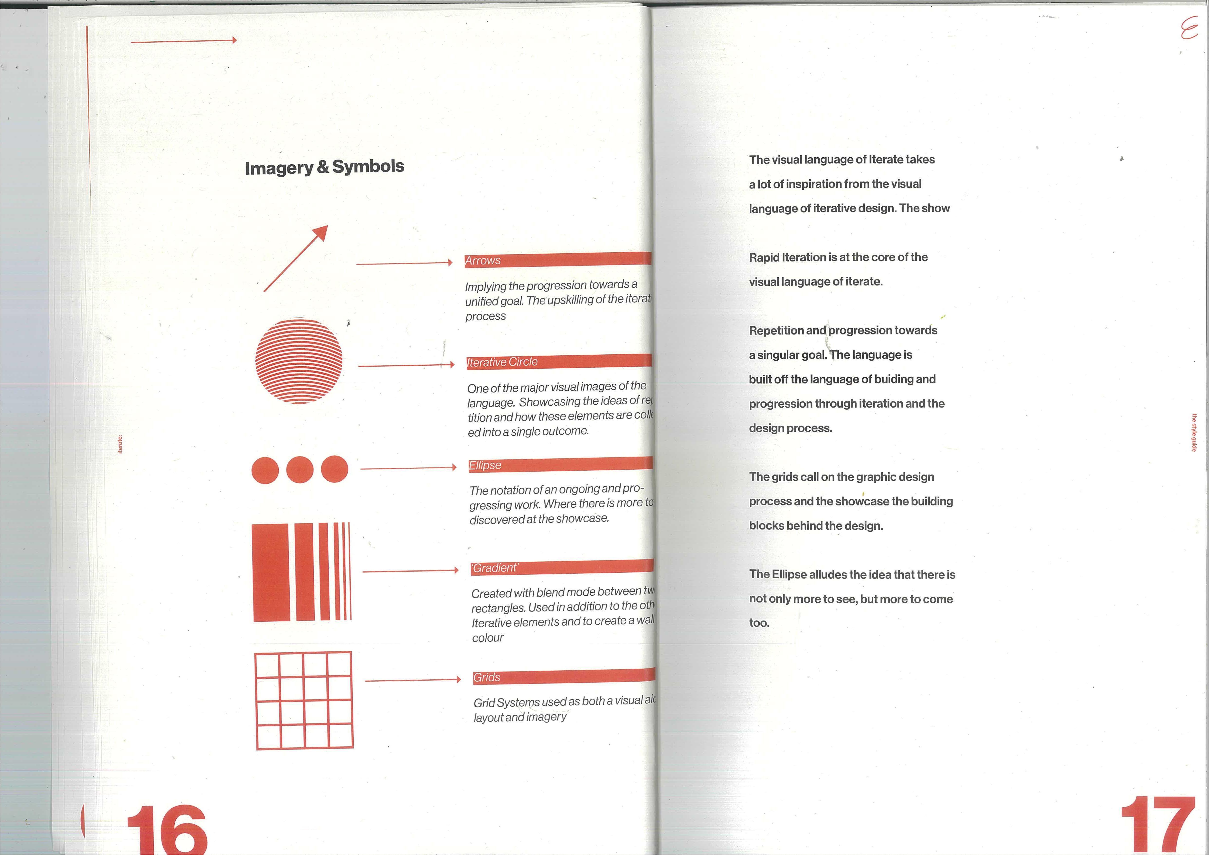
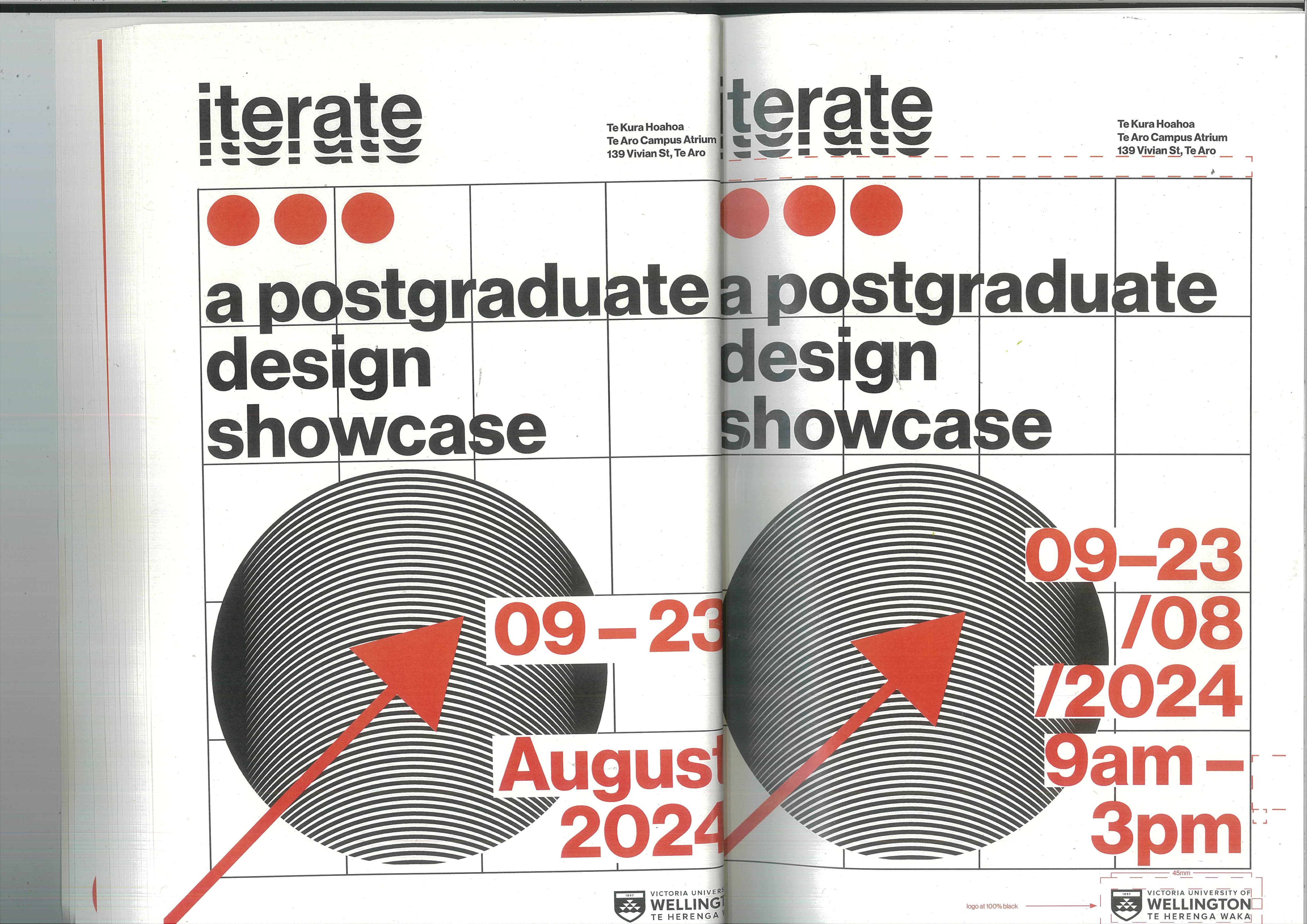
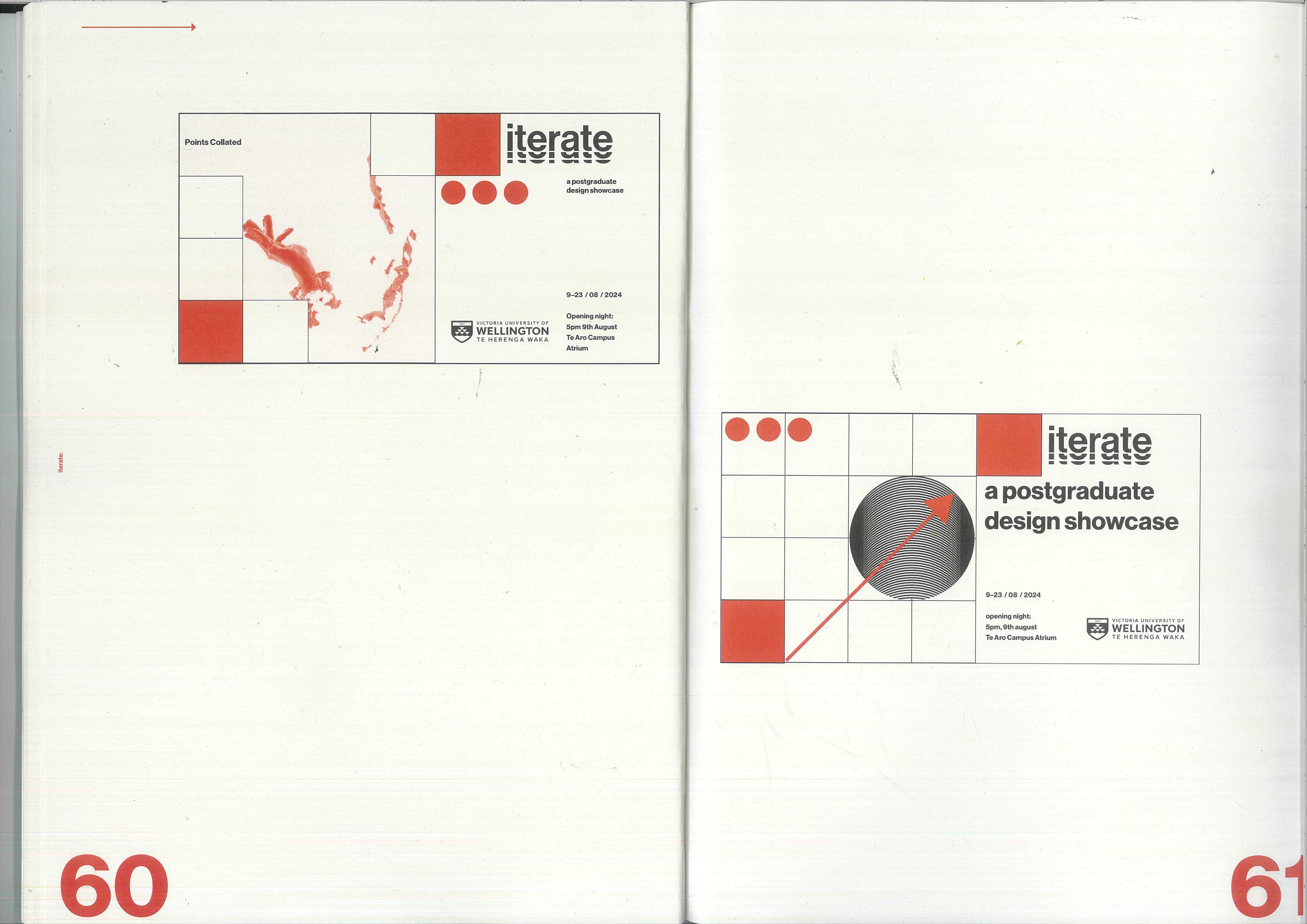
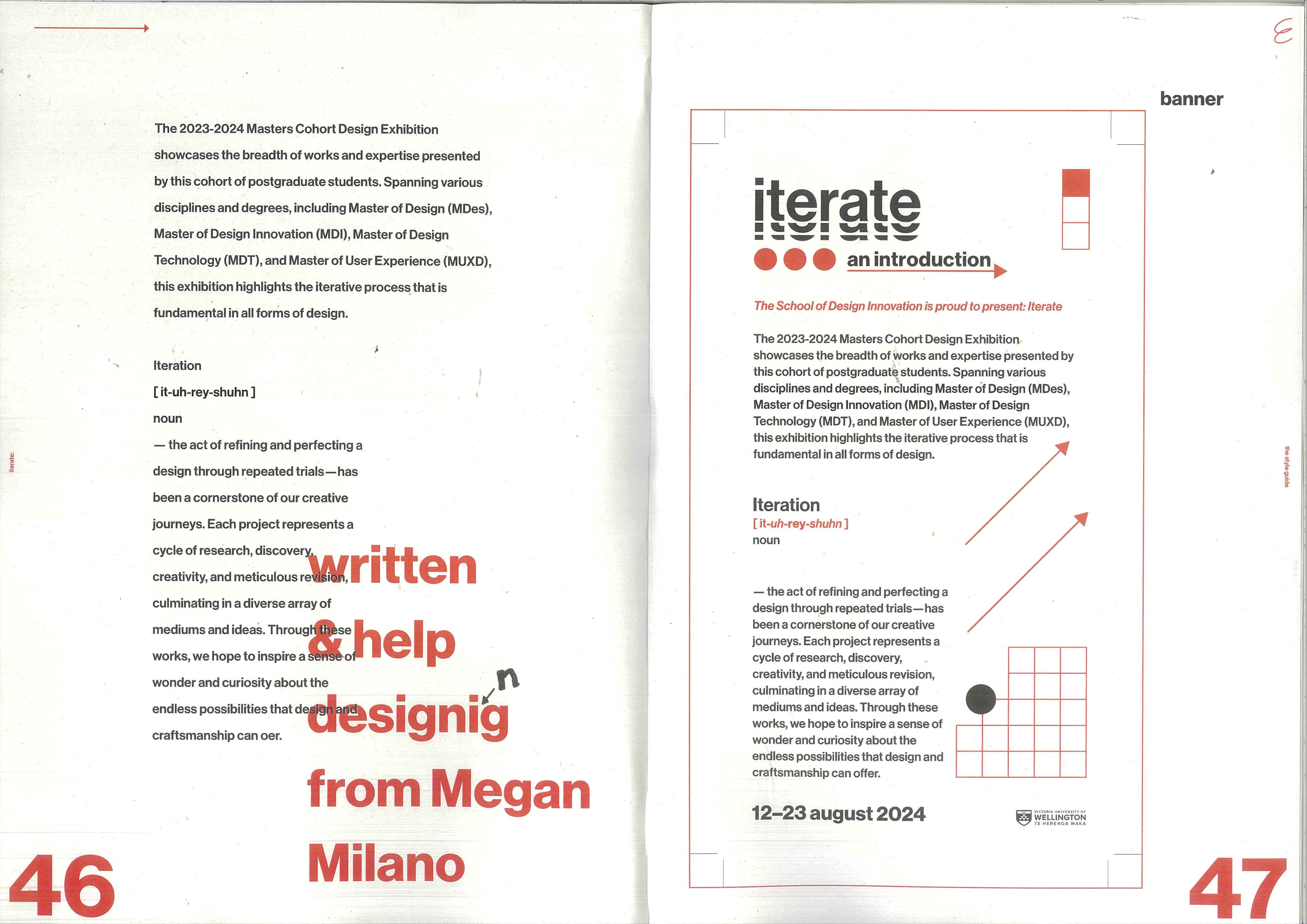
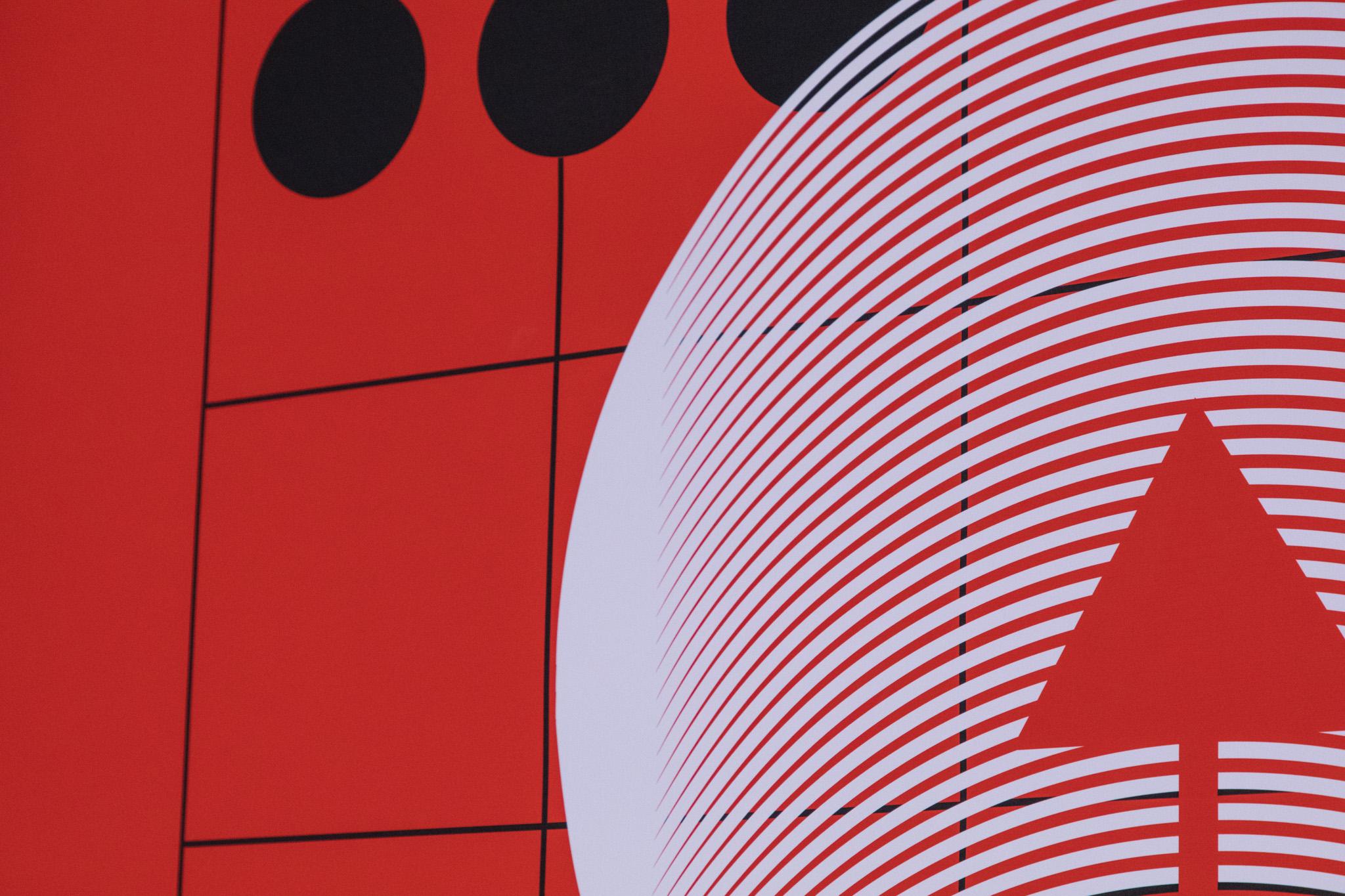
The wordmark stacks a solid iterate over a half-cut echo of itself — the logotype literally repeating and shifting, an iteration in the letterforms. Three red dots and a rising arrow act as supporting marks, drawn straight from the grid.
Colour
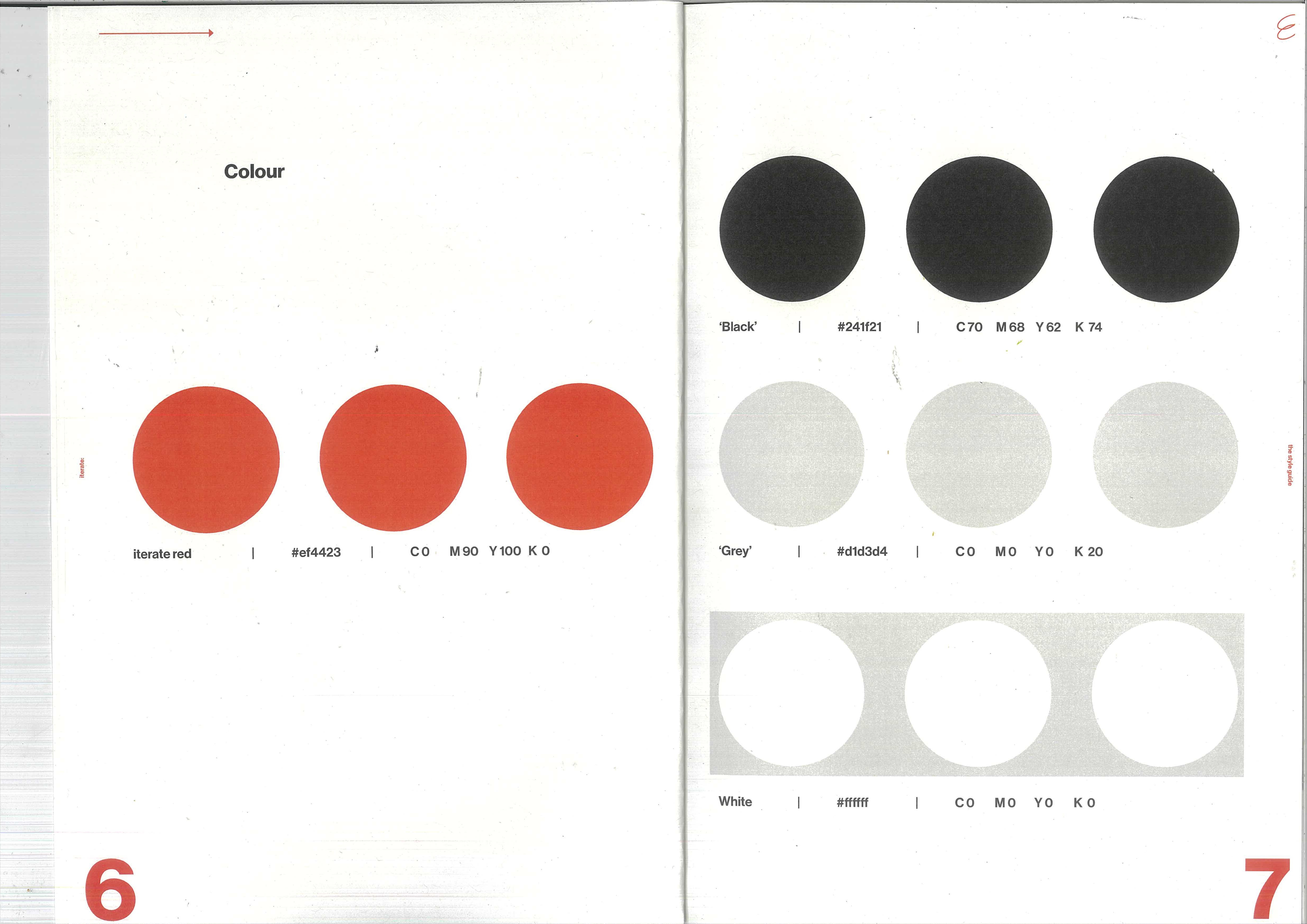
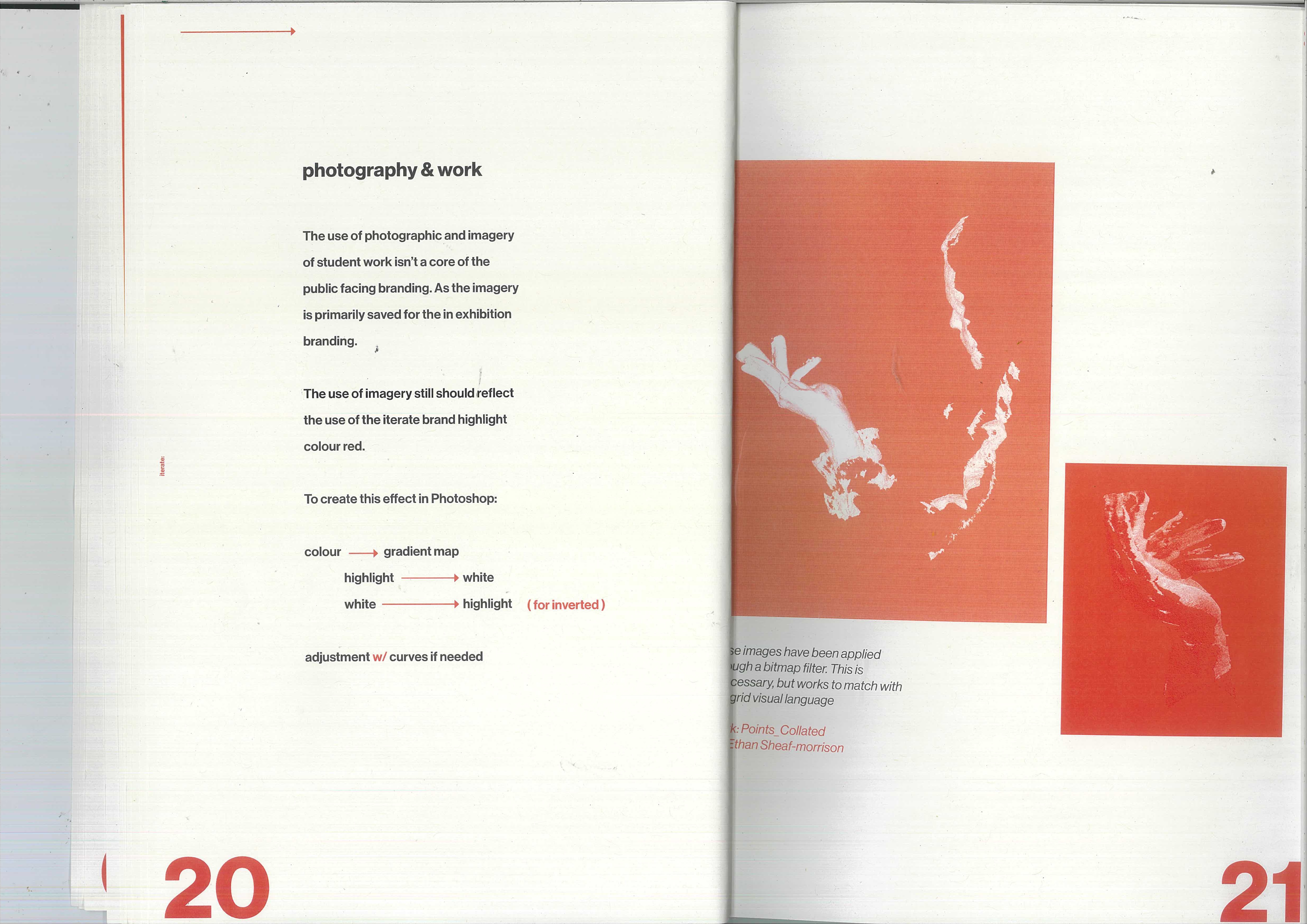
The palette is deliberately spare: a single vermilion red against black and off-white paper. Red is reserved for accents, marks, and moments of emphasis; black carries the type; the grid does the rest. The restraint keeps 30-plus distinct research projects from competing, and makes the red read instantly as Iterate.
Typeface
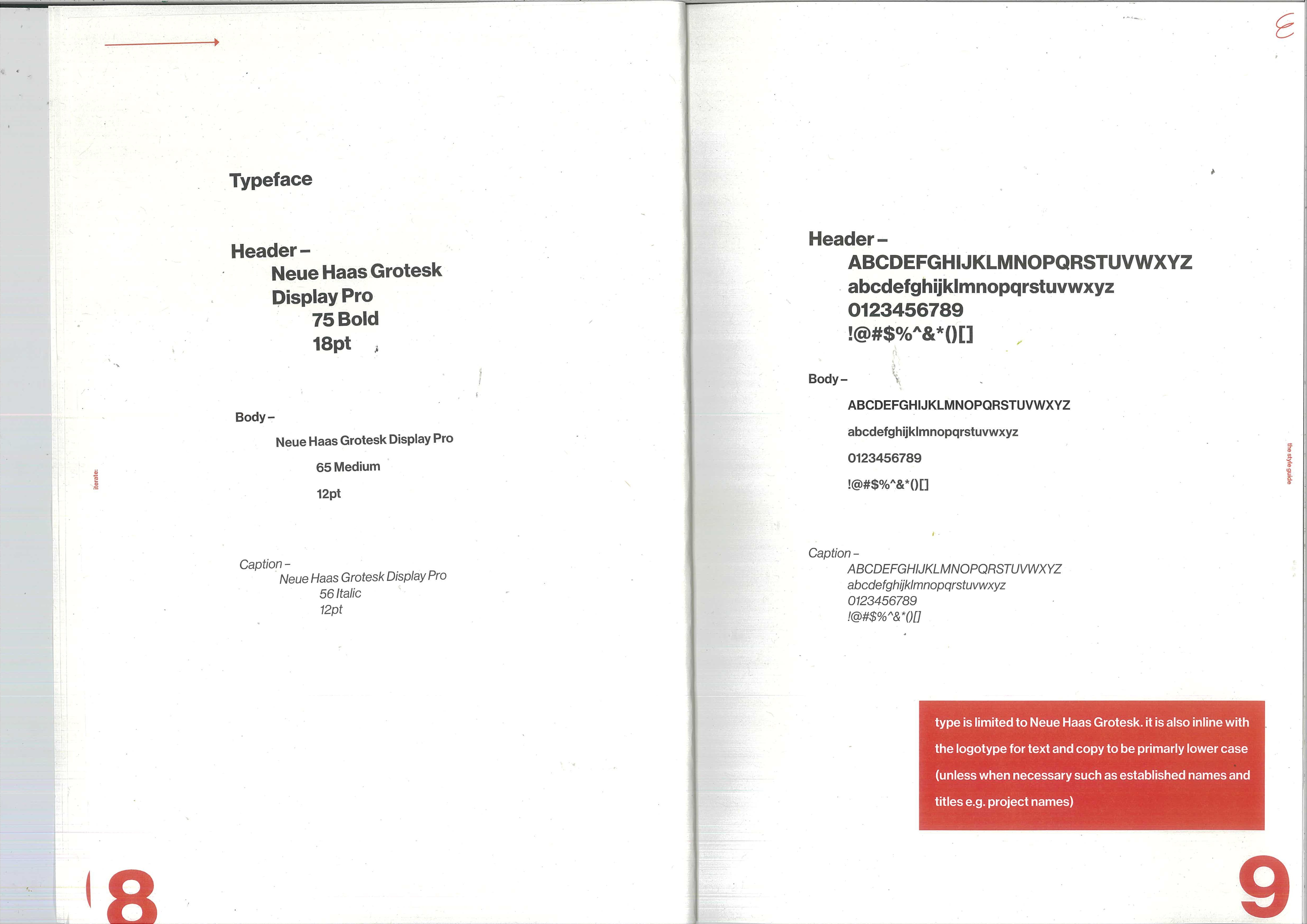
Type is limited to Neue Haas Grotesk Display Pro — Bold for headers, Medium for body, Italic for captions — set primarily in lower case to stay inline with the logotype. The Swiss neo-grotesk lineage anchors the whole system: tight, neutral, and built for the grid.
Imagery & Grid
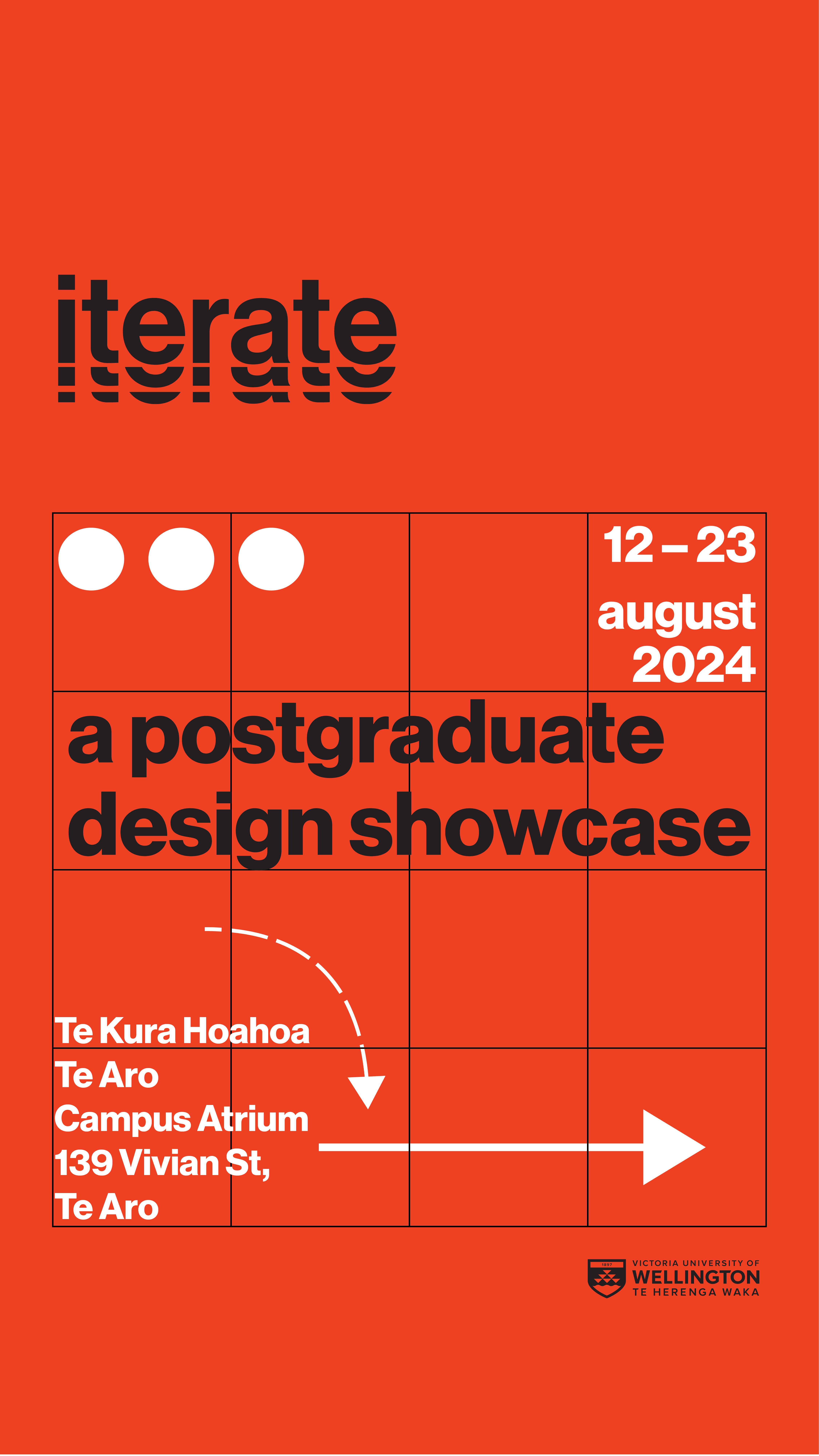
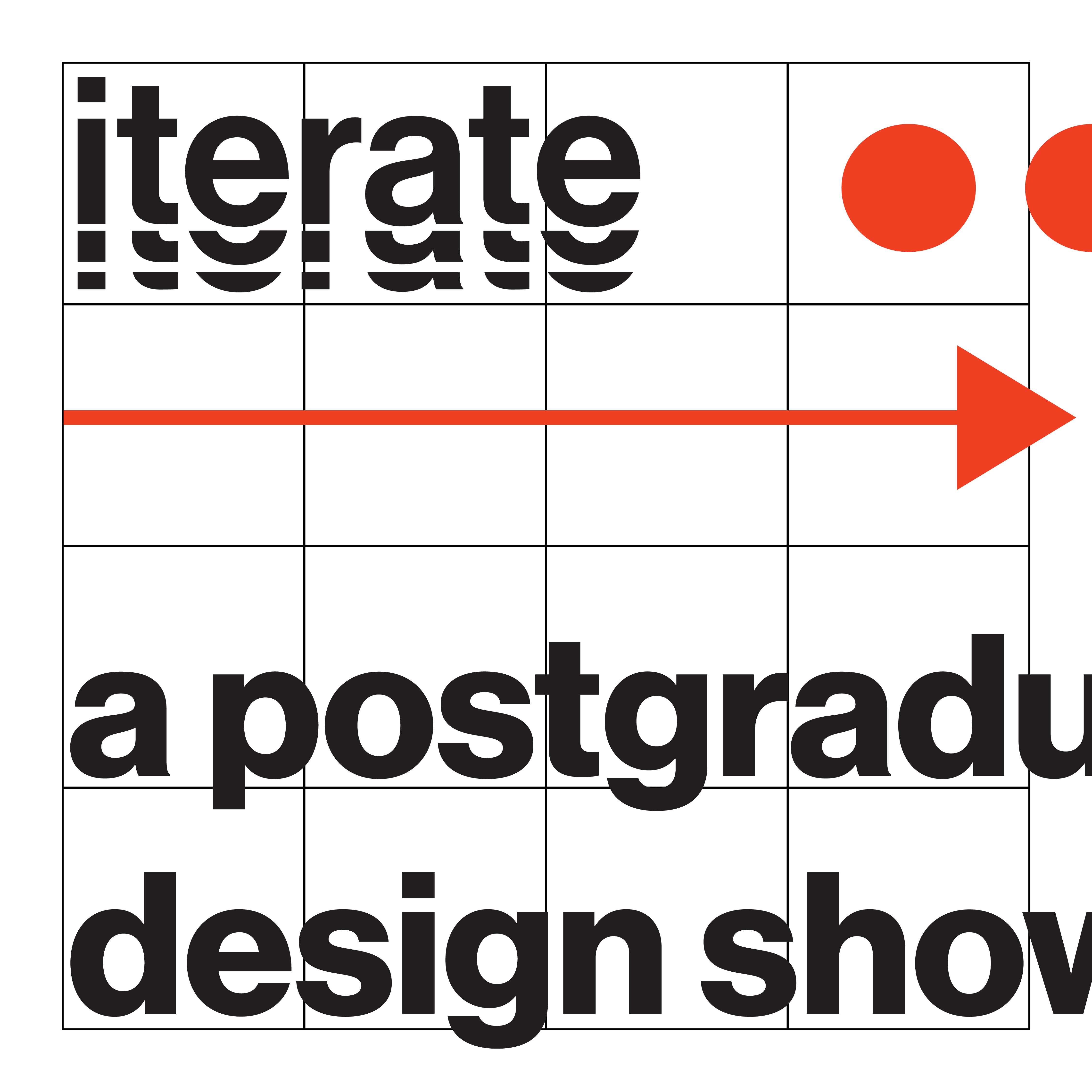
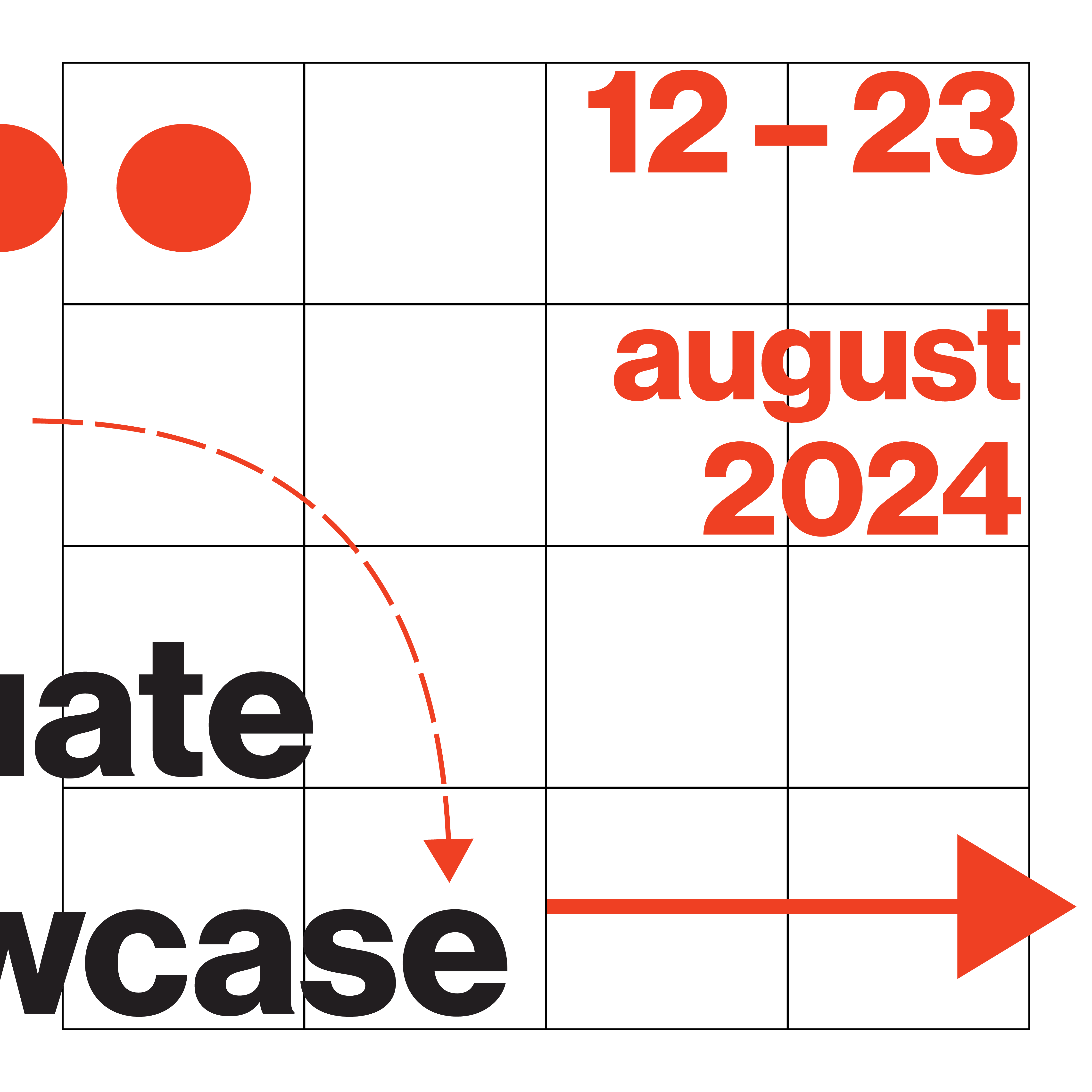
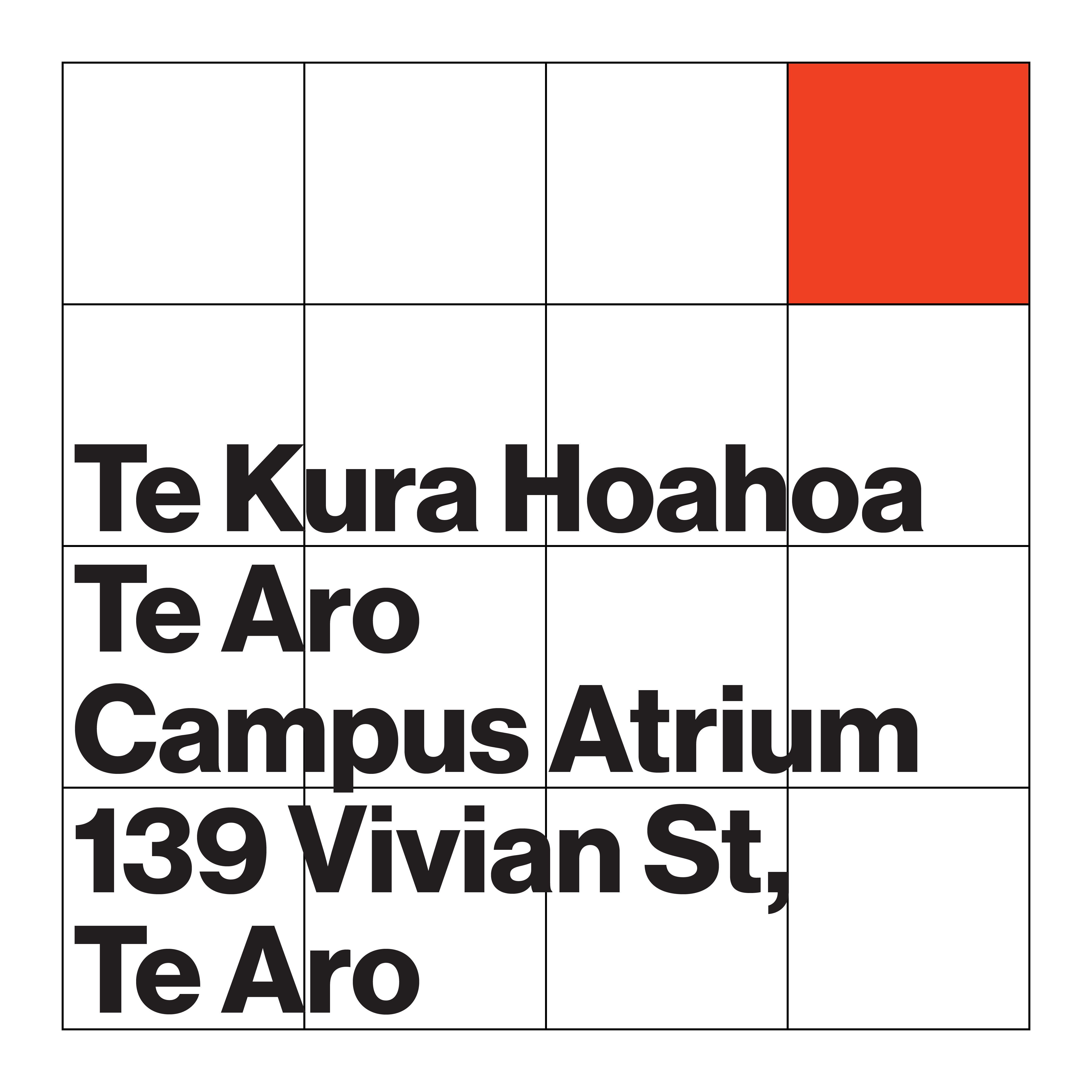
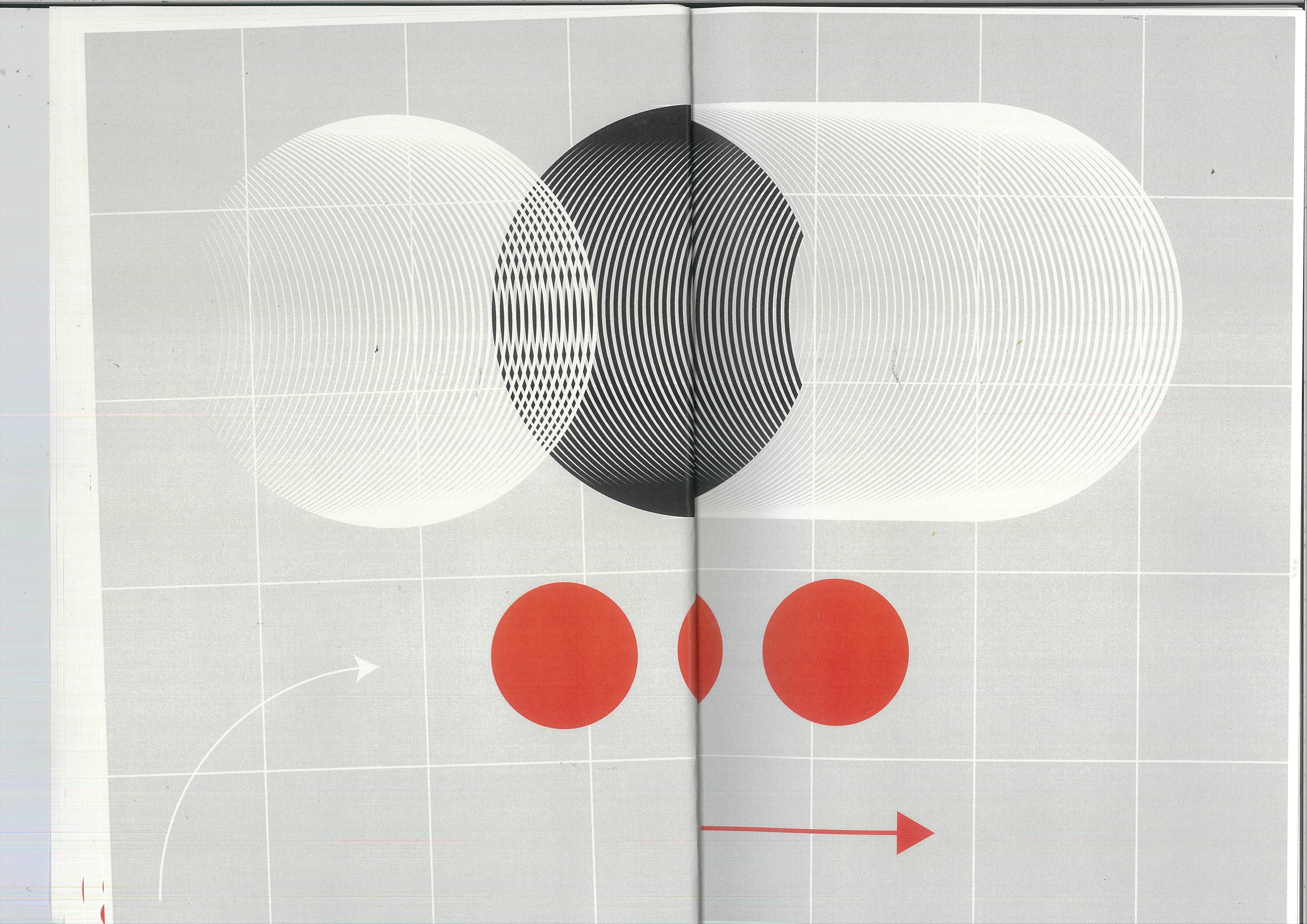
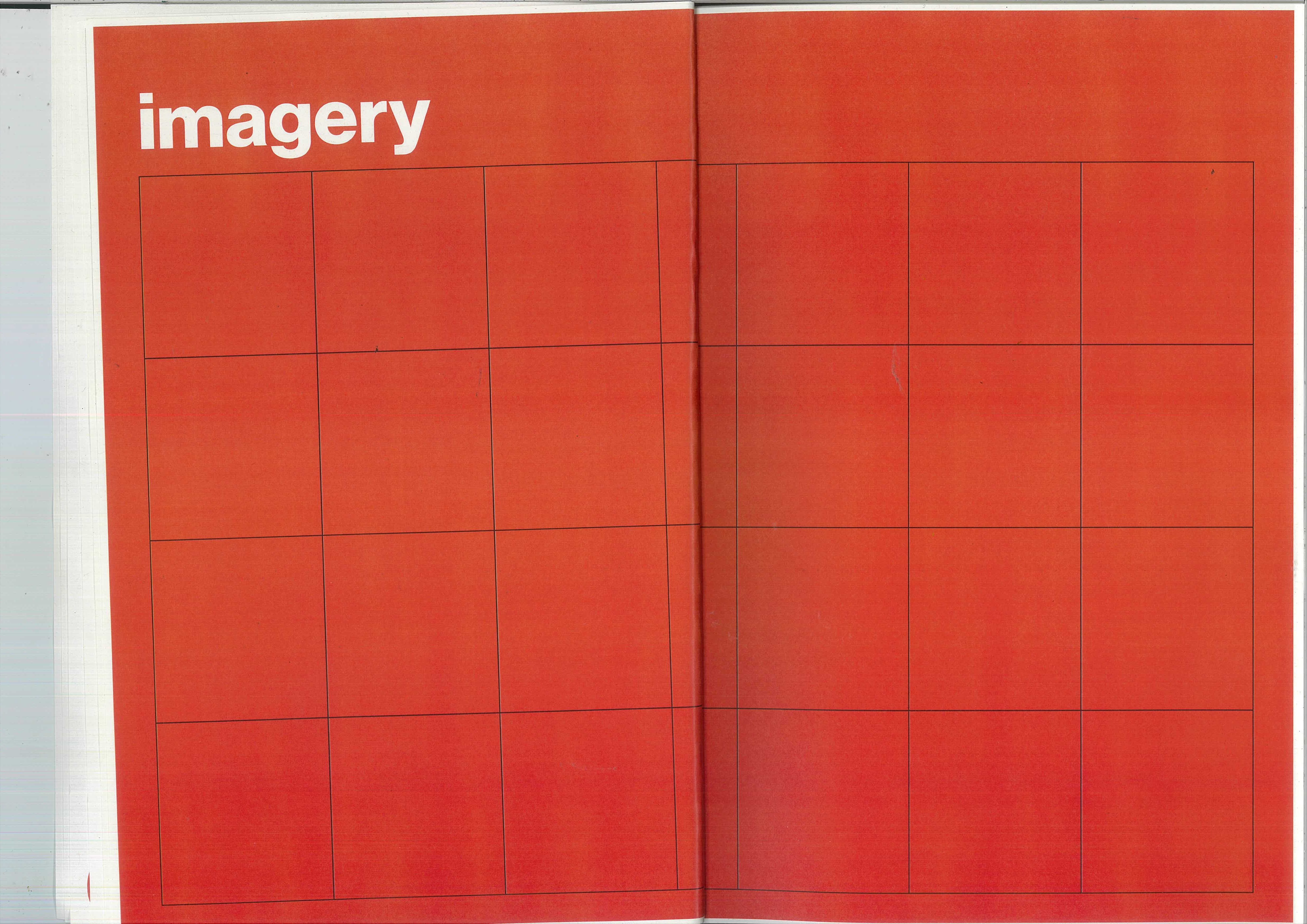
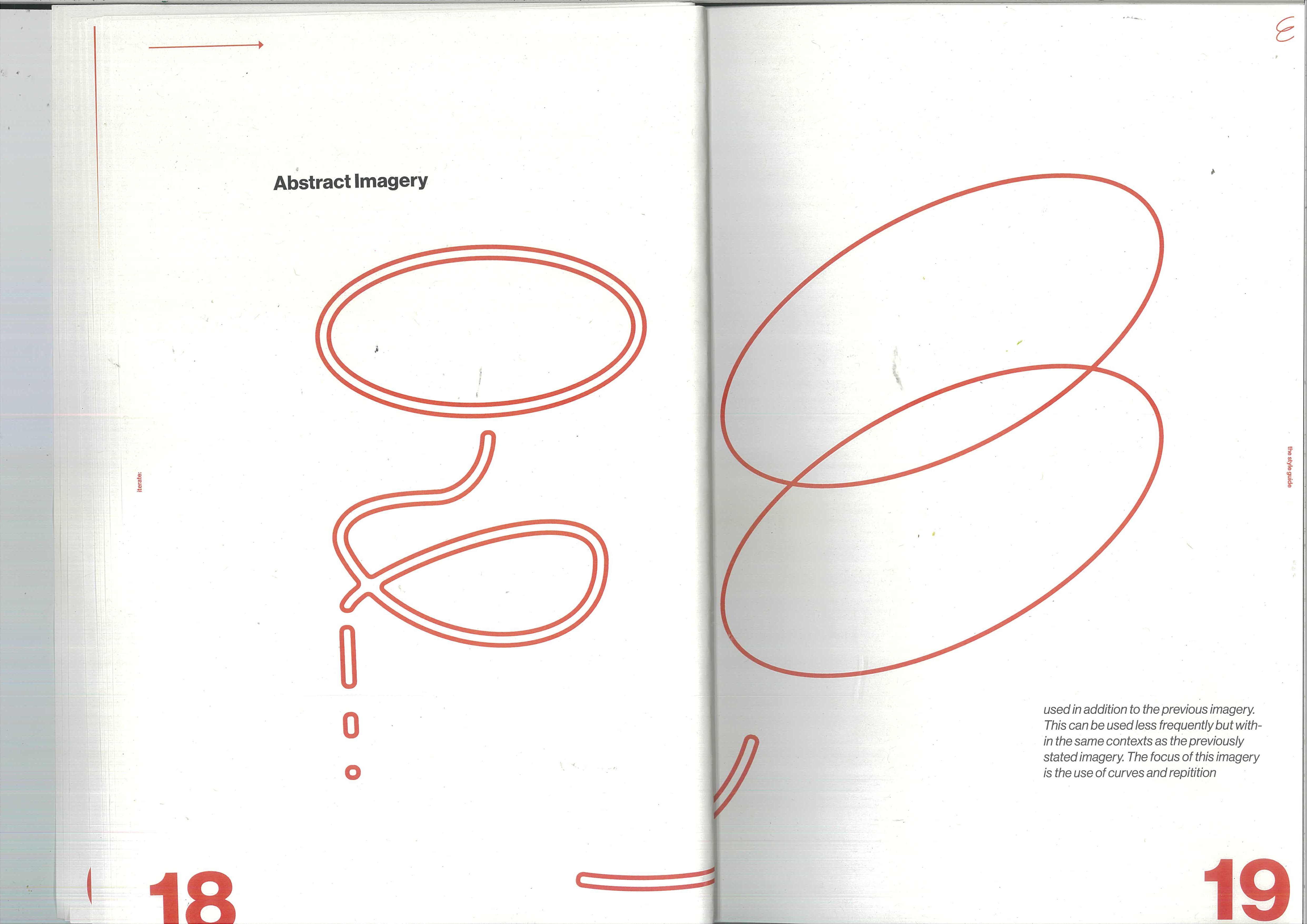
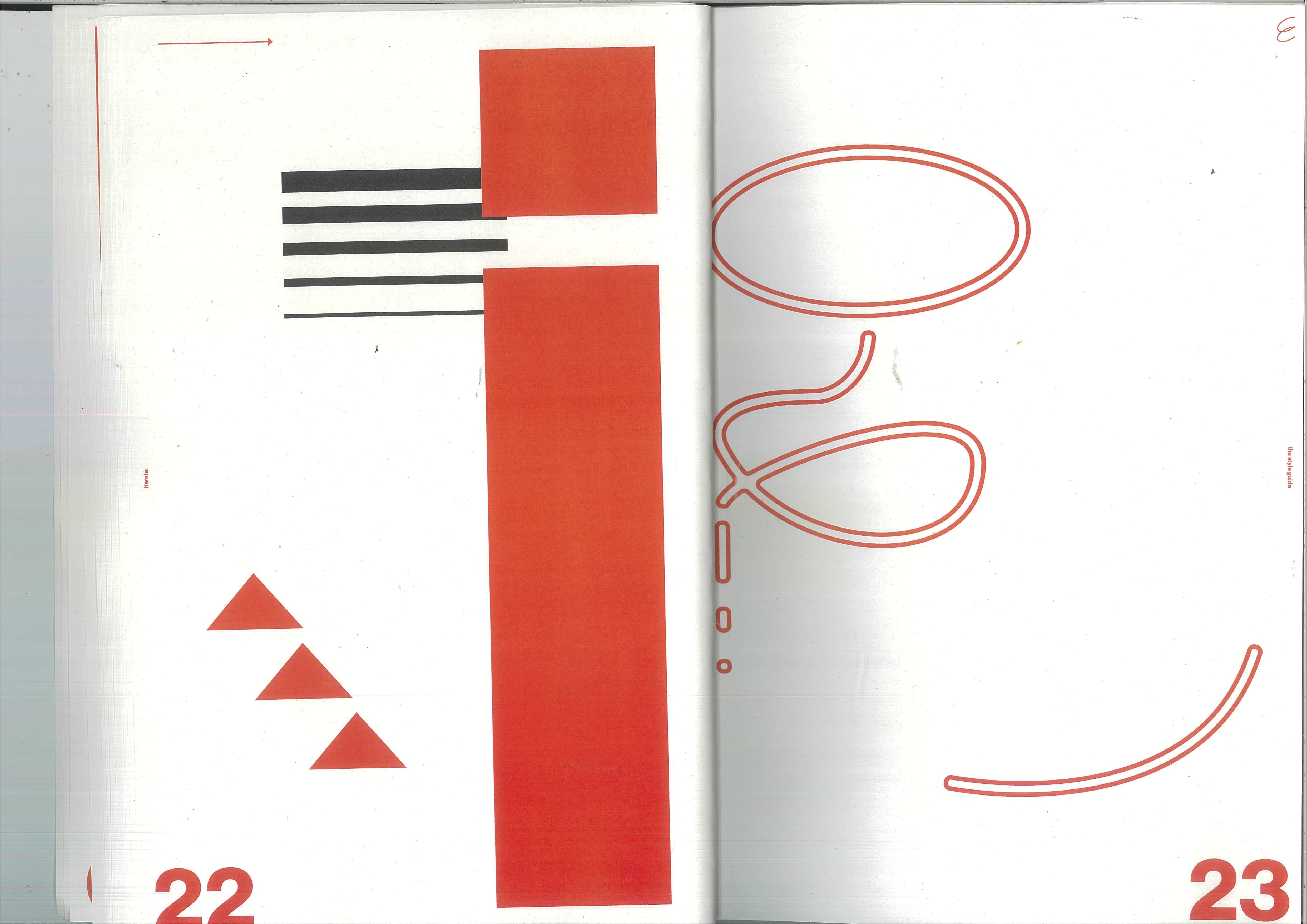
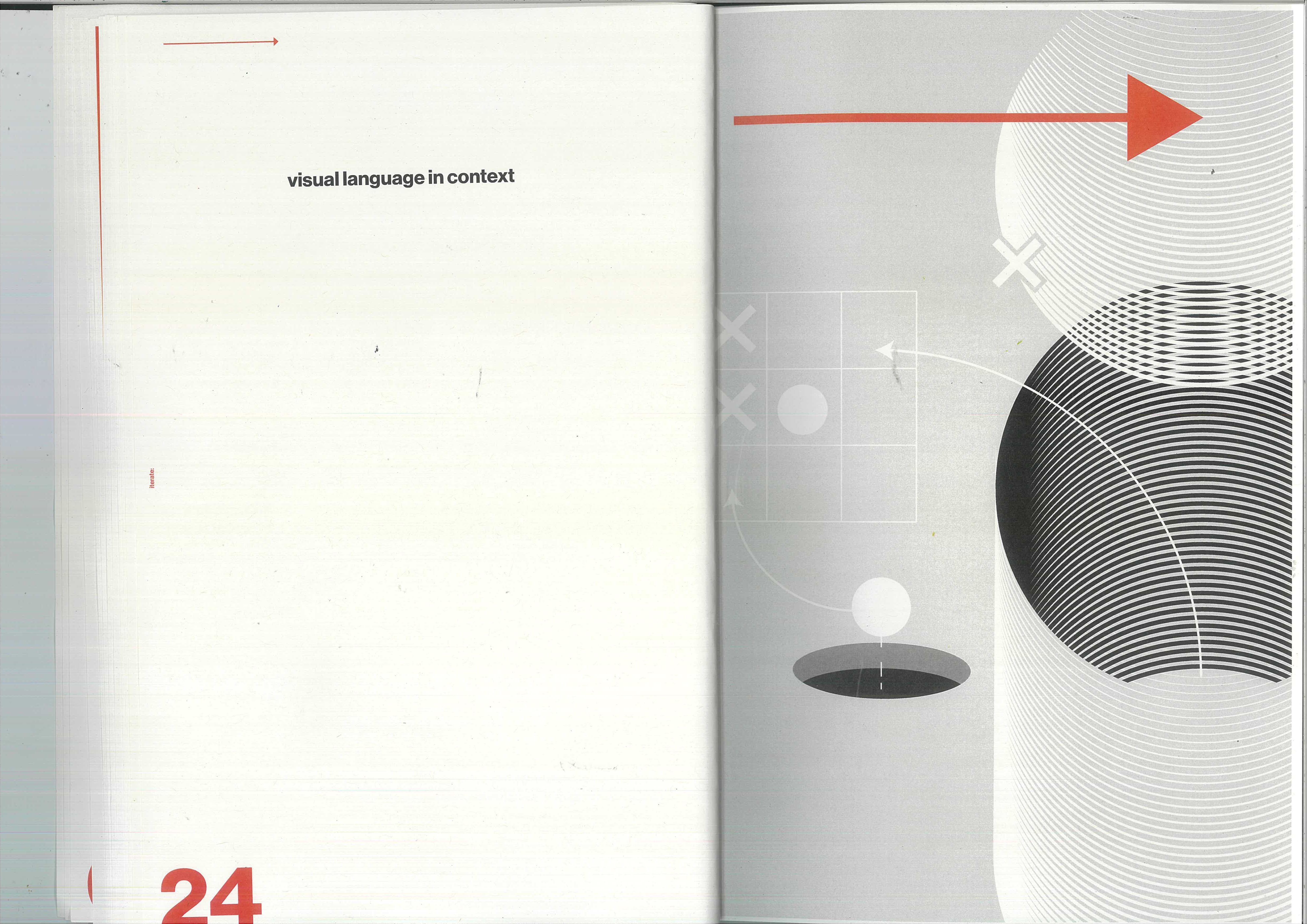
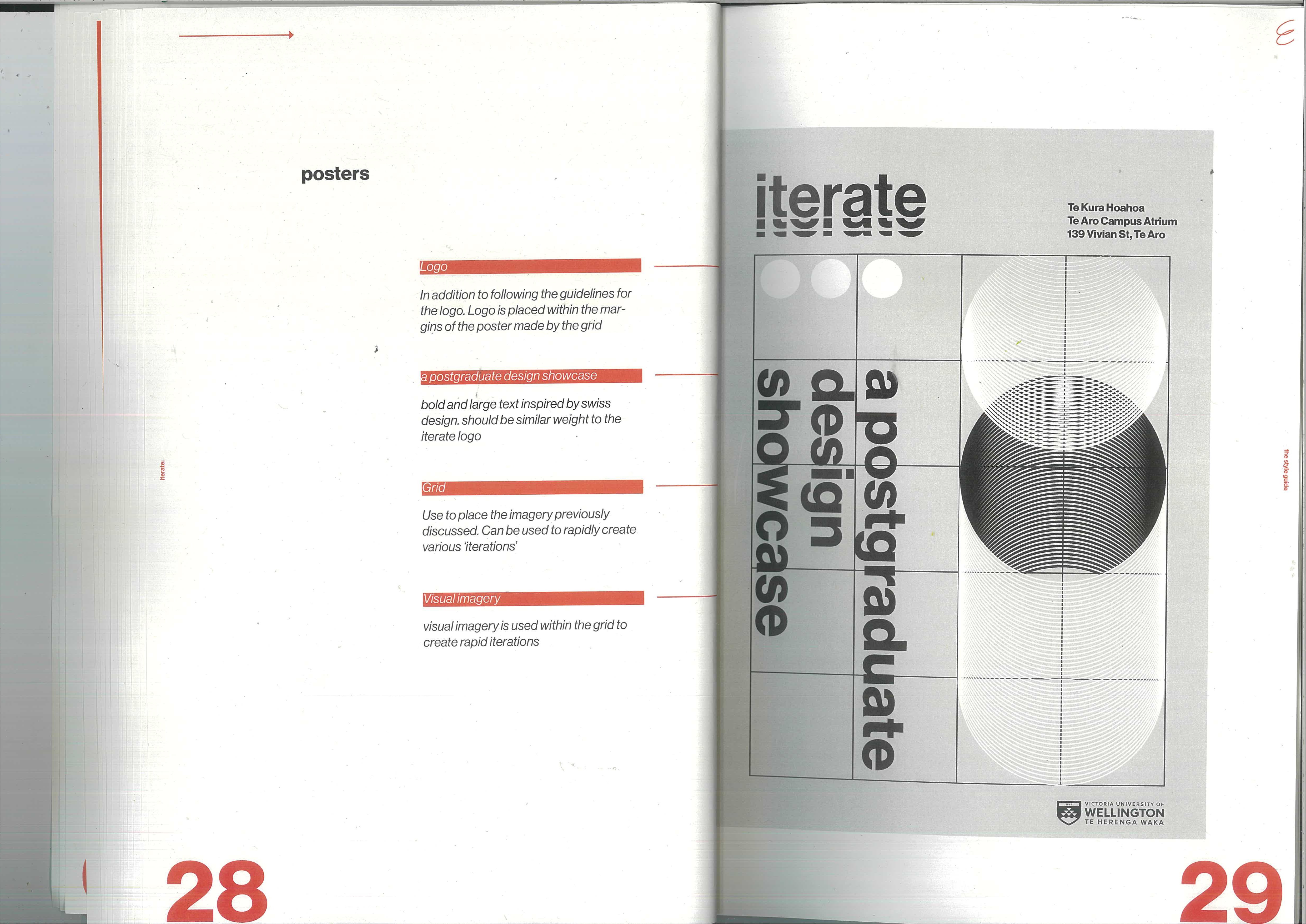
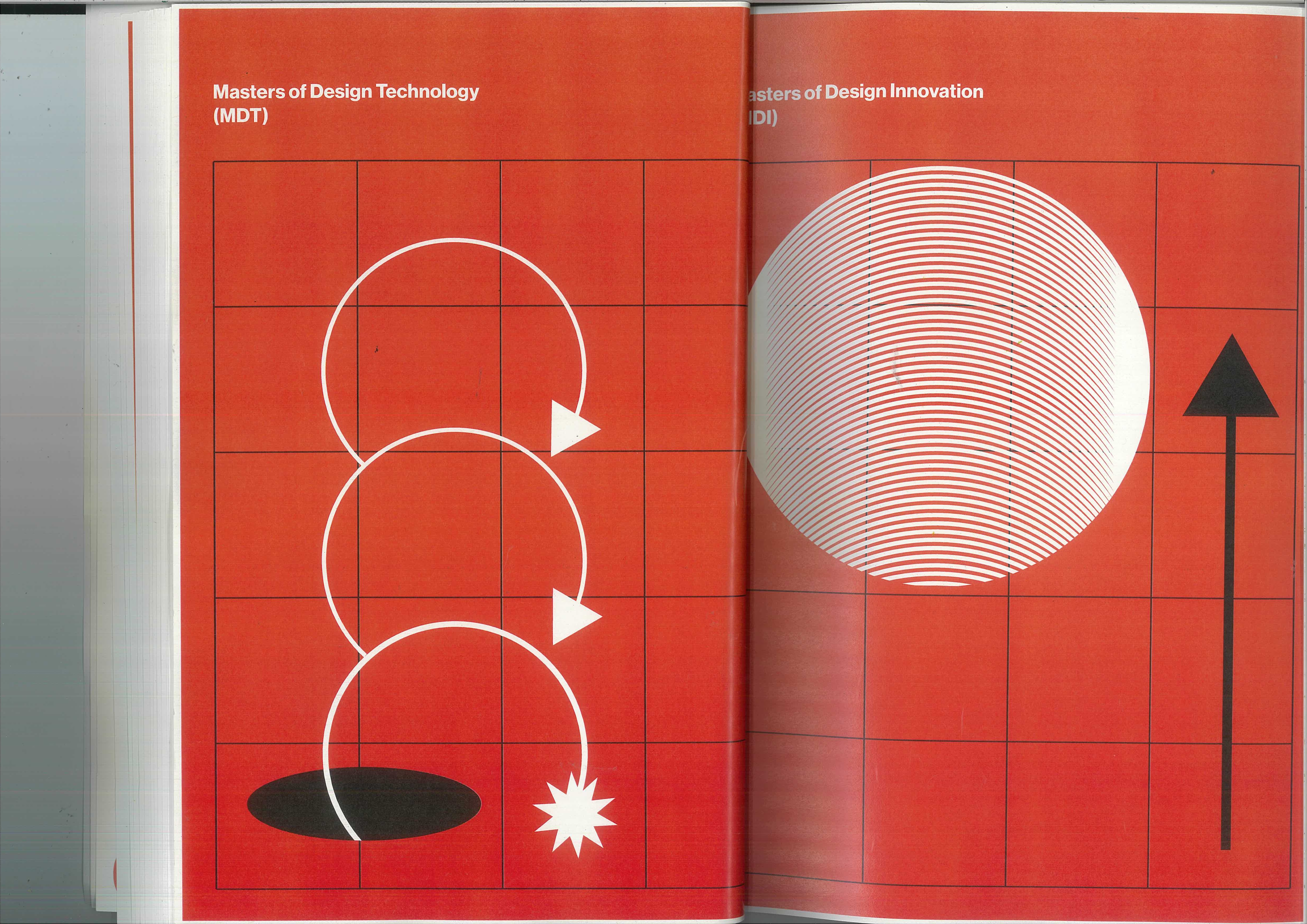
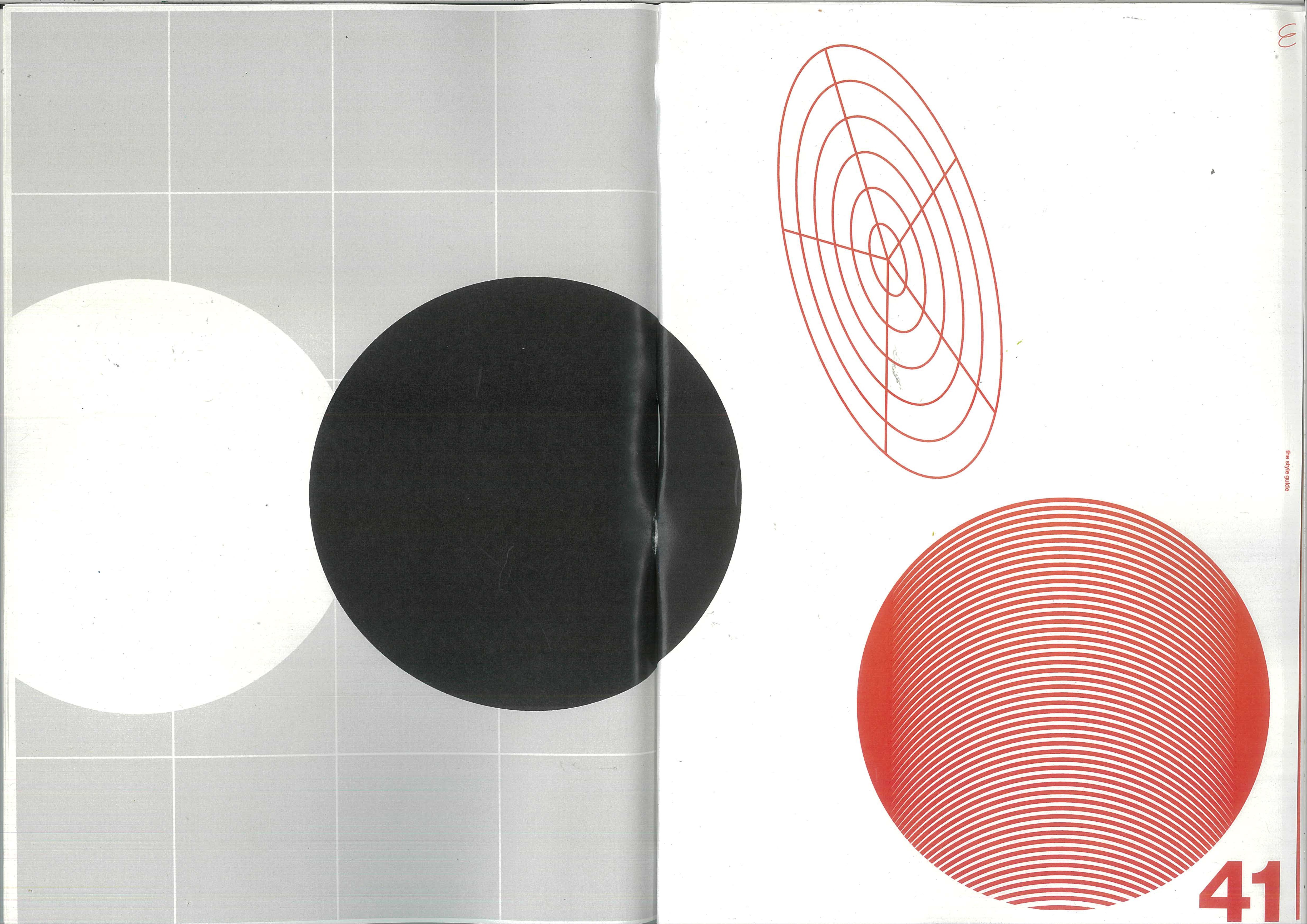
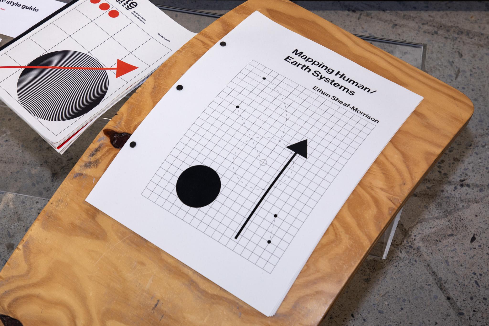
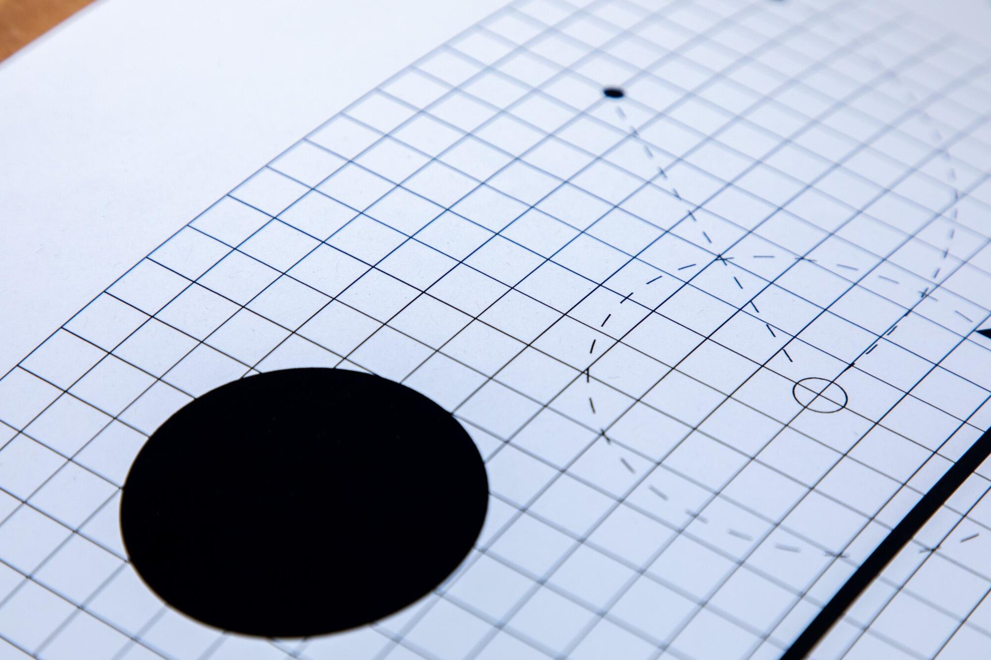
Every layout is built on the same modular grid, and the imagery grows out of it — abstract line work, concentric curves, and halftone spheres that read as iterations of a single form. The studies below pan across that system: grid, mark, and abstract figure recombining as the eye moves.
Applications
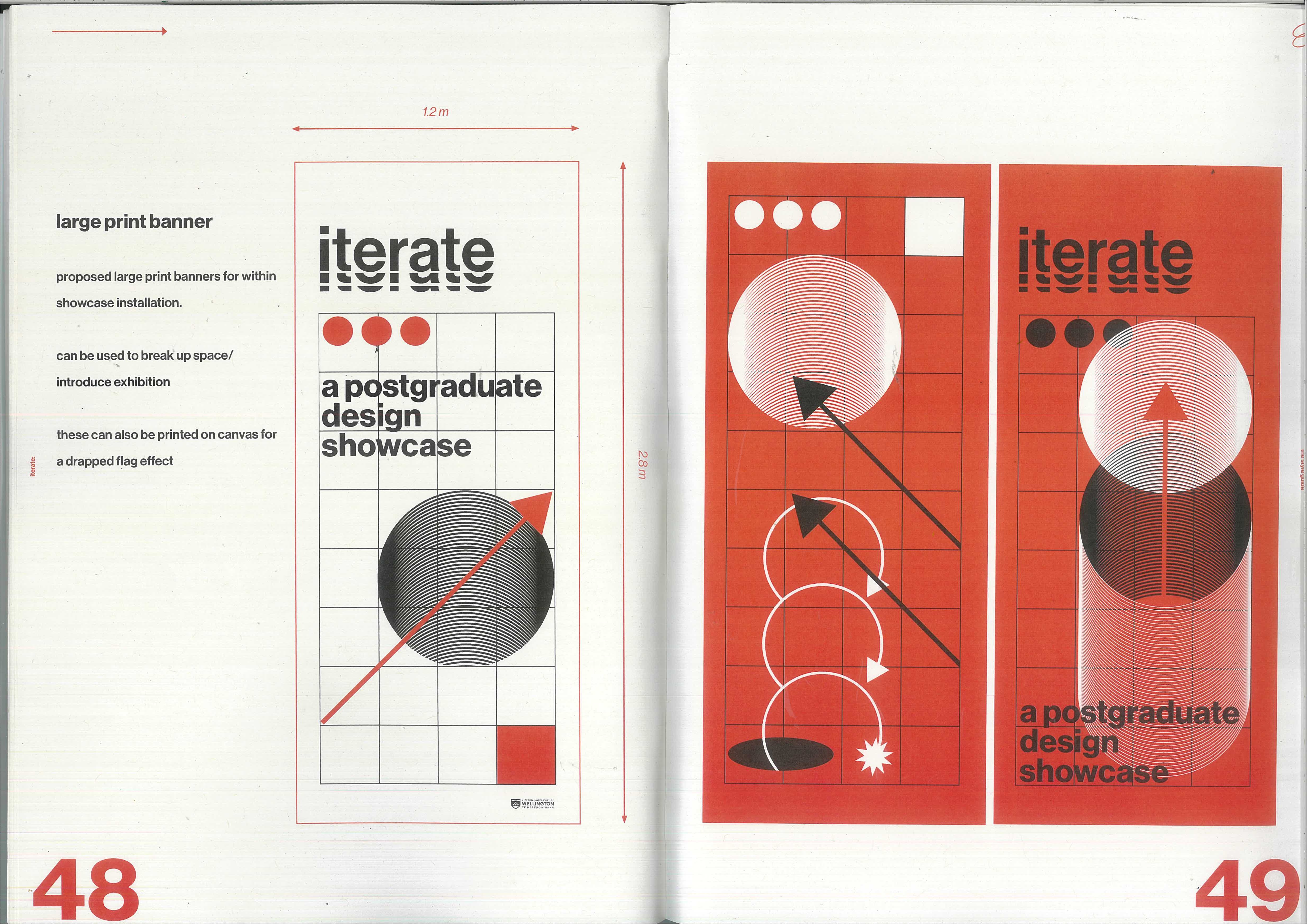
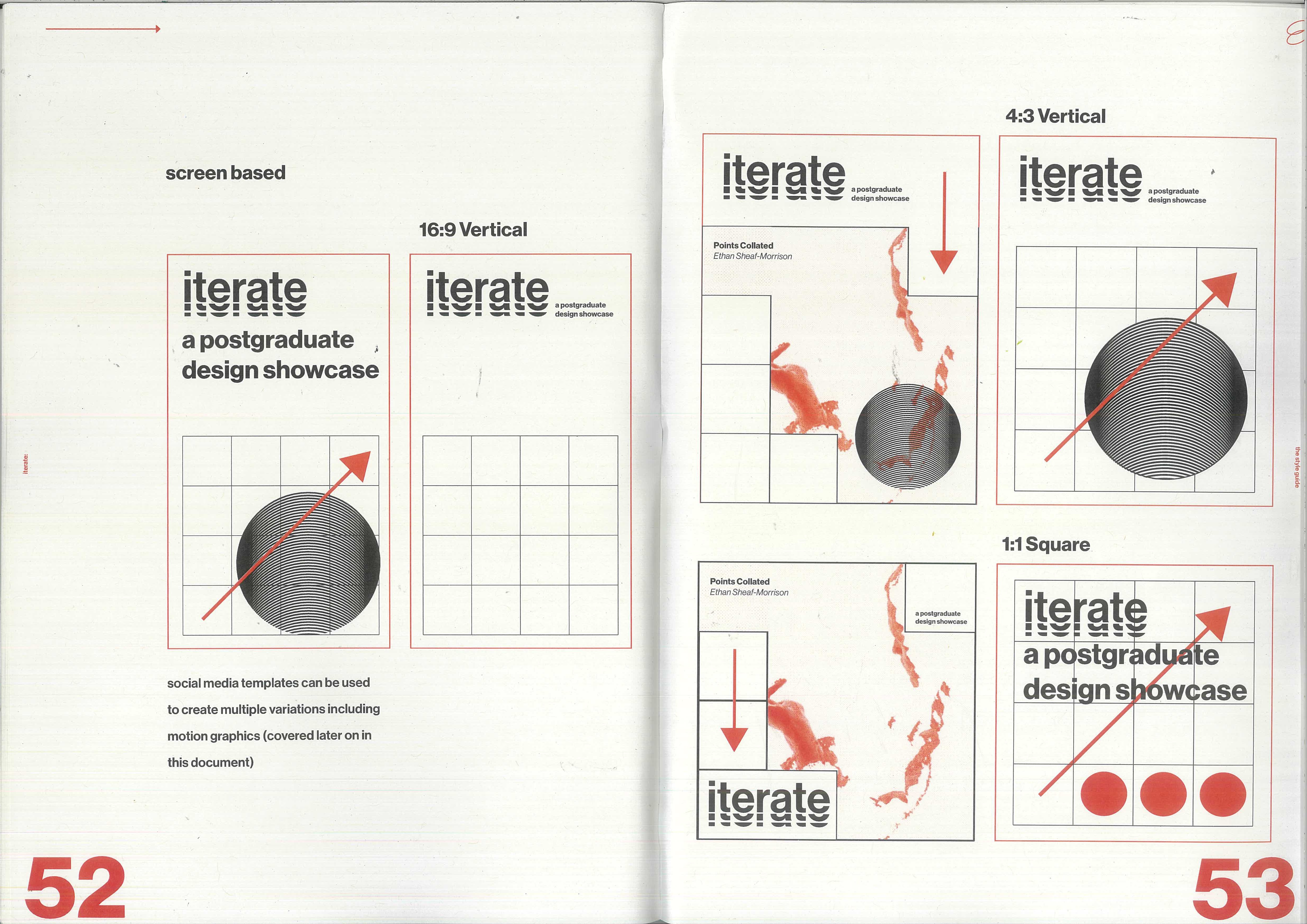
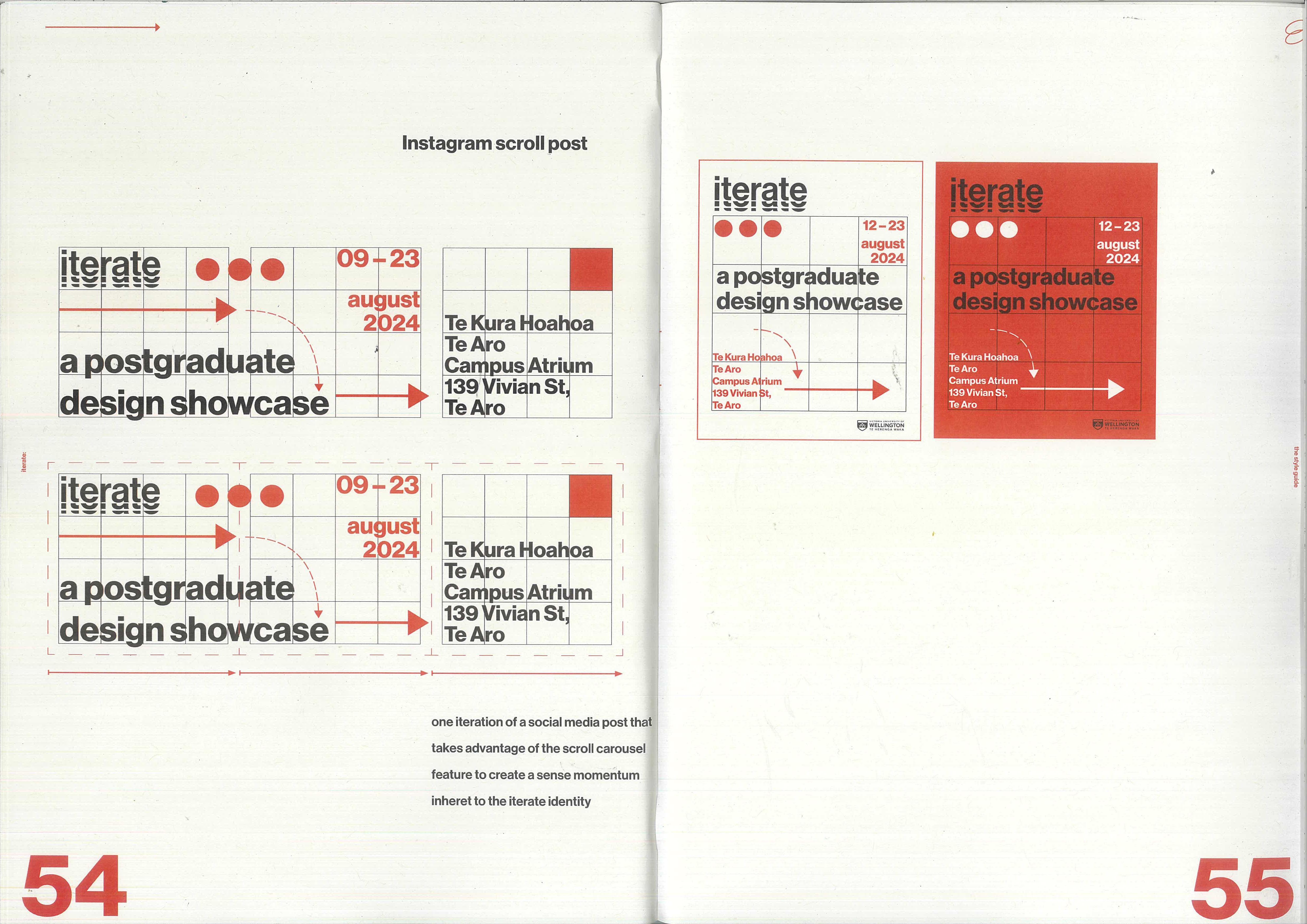
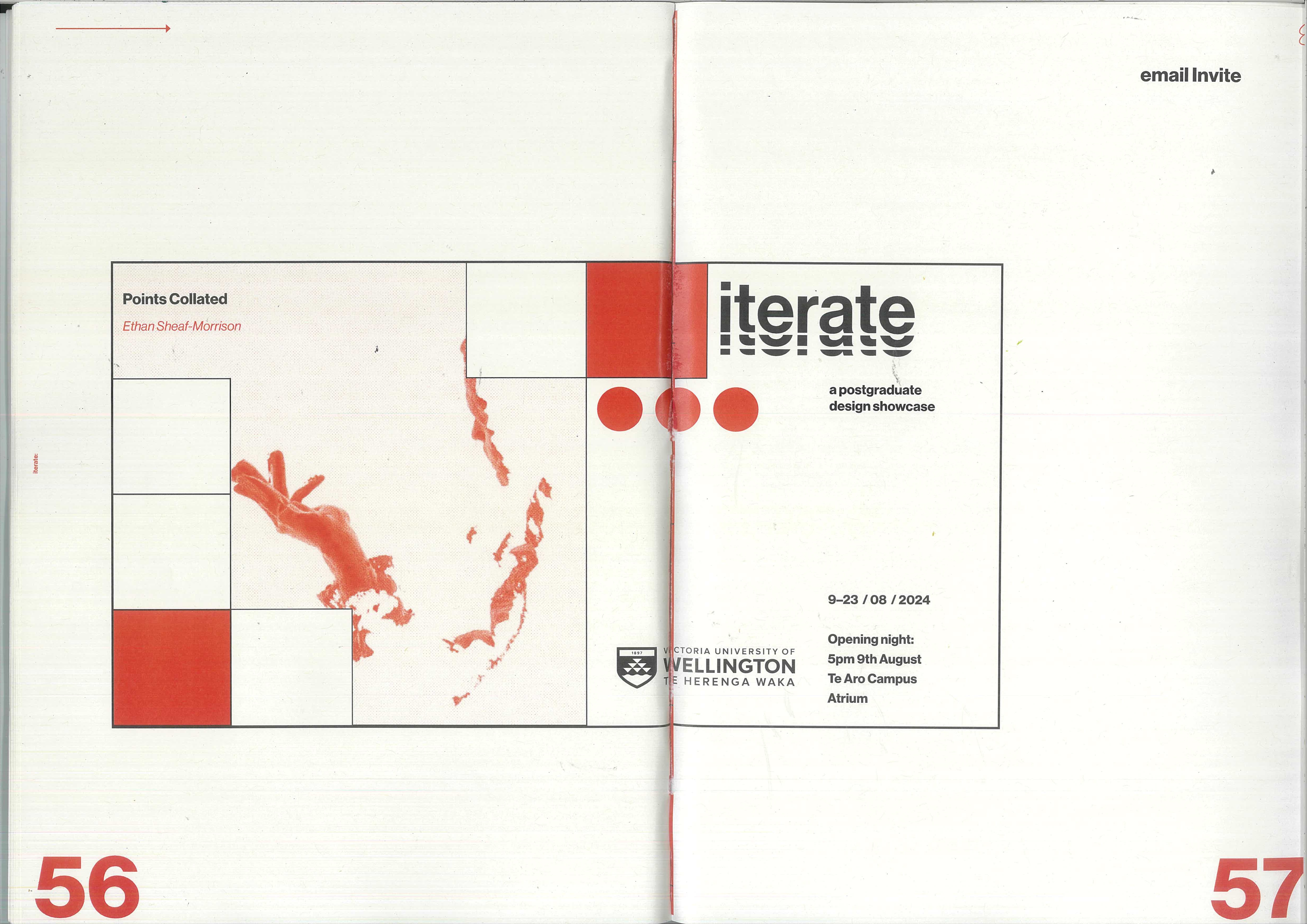
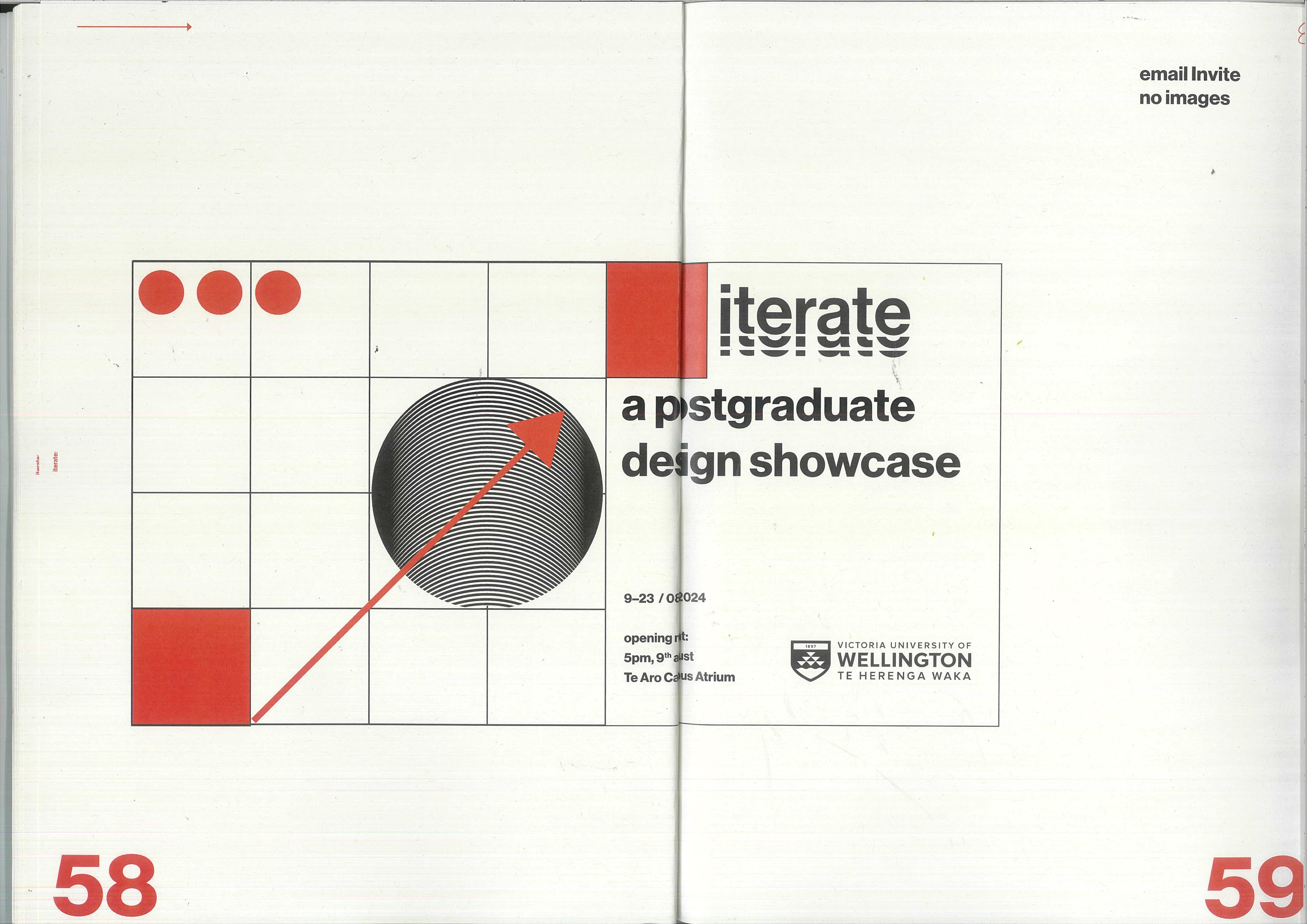
The system was designed to travel: from large-format posters and campus banners to square social cards and a motion graphic. Each application is another pass over the same grid and marks.
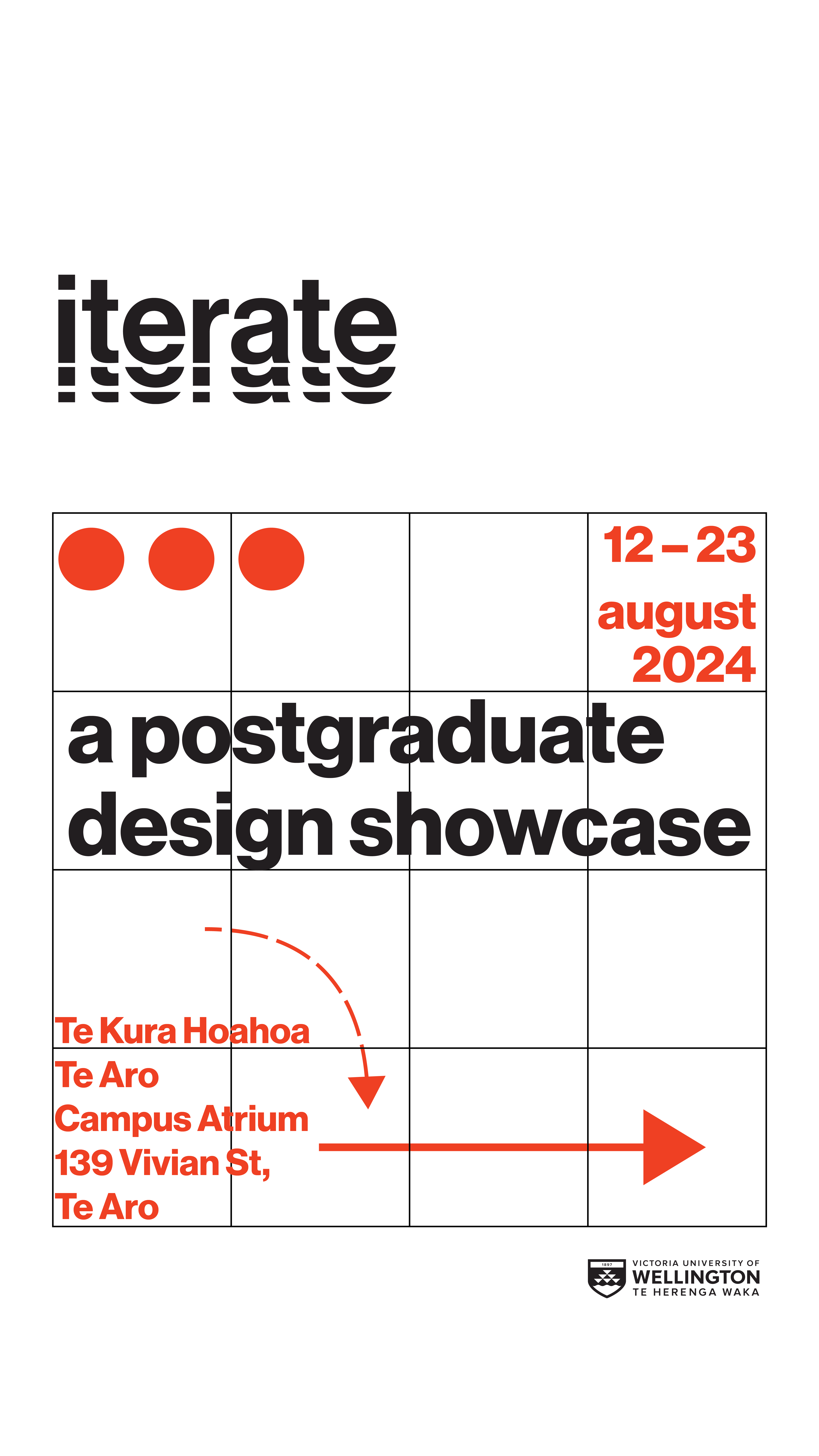
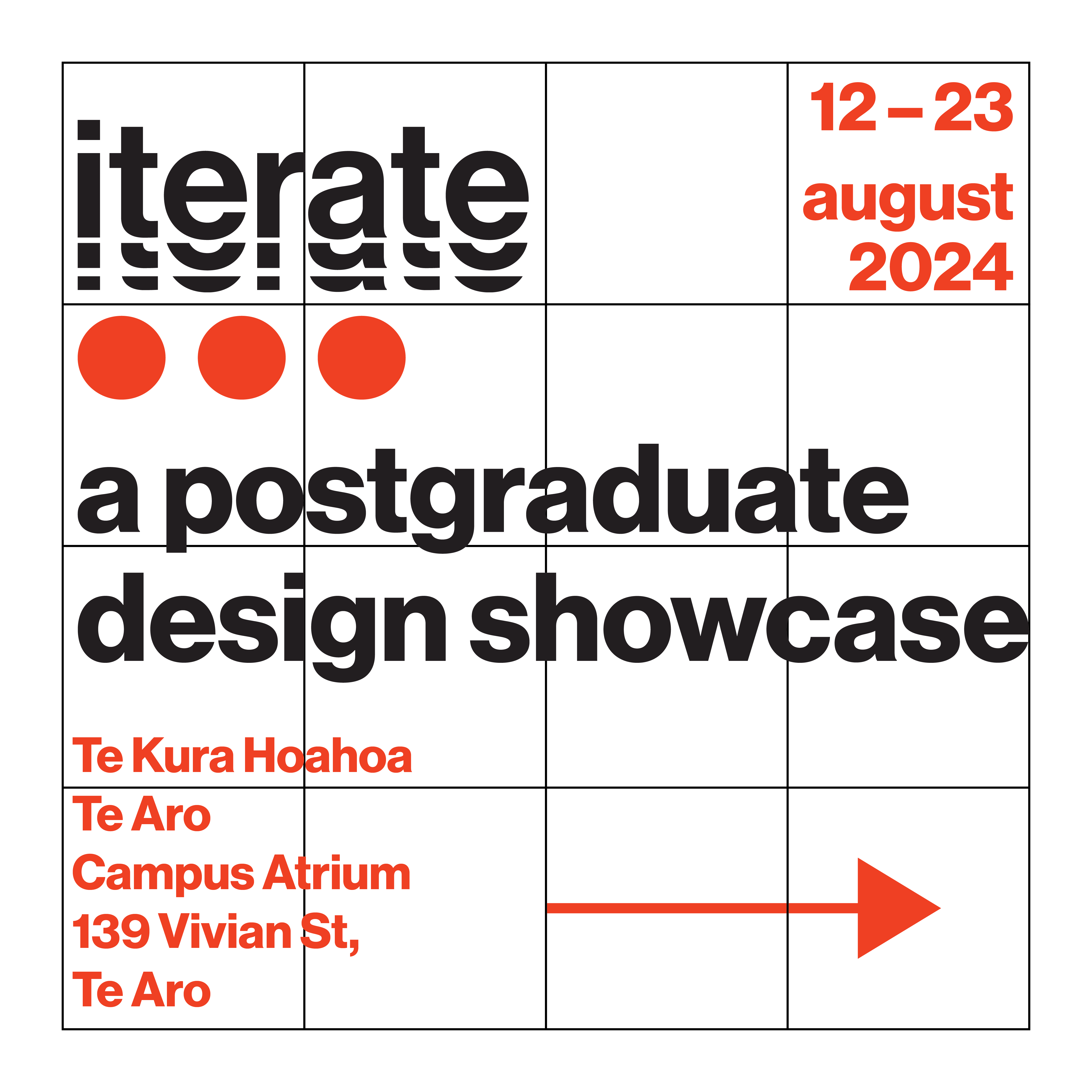
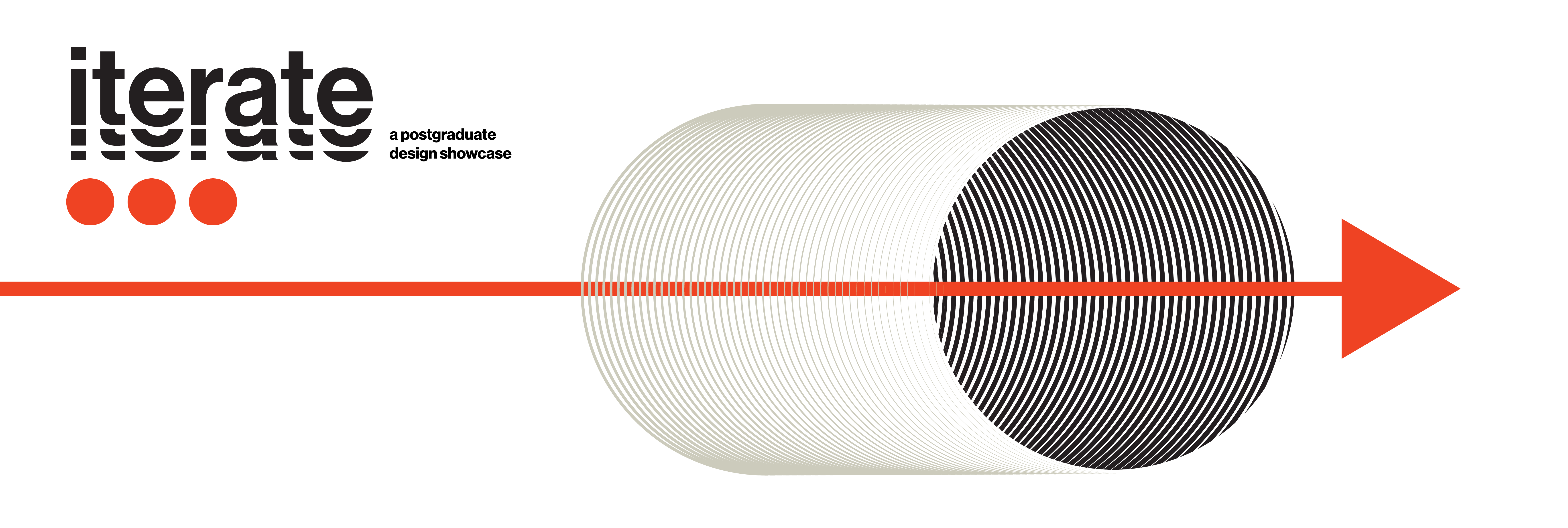
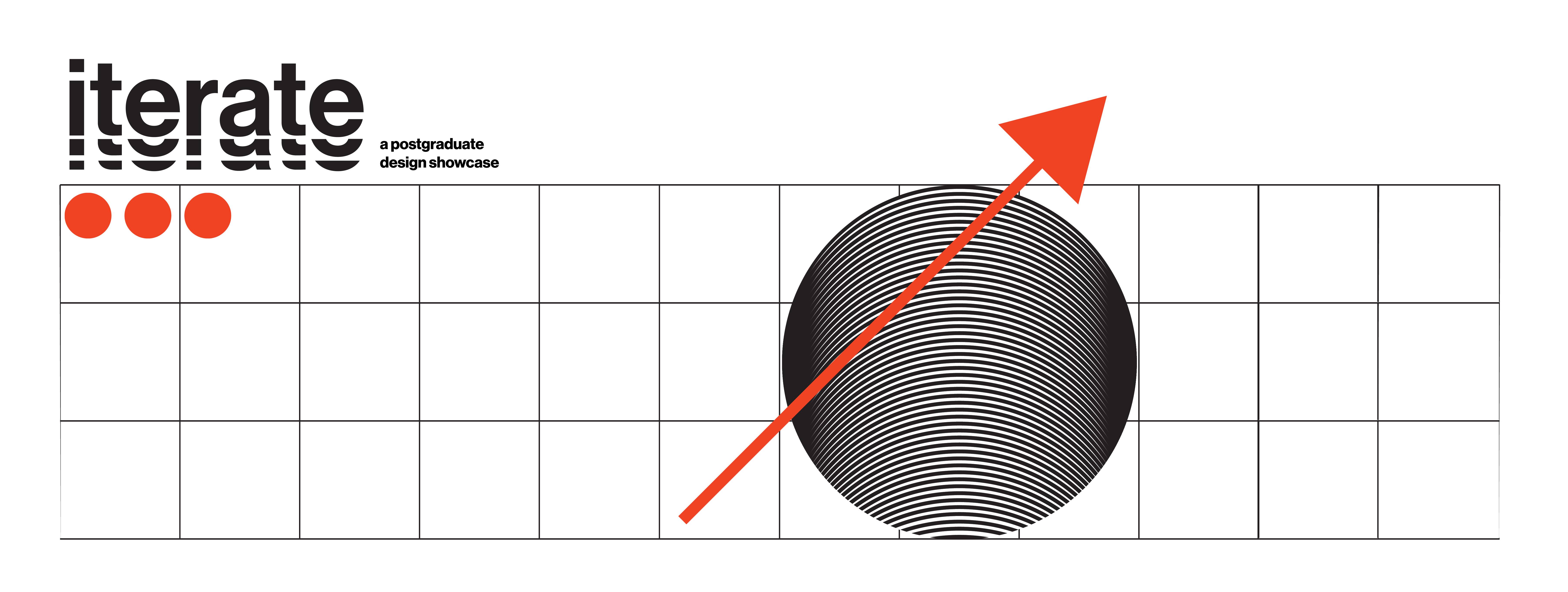
A short motion graphic extends the identity into screen — the grid drawing itself in, dots and arrow animating along it.
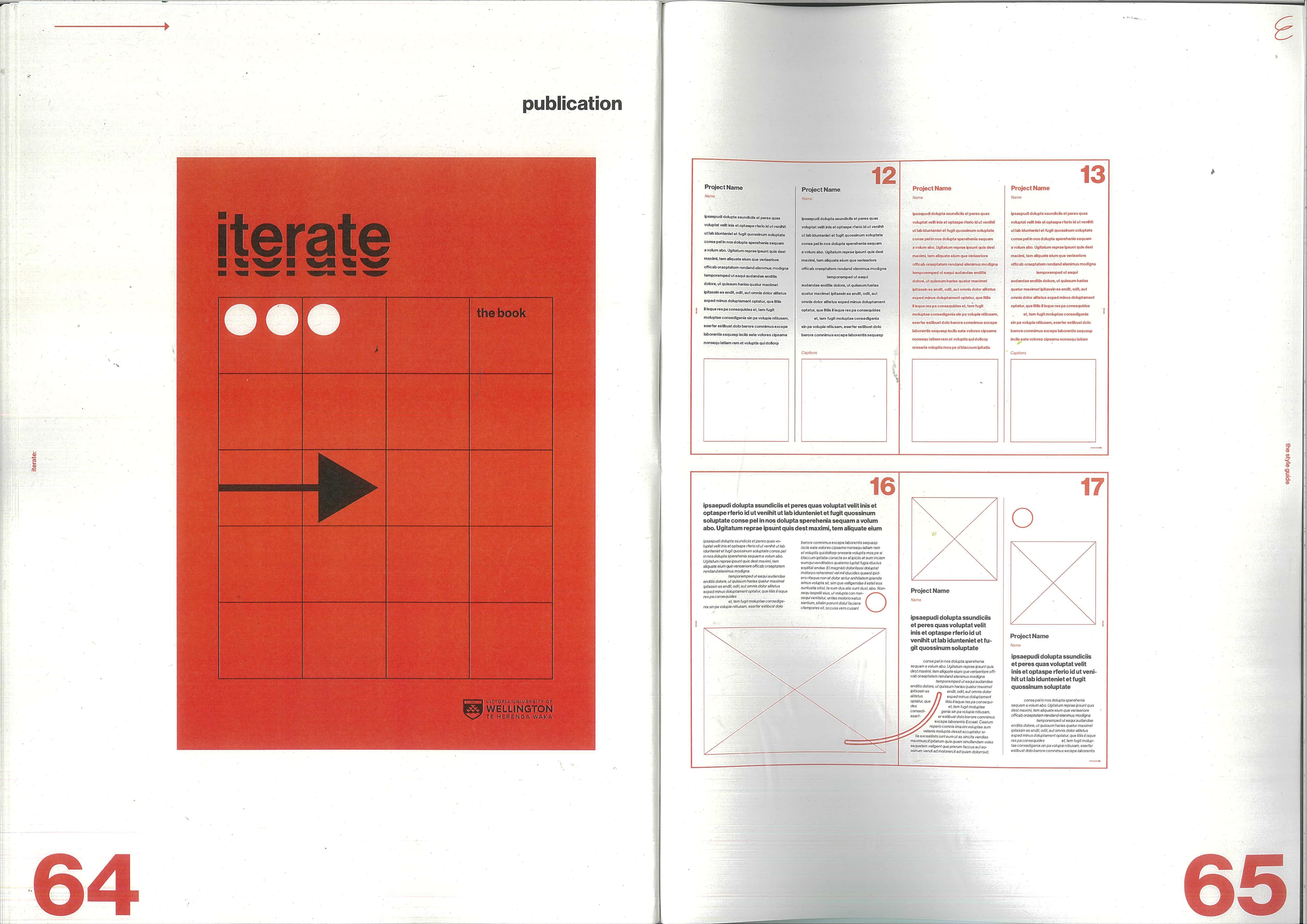
The printed publication gathered the cohort’s work into a 44-page catalogue, threaded saddle-stitch.
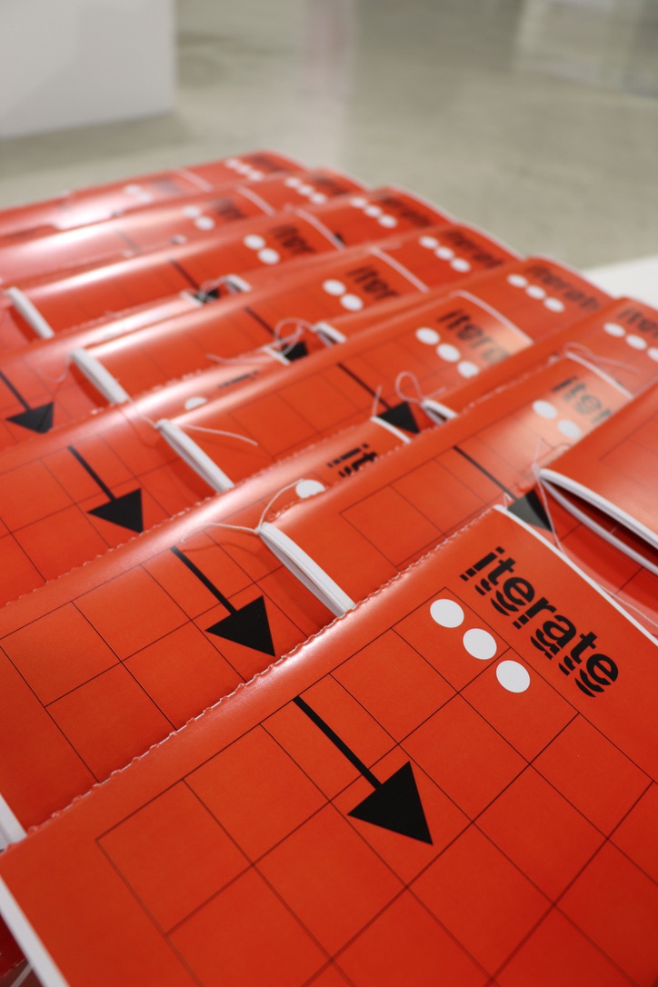
The Style Guide
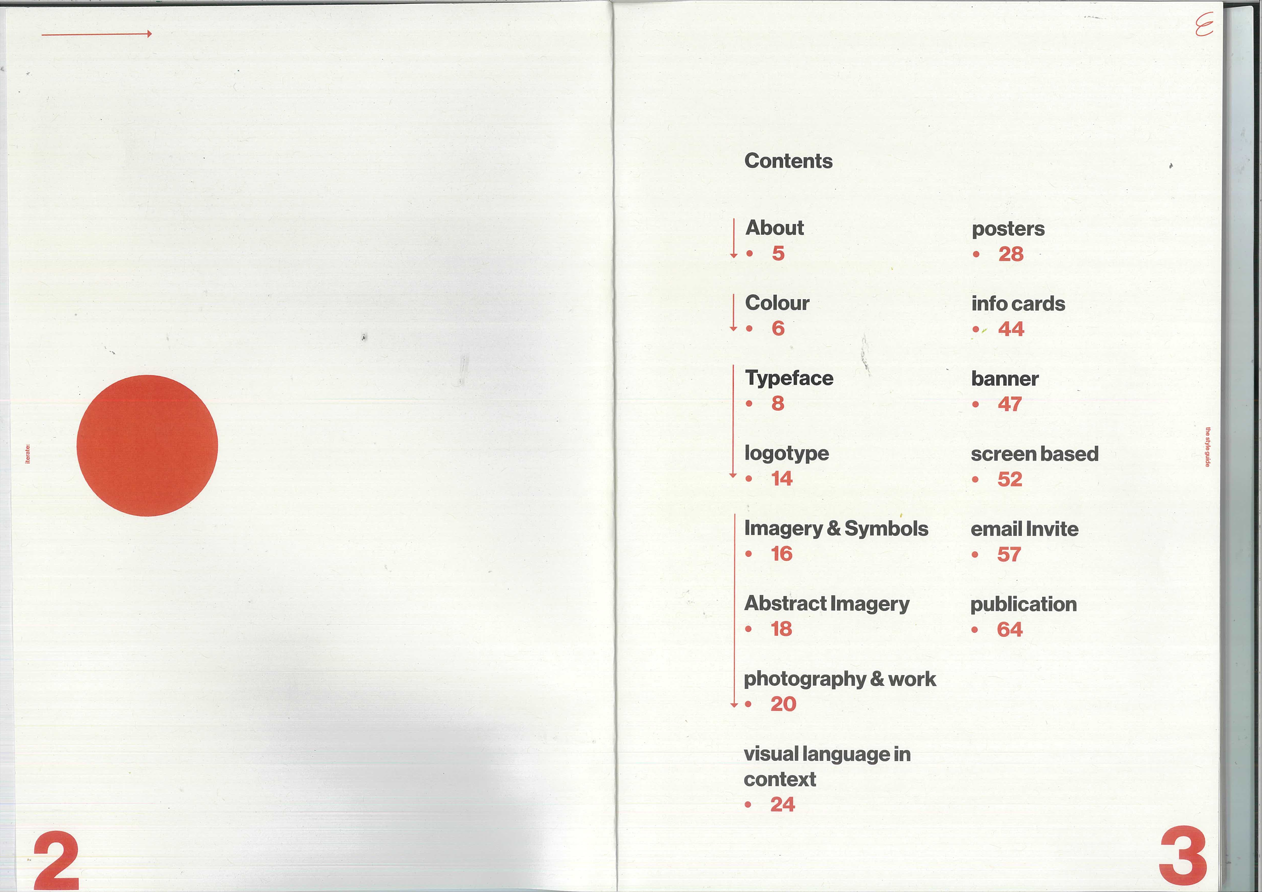
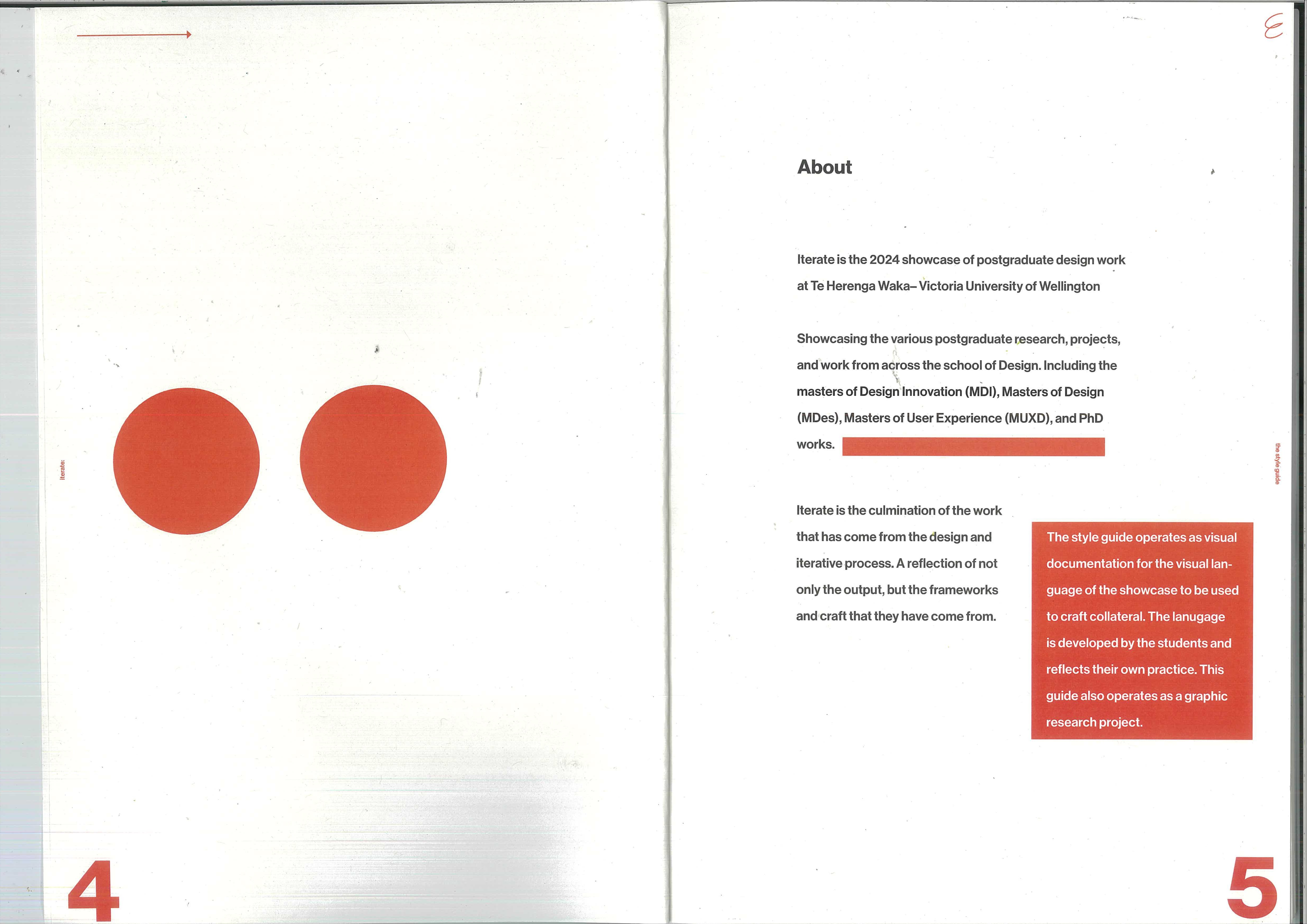
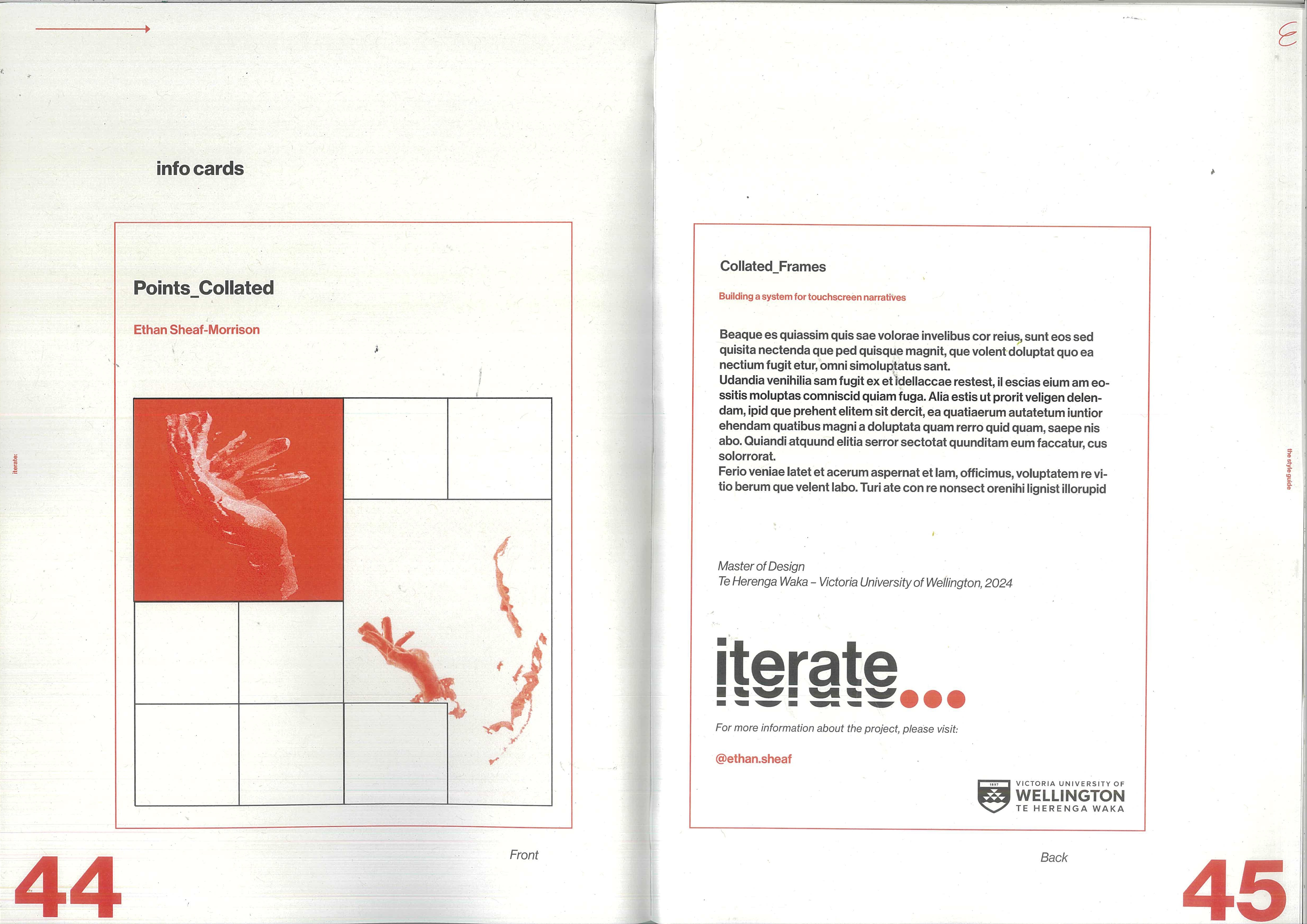
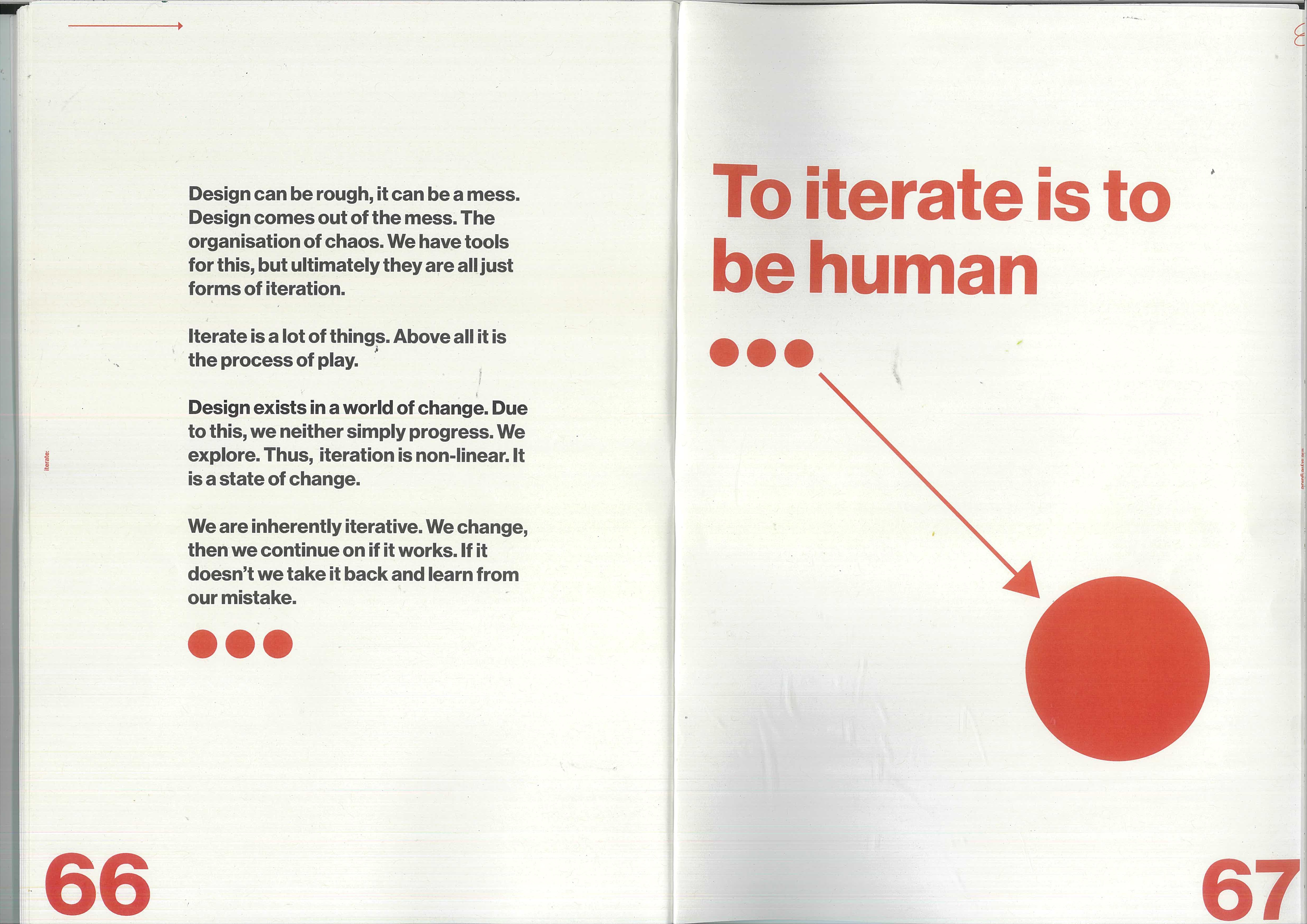
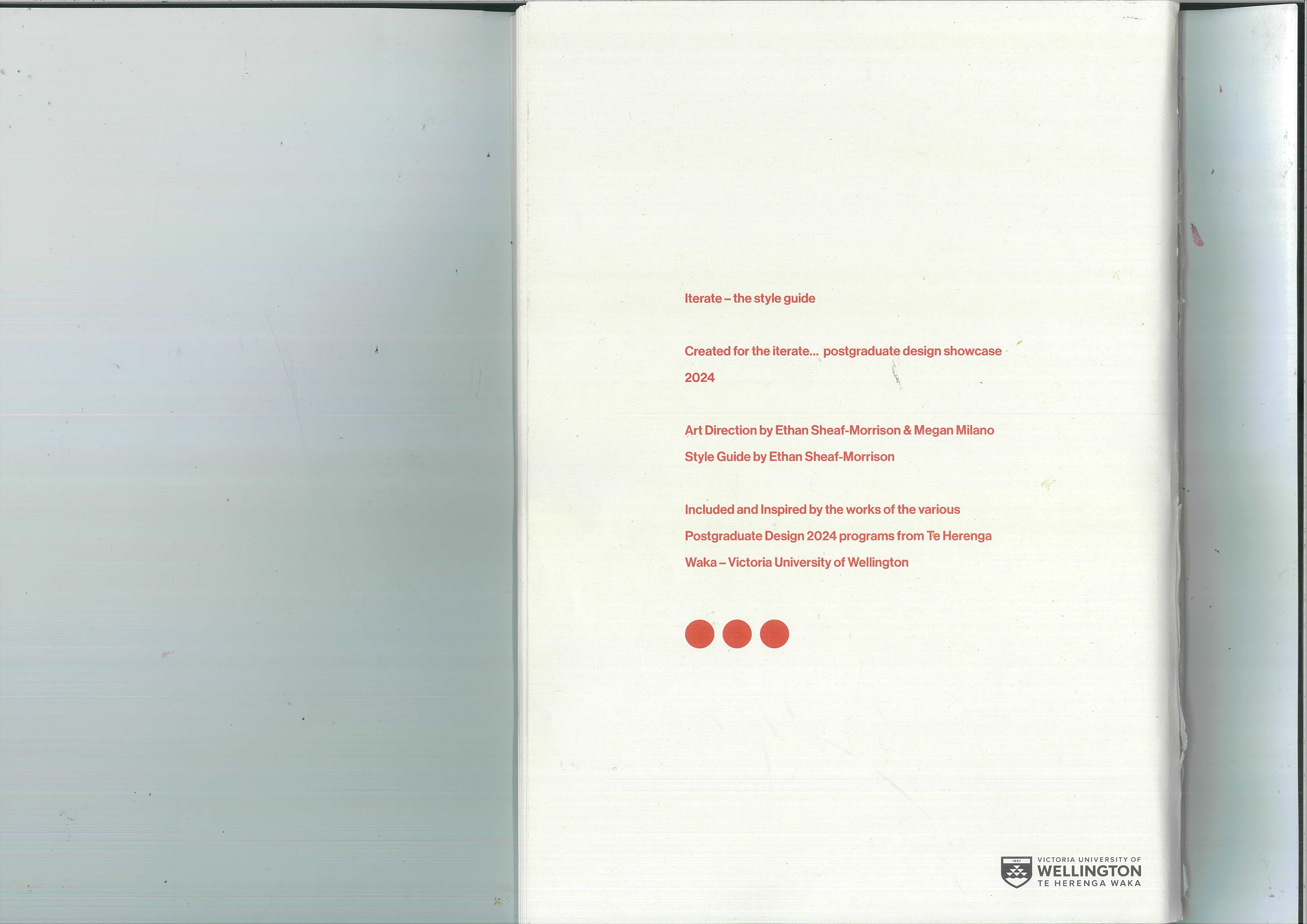
Every rule above lives in a printed style guide — the reference that kept the system coherent across contributors and applications. Page through it below, in order, as it was bound.
Exhibition
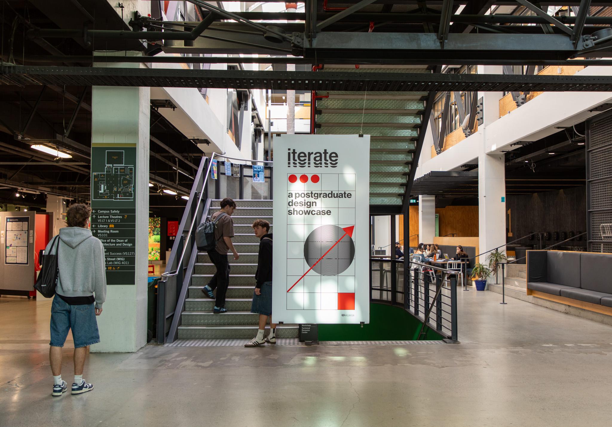
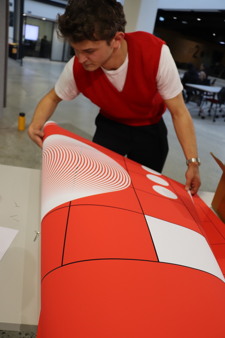
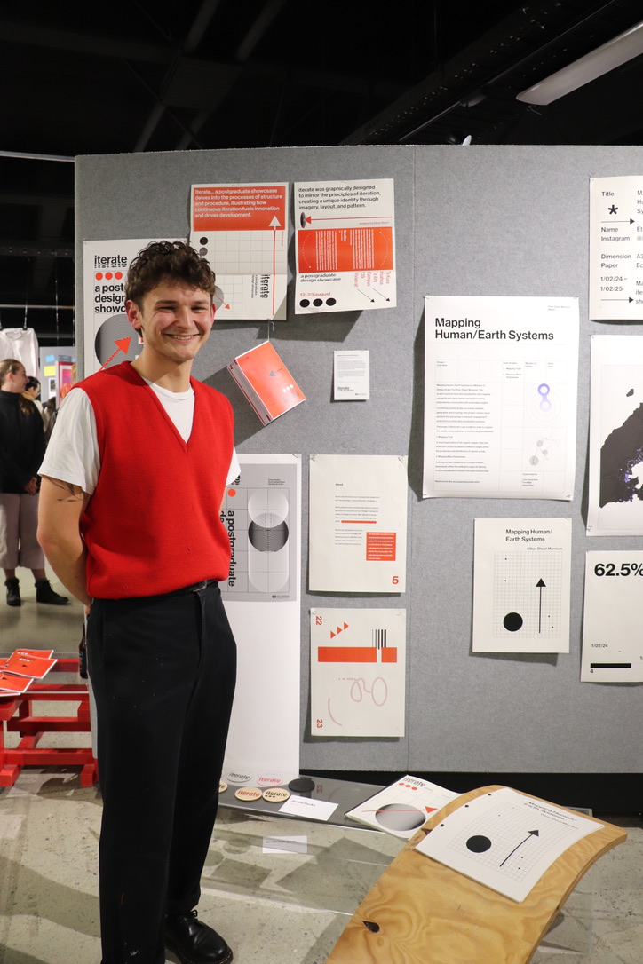
Installed in the Te Aro Campus Atrium, the identity scaled up into banners, wayfinding, and the hanging exemplars — the flat system finally standing in space.
Tools
-
Adobe InDesign
-
Adobe Illustrator
-
Adobe After Effects
Gallery